Nature Canada
Branding, Editorial Design
Nature Canada is an 87-year-old, member-base environmental organization whose supporters include more than 100,000 individuals and around 1,200 affiliated organizations. The organization’s mission is to “protect and conserve wildlife and habitats in Canada by engaging people and advocating on behalf of nature.
We were trusted with leading a significant rebranding effort, to help modernize the organization’s public presence while paying homage to it’s editorial roots.
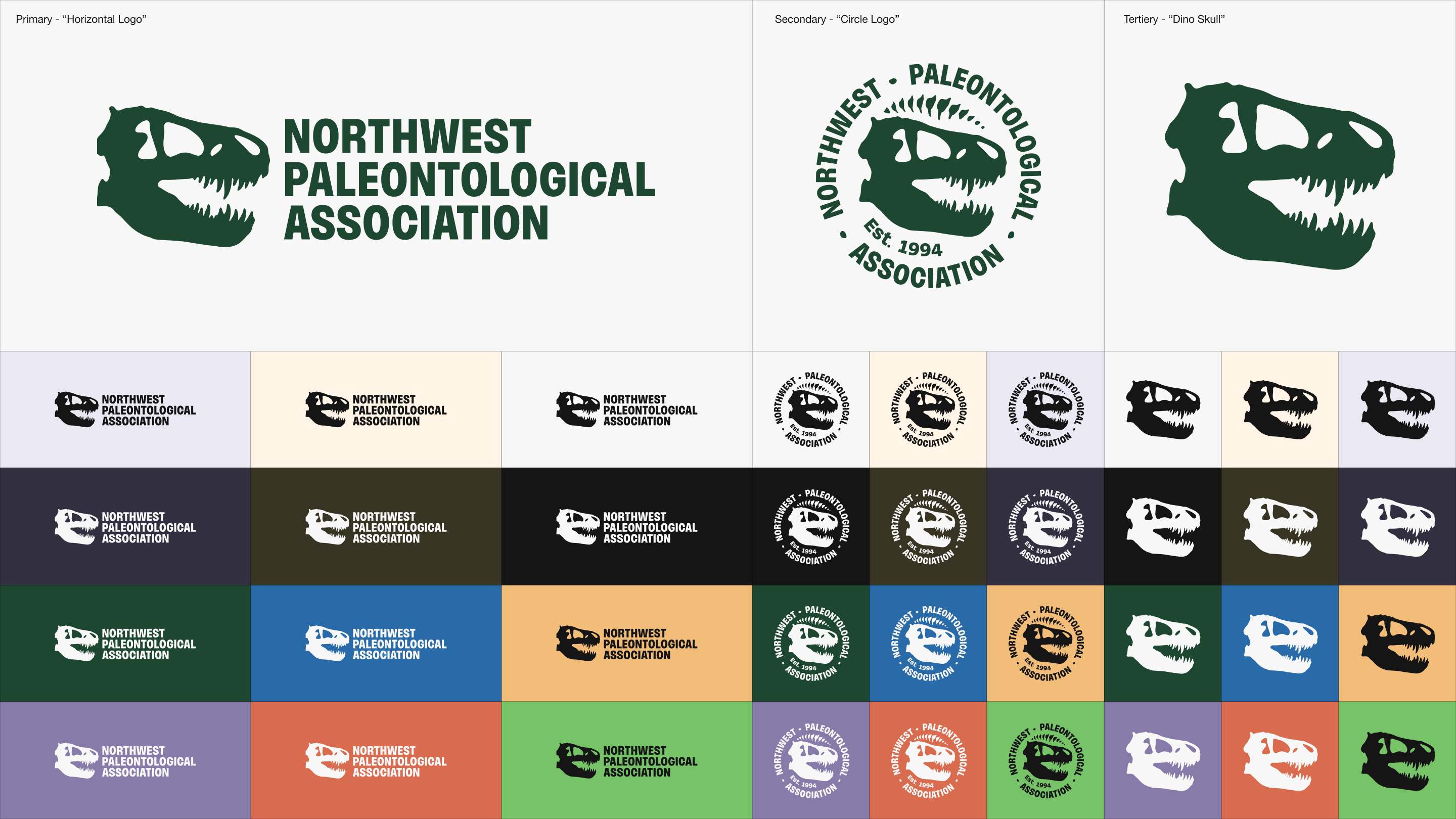
The Challenge
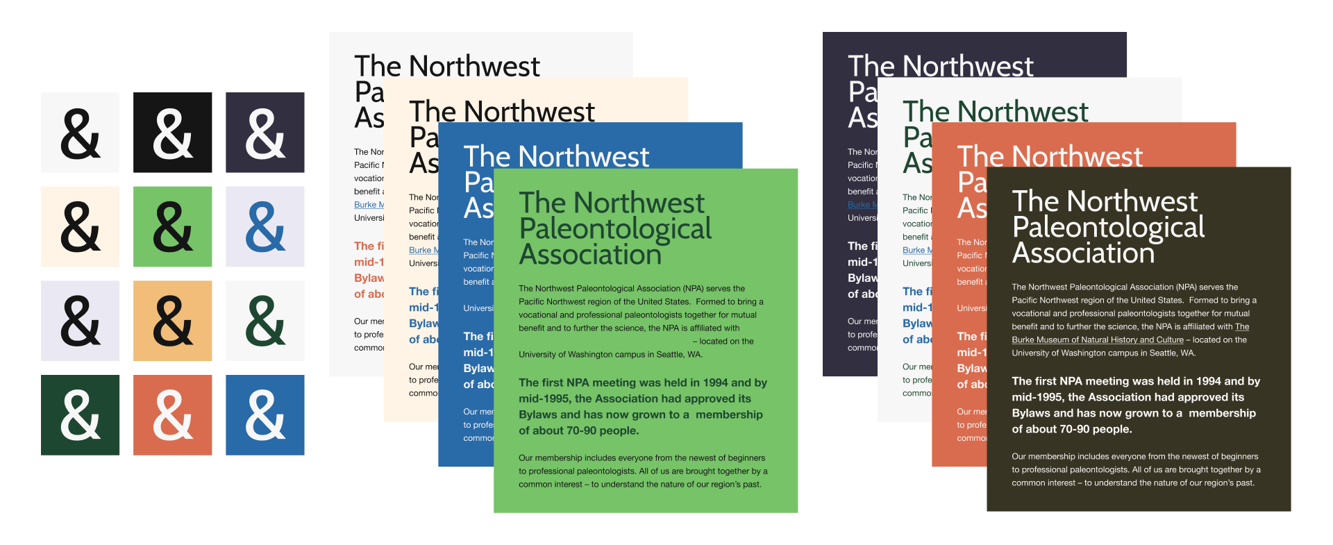
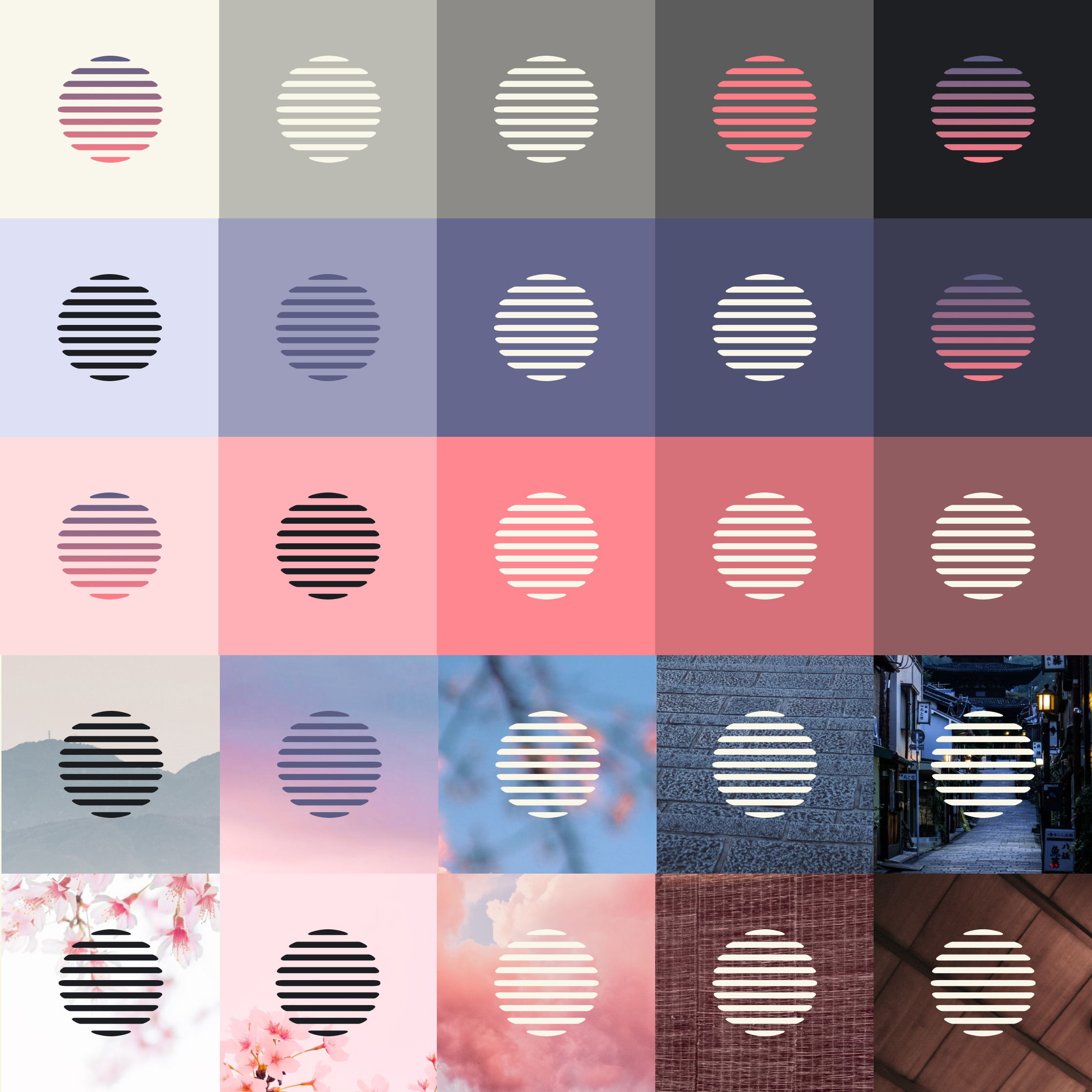
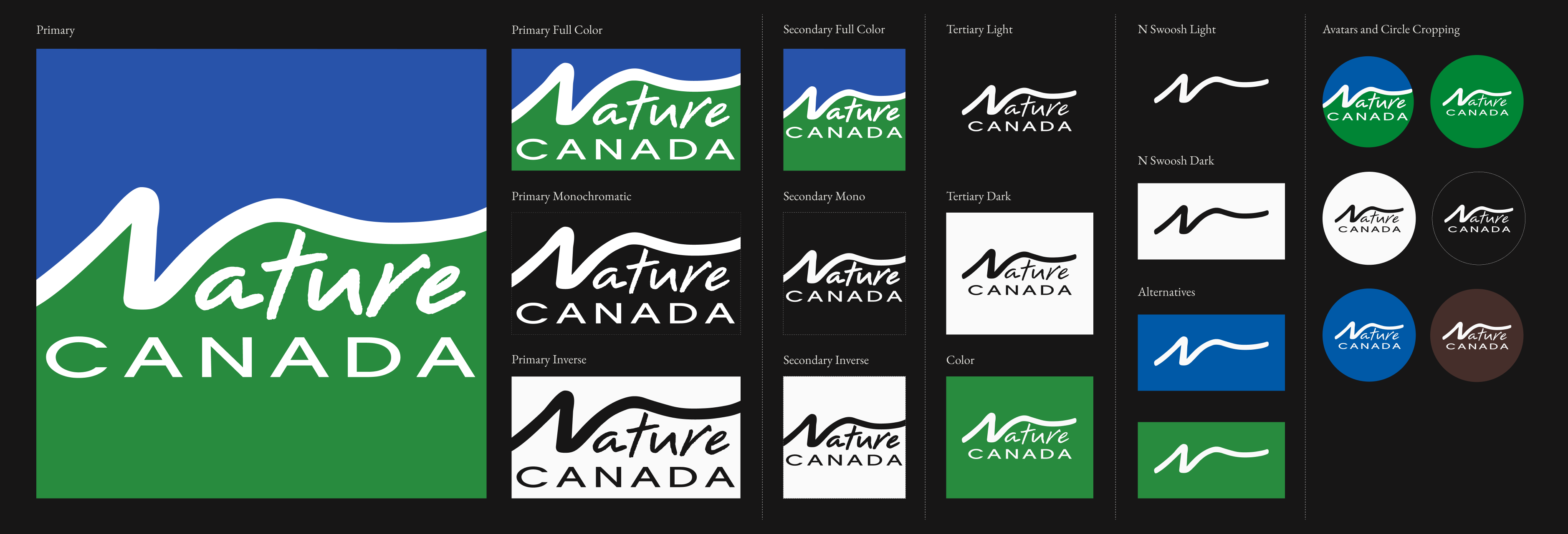
Elevate the organization’s visual identity by addressing an outdated color and typographic system. The brand already had a strong, recognizable logo so we started there and moved outward. A refined, flexible version of the logo was created for different modalities and updated to reflect accessible, modern colorways.
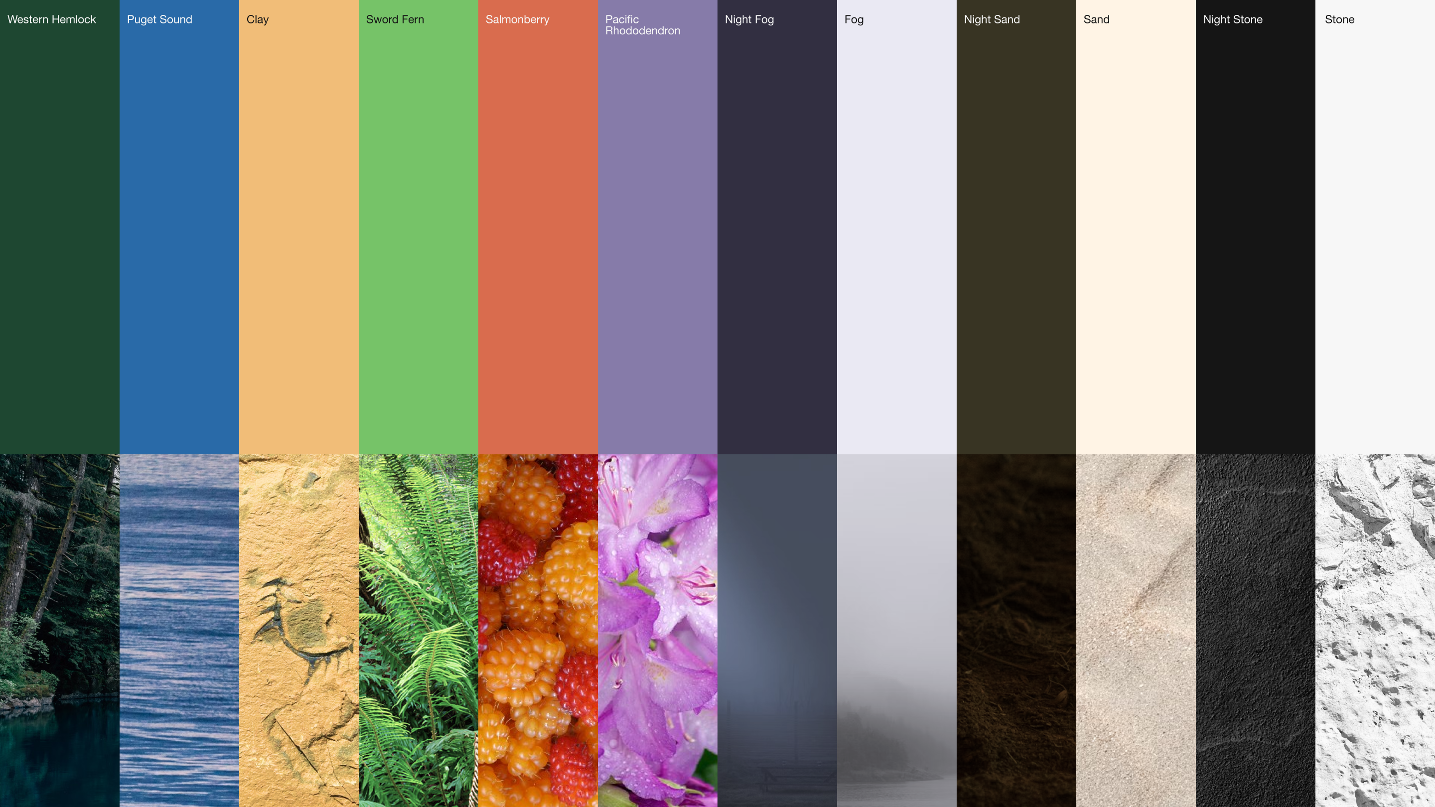
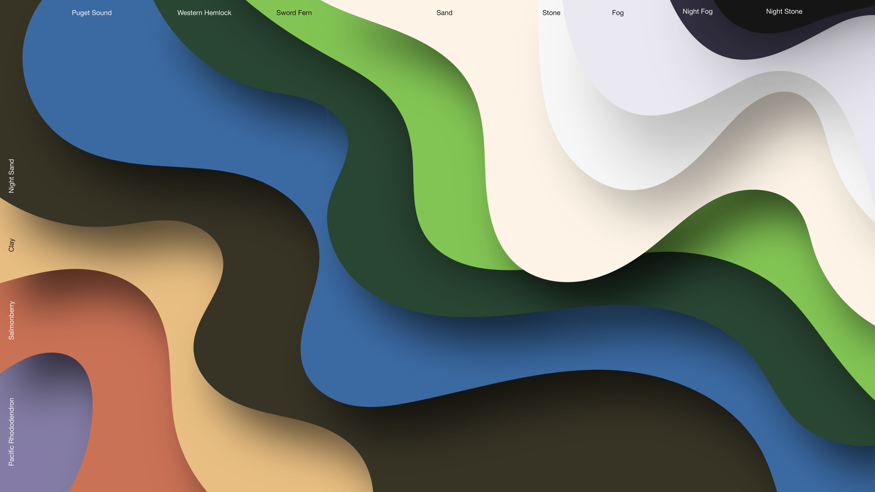
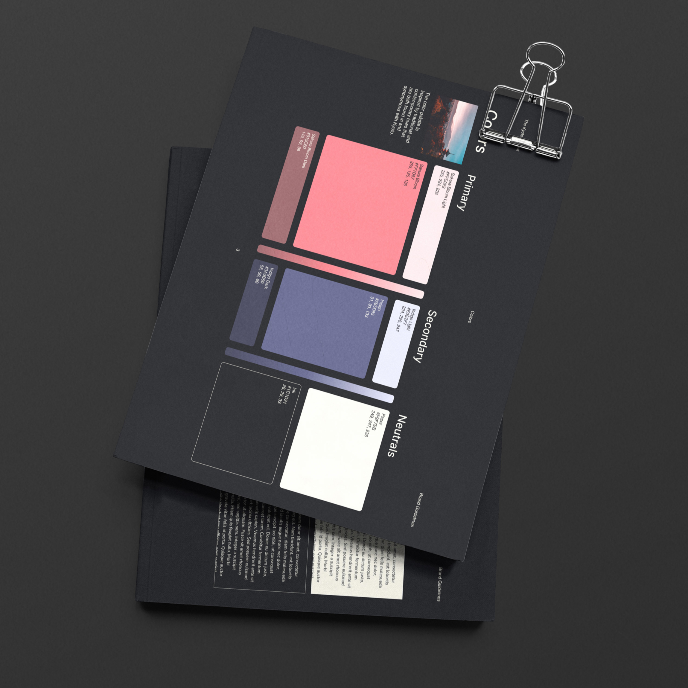
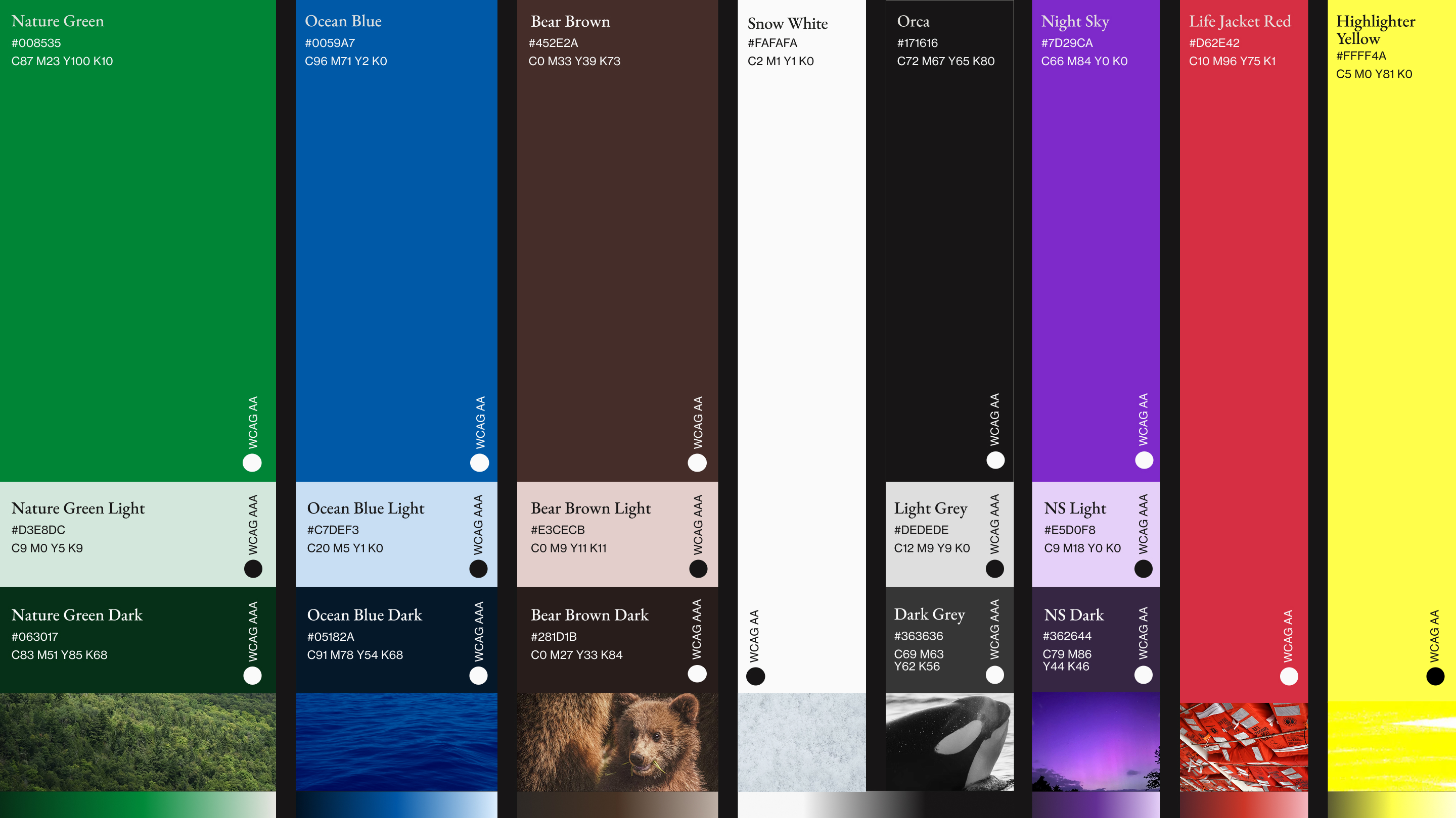
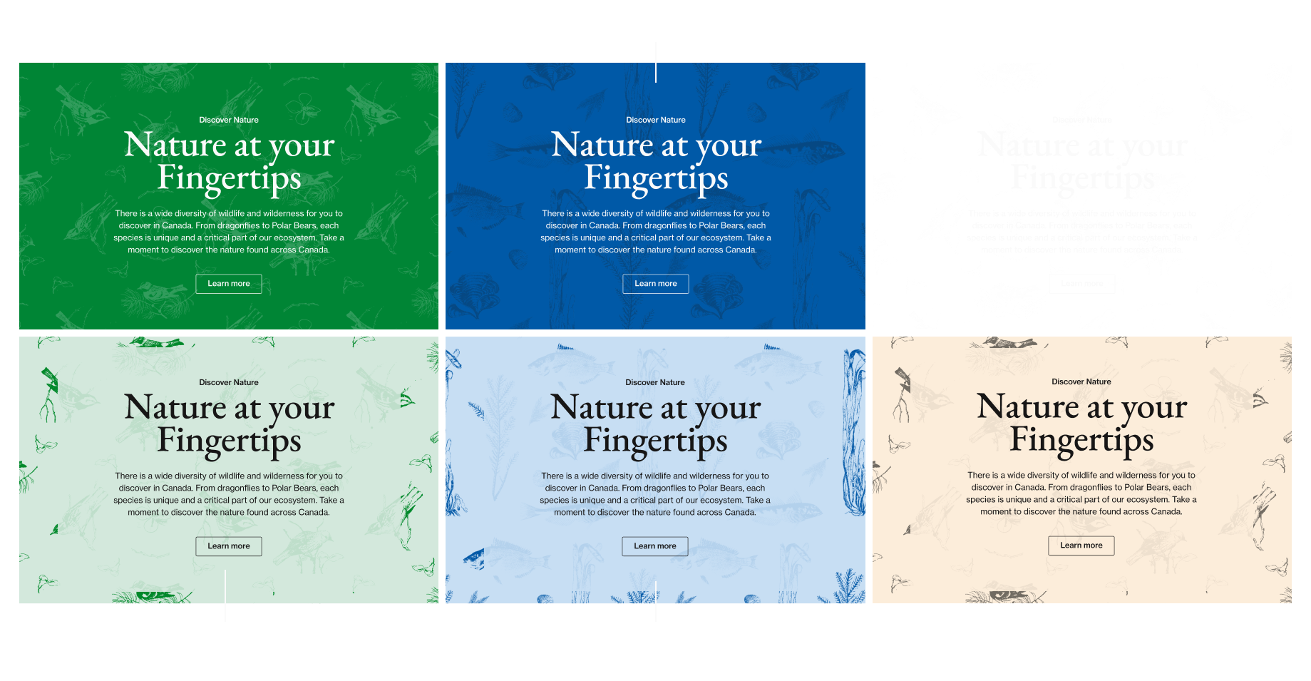
The Colors of Canadian Nature
Through arduous research into beautiful Canadian vistas and landscapes (someone had to do it) and conversations with stakeholders, we determined that a palette grounded in a couple core, recognizable, earthy brand colors was best complemented by bold accents that celebrated and bragged about the beauty of Canada’s natural world.
Typography with a Story
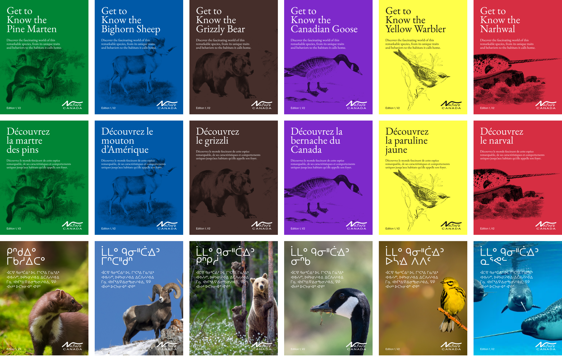
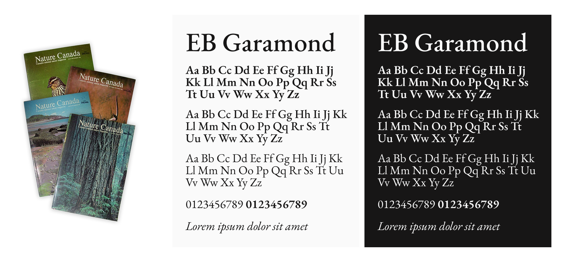
Nature Canada has been publishing, educating, and advocating for the natural world since the 1940s, and their typography needed to carry that weight while still feeling current.
After reviewing mastheads spanning decades of the organization’s history, the 1980s era emerged as the strongest typographic reference point, leading us to EB Garamond. A typeface that mirrors that editorial legacy while being a digitally remastered modern revival, with full French language support to reflect Canada’s bilingual identity.
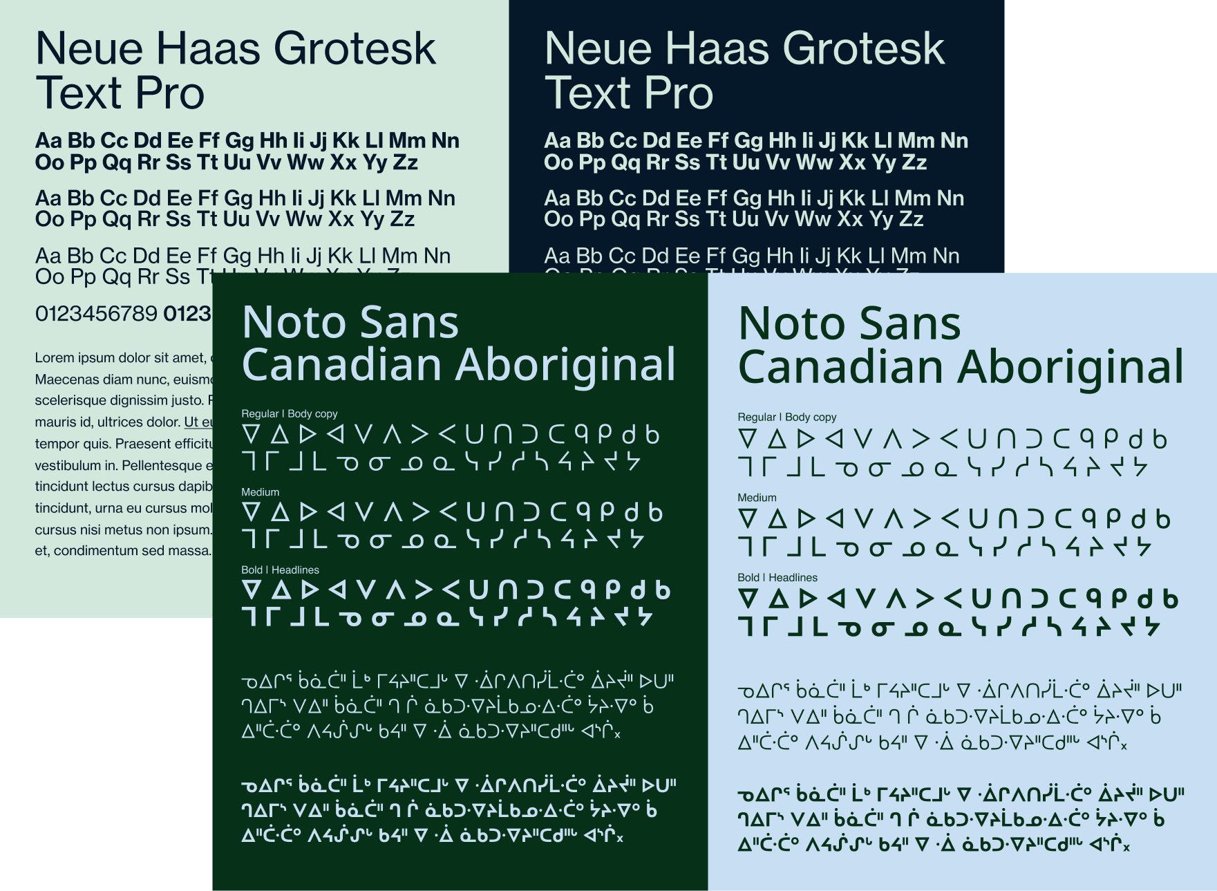
Neue Haas Grotesk was brought in as the workhorse for body copy, providing a clean, neutral counterbalance to Garamond’s editorial character, while Noto Sans Canadian Aboriginal was included to ensure the brand could authentically and respectfully represent Indigenous language and script across communications.
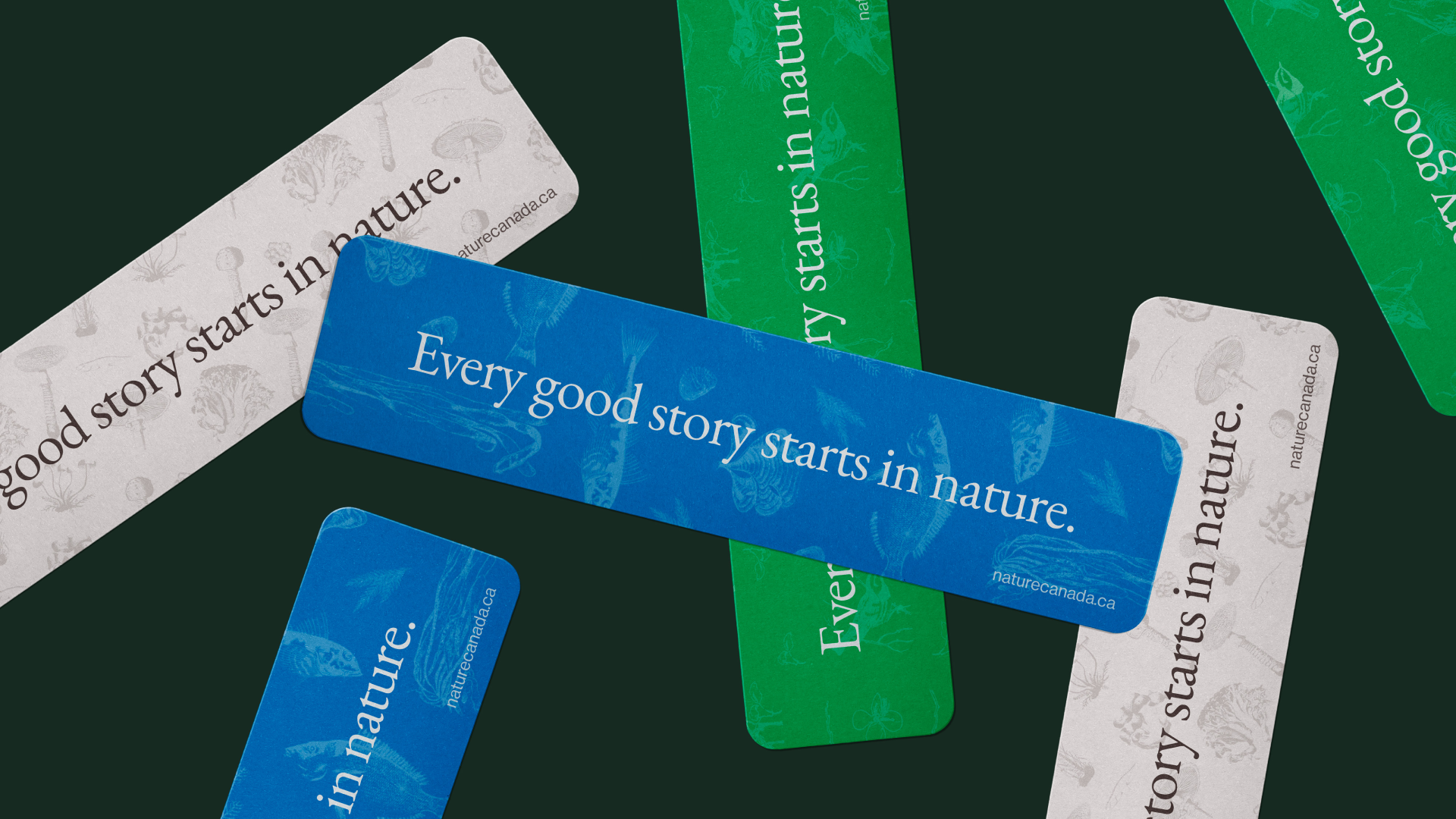
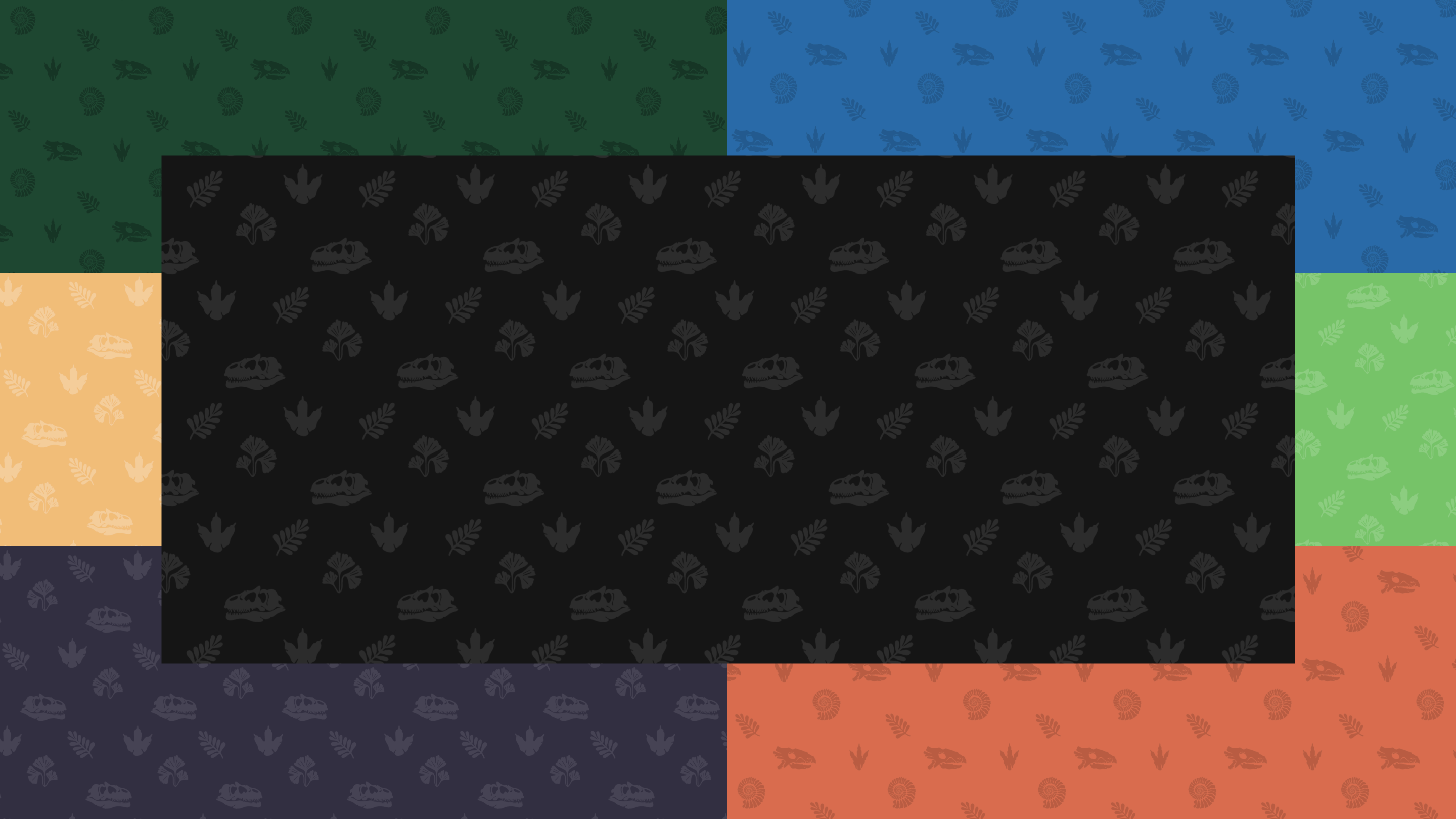
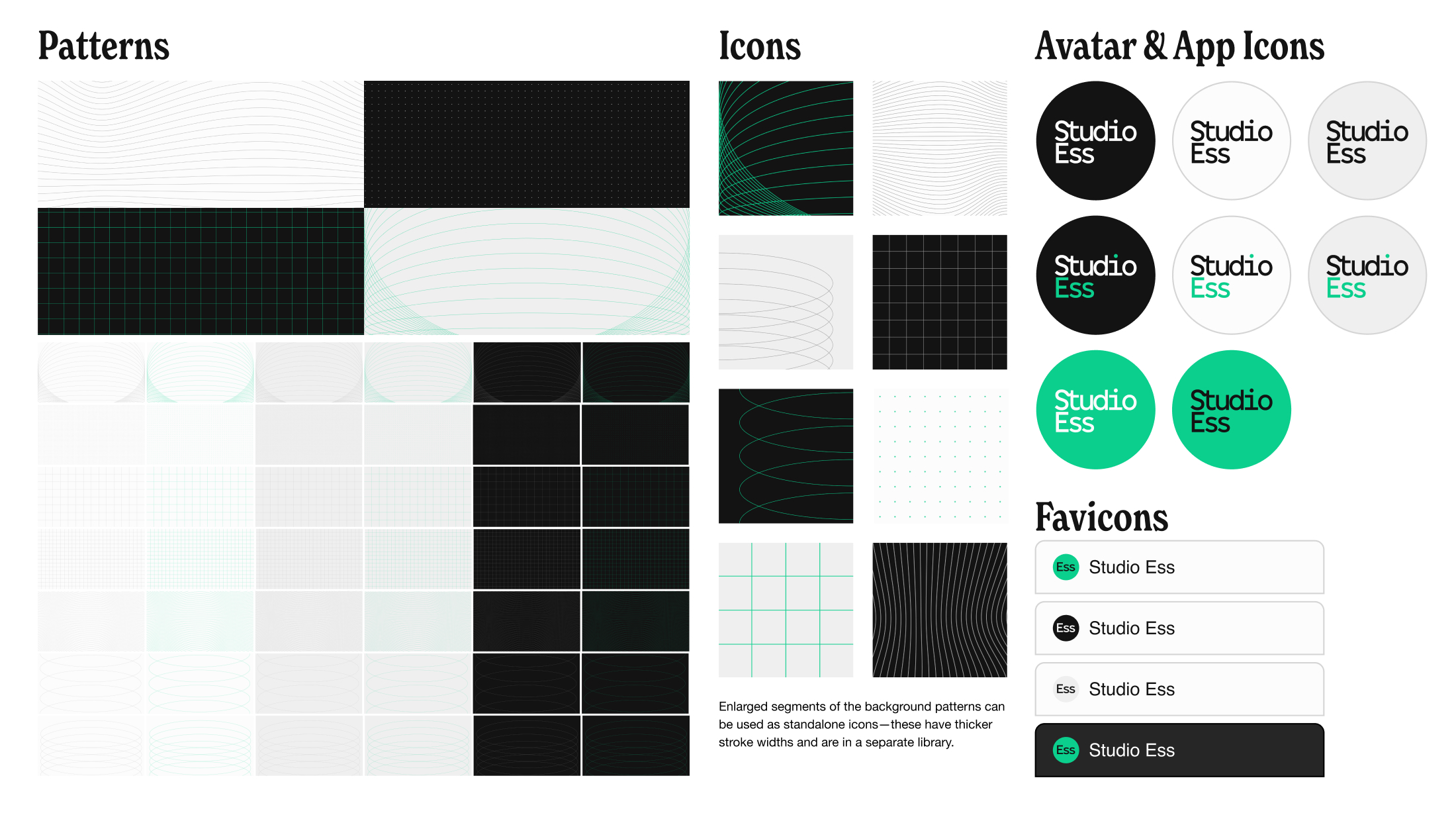
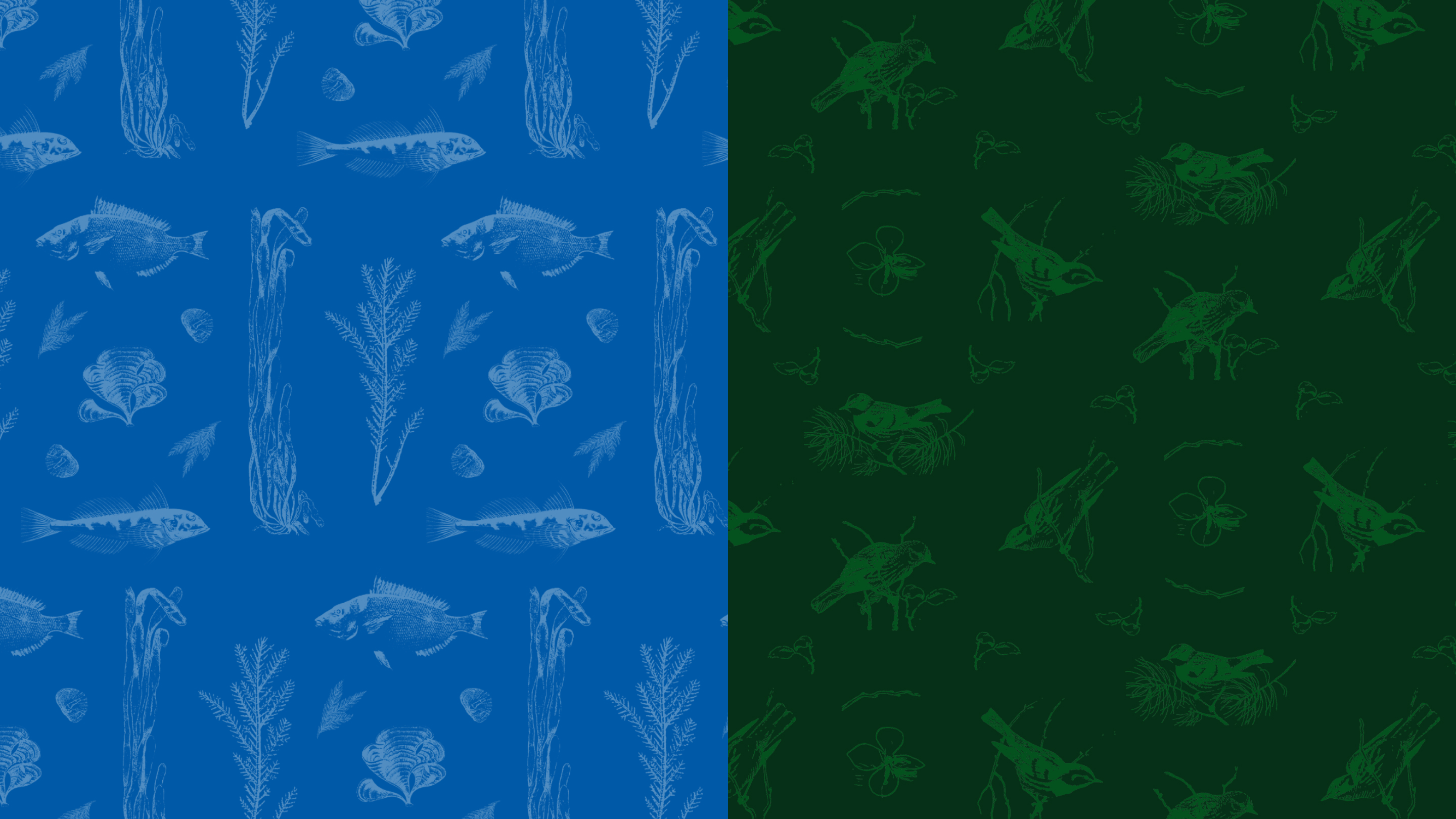
Old World Patterns, Modern Design
The pattern system draws directly from Nature Canada’s own archives, transforming scientific illustrations from their legacy publications into rich, wallpaper-inspired repeating patterns.
Organized thematically around Canadian biodiversity, they work equally well as subtle background textures or bold standalone design elements, turning nearly a century of publishing into living visual identity.
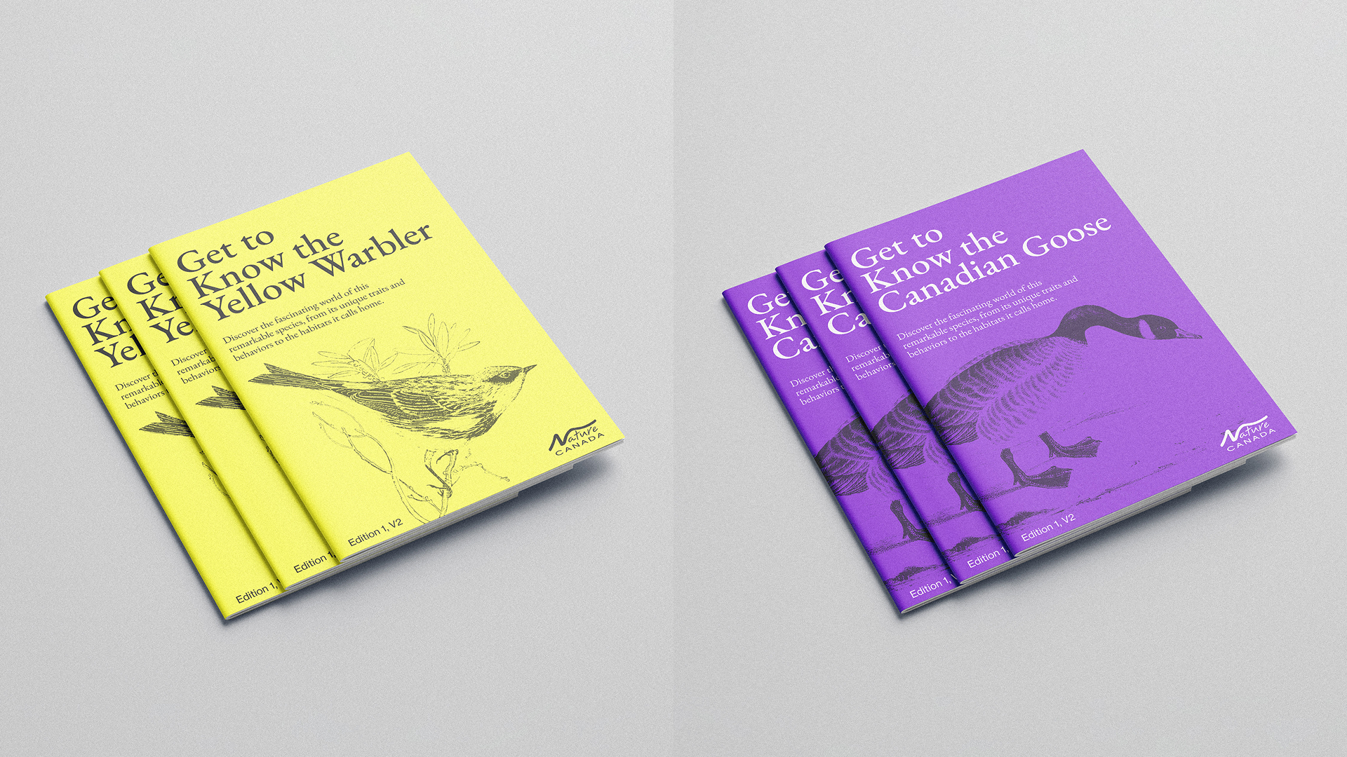
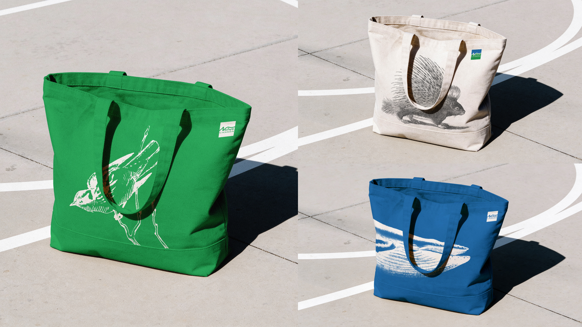
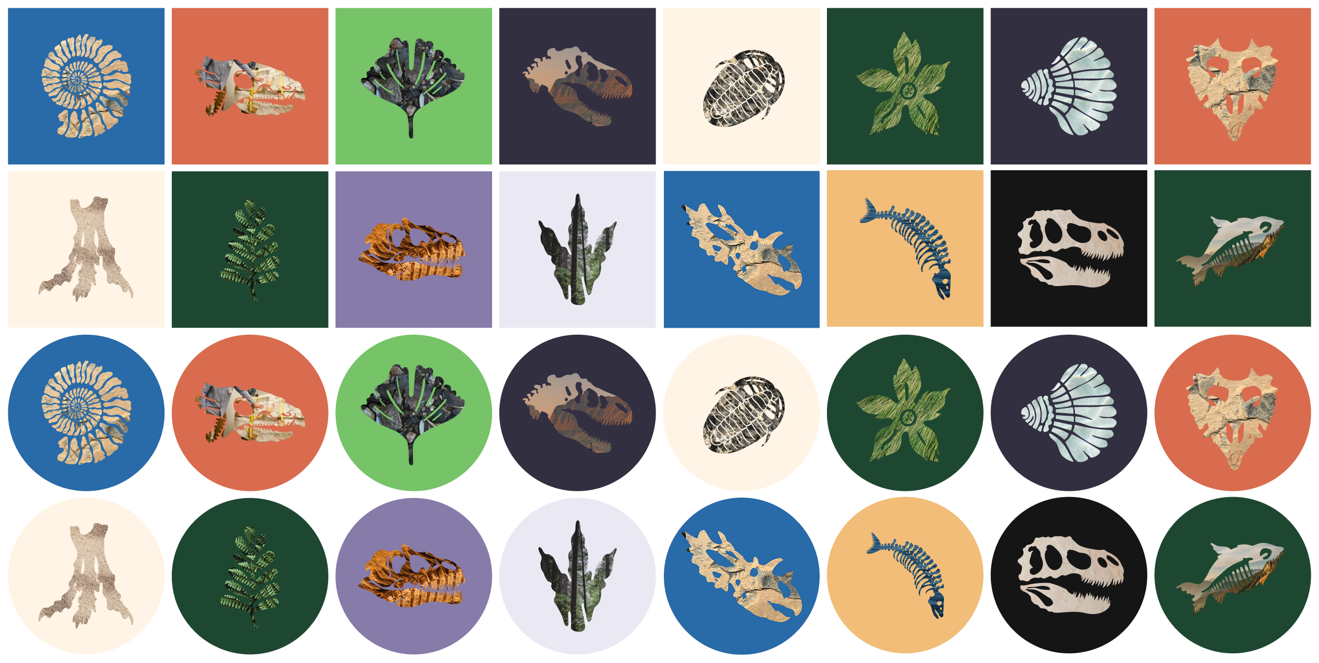
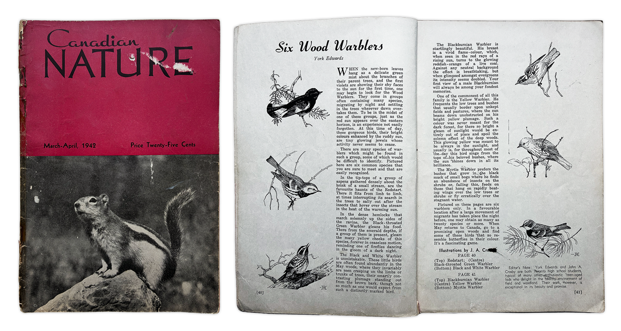
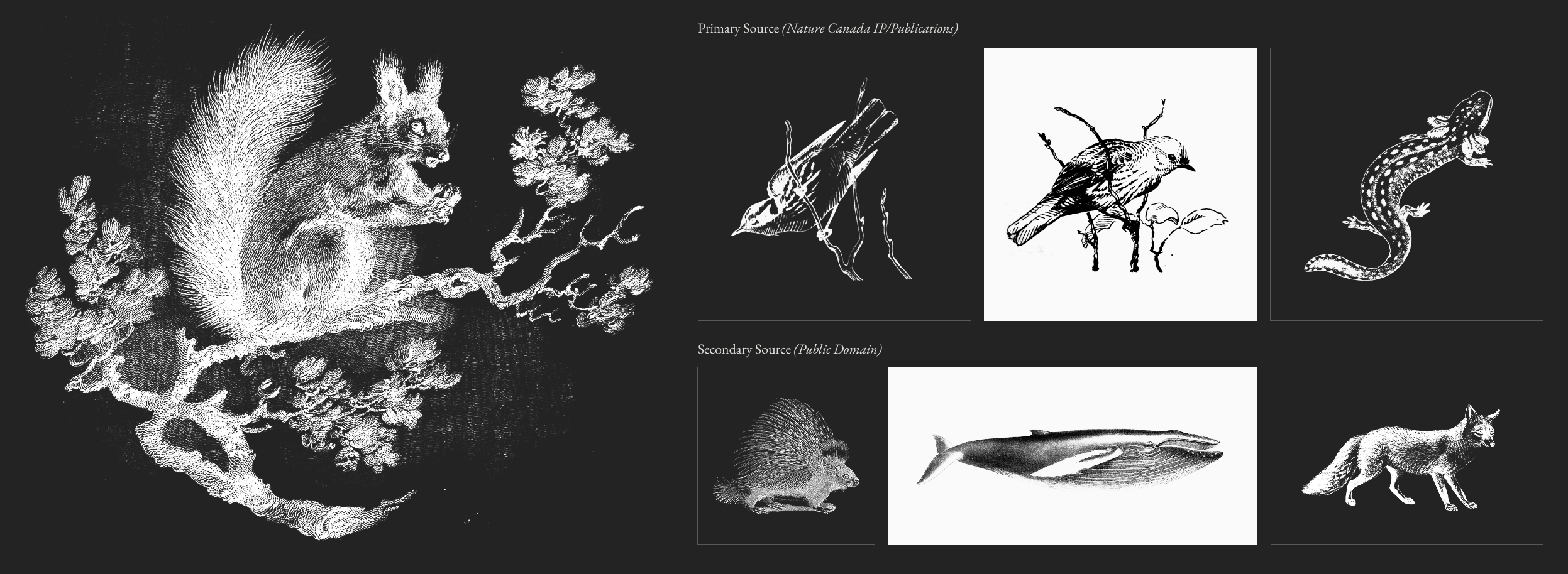
Illustrations from Another Era
The illustration system follows the same philosophy as the patterns, rooted first in Nature Canada’s own archival publications and supplemented where needed by historic scientific drawings from public domain repositories like the Biodiversity Heritage Library. Used as standalone elements across social, web, and print, they bring a naturalist editorial character to the brand that reinforces what Nature Canada is at its core: an organization with nearly a century of knowledge and credibility behind it.
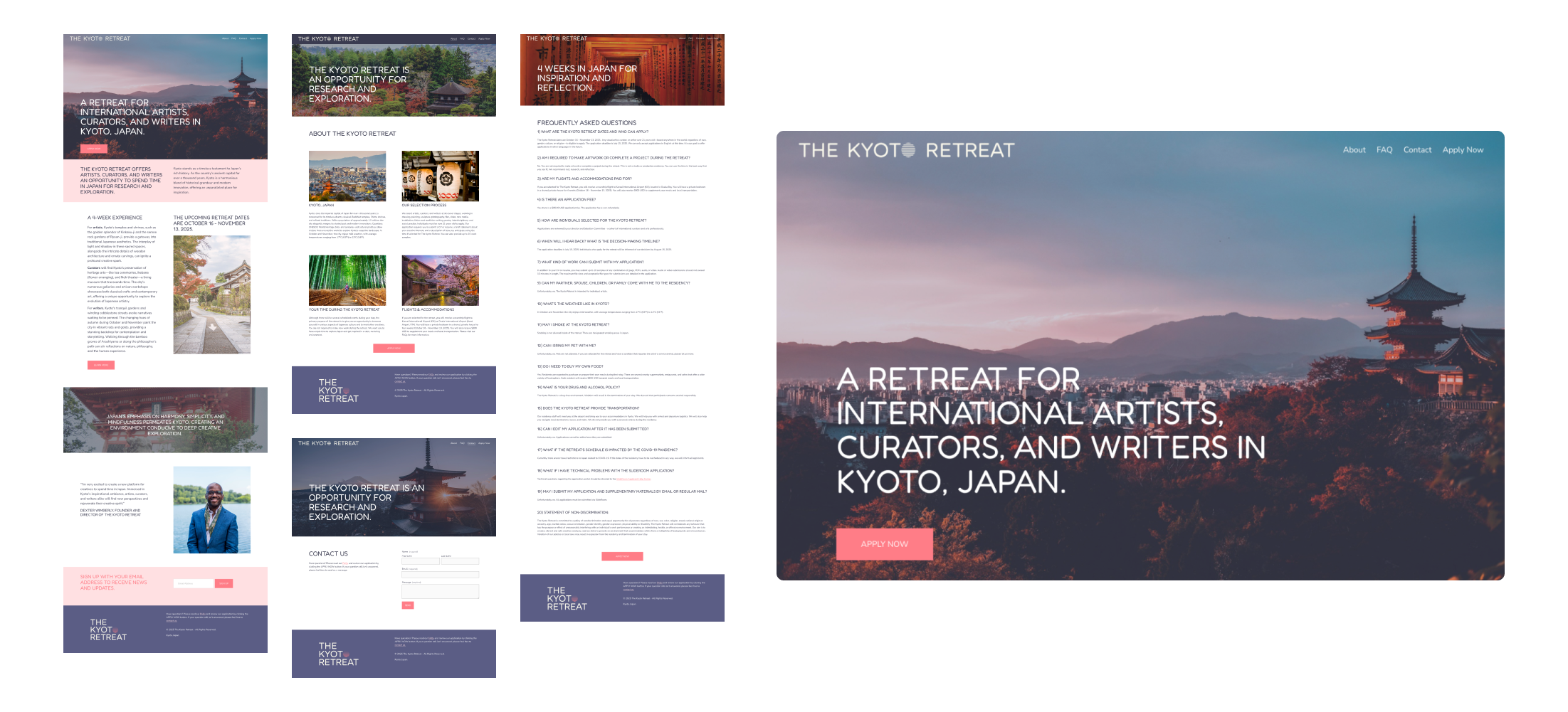
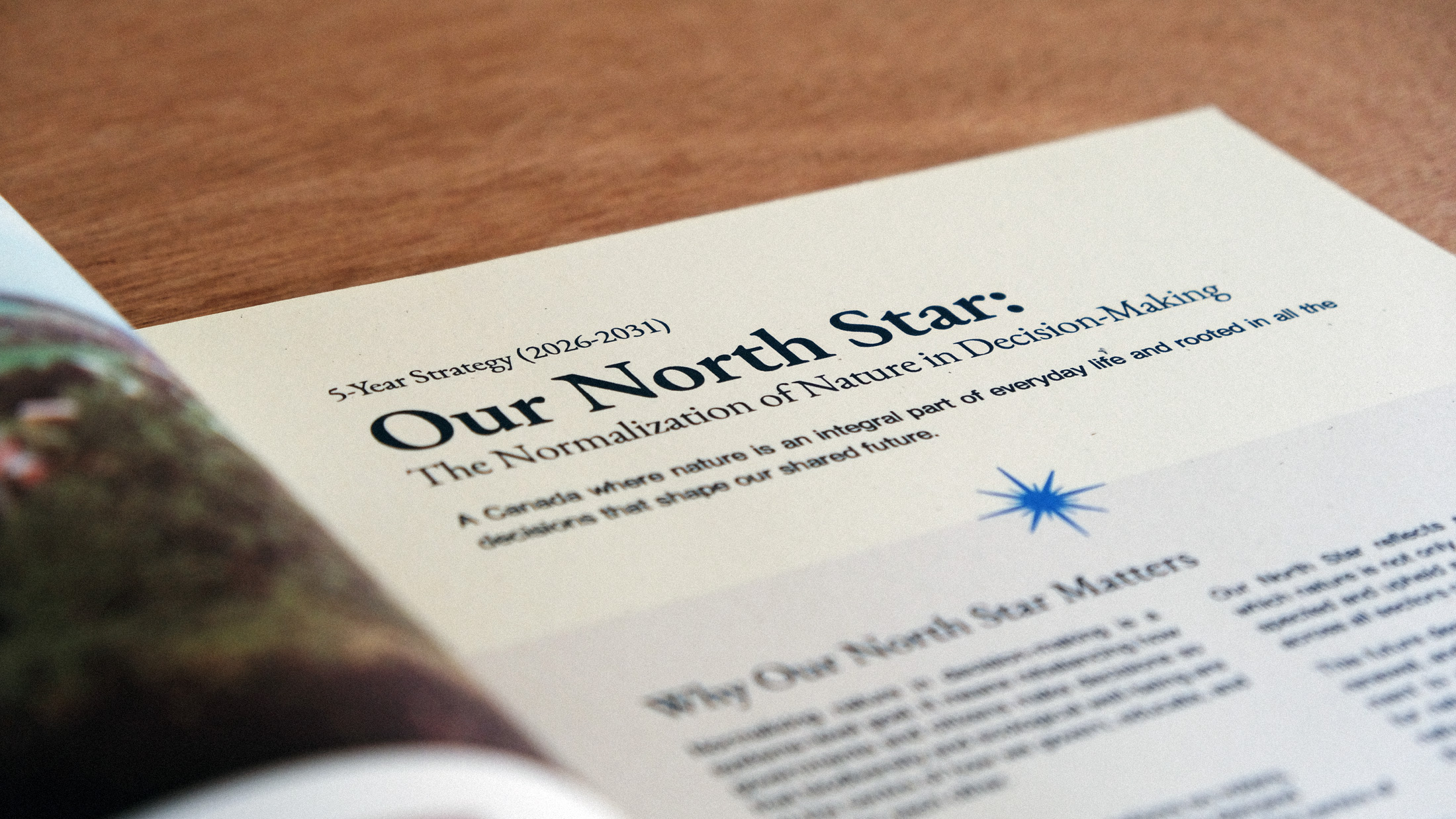
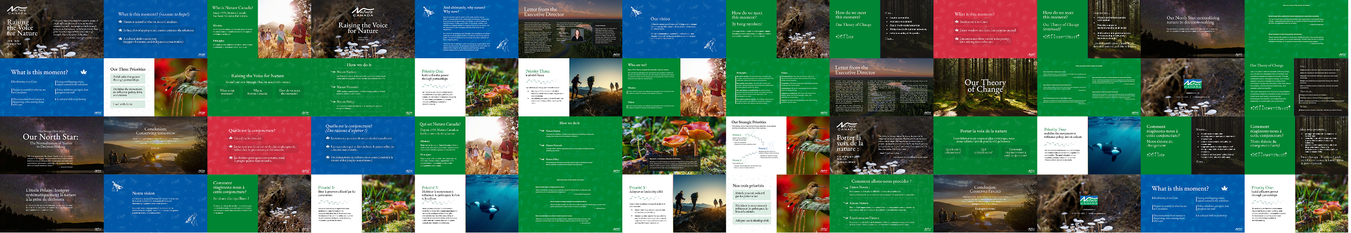
Strategic Plan & Editorial Direction
Beyond the brand system itself, we designed Nature Canada’s 2026-2031 Strategic Plan as a fully realized editorial publication—a printed booklet built for donors, board members, and supporters that lays out the organization’s vision and priorities for the next five years.
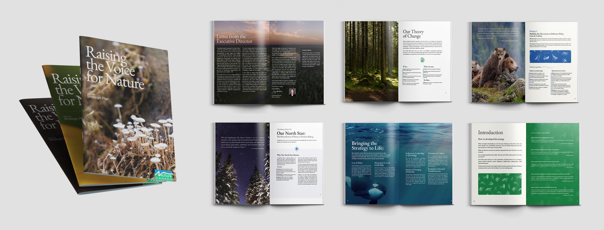
This wasn’t a templated report; it was designed from the ground up, with the full brand system doing real work across every spread: the archival patterns as textural backgrounds, the illustration system woven throughout, typography setting the tone between gravitas and warmth, and photography anchoring the emotional weight of the mission.
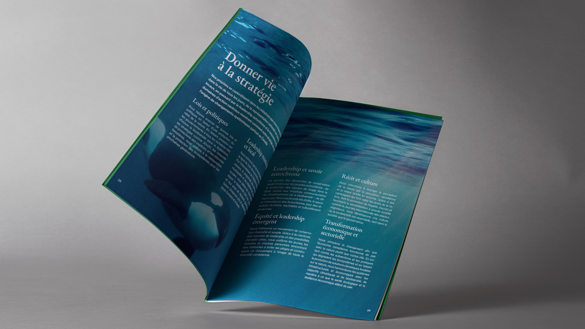
The result is a piece that feels as considered as the strategy it contains. It was also adapted into a presentation deck, and establishes a strong foundation for Nature Canada’s future print work, proving the brand can carry itself confidently across long-form editorial formats.
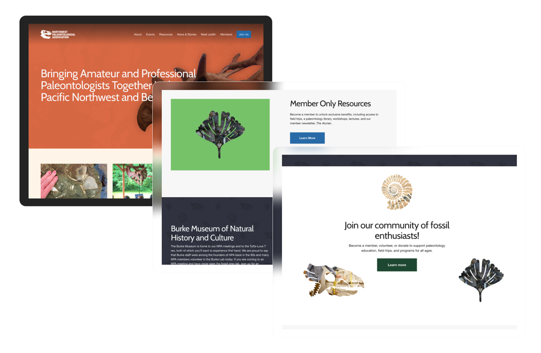
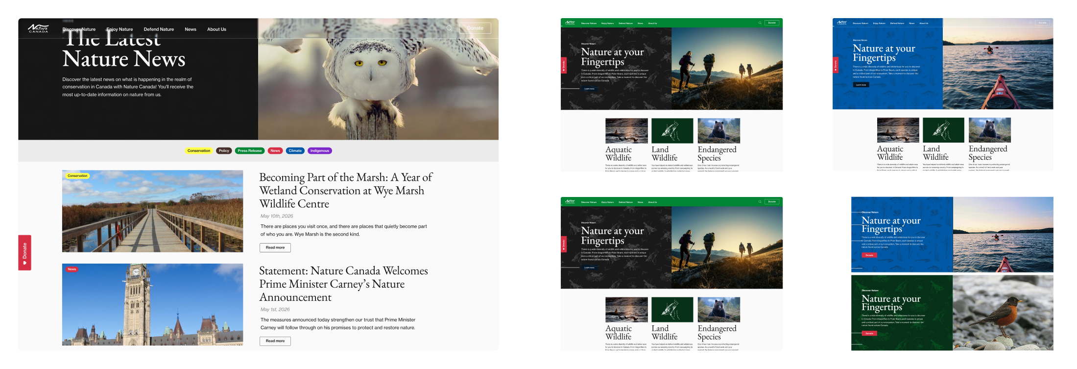
Web Guidance
The brand system also included web guidance to carry the new identity into Nature Canada’s existing digital presence ahead of a full redesign in 2026. Rather than a full overhaul, this work showed how updated colors, typography, spacing, and content hierarchy should apply across key site elements, giving Nature Canada and their incoming web team a clear foundation for consistent online expression in the interim.
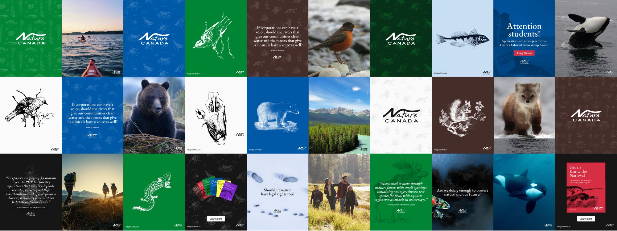
Social Animals 🦊 🐻 🐸
Social media templates were developed to show the brand system in action across a range of content types: photography, illustration, advocacy messaging, quotes, and announcements. These demonstrate how the color palette, patterns, and illustration system flex across formats while maintaining a cohesive and recognizable presence at the scroll.
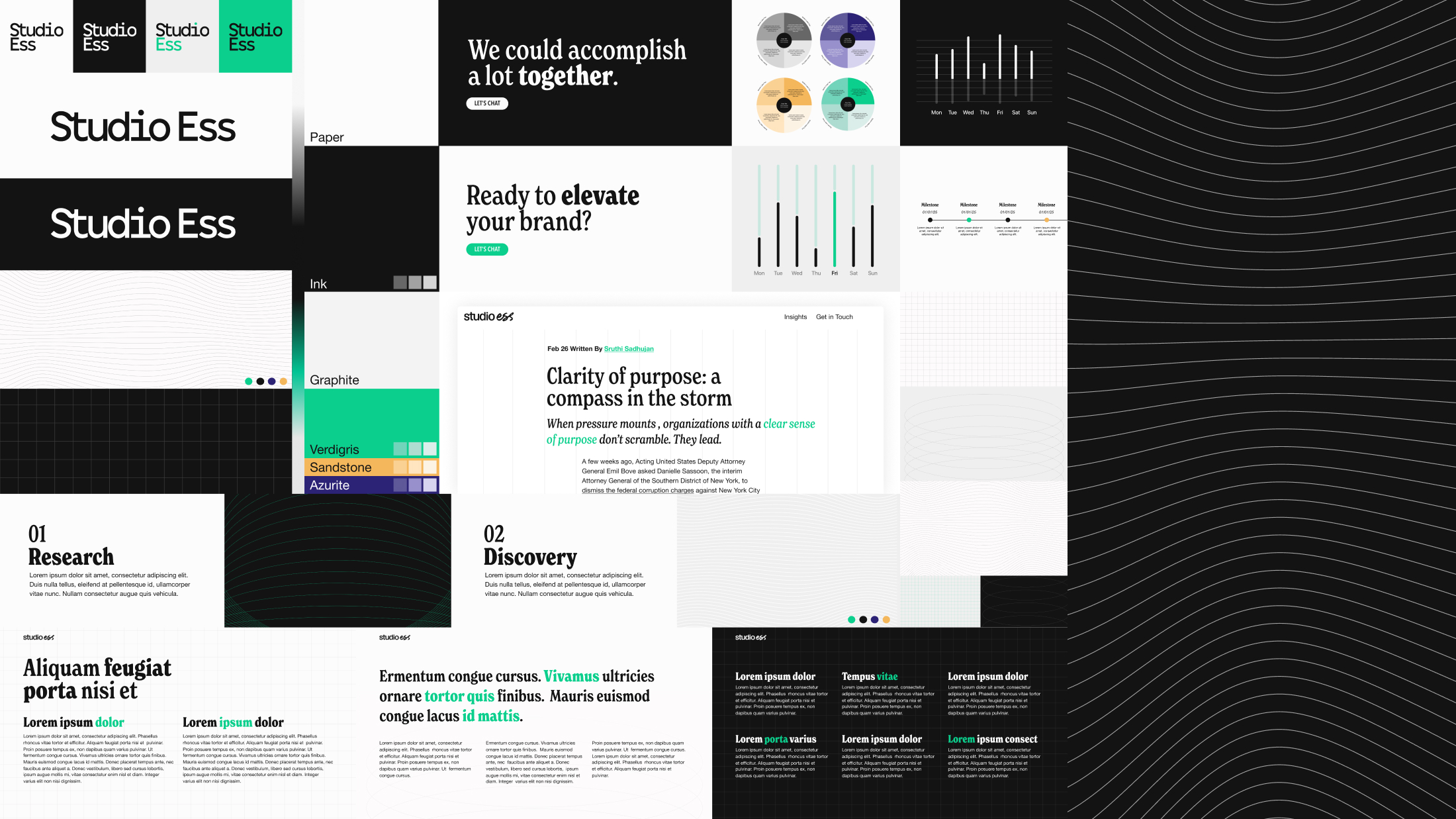
Deck Support
Presentation and data visualization templates extend the brand into Nature Canada’s reporting and advocacy work, covering bold stat slides, charts, and dashboards in both light and dark colorways, with the expanded accent palette doing the heavy lifting across all of it.
Additional Applications
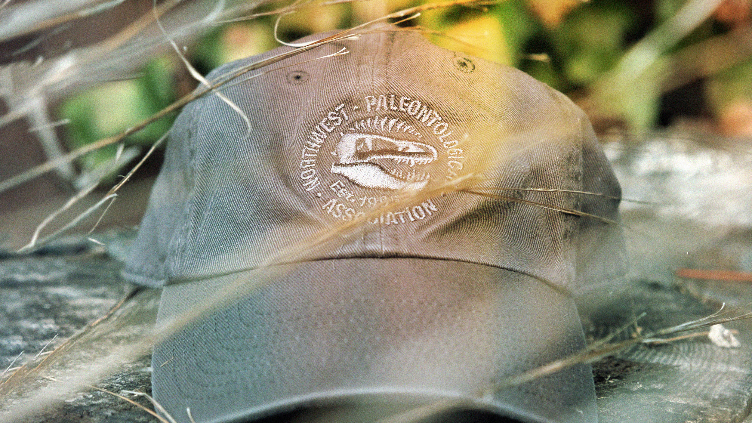
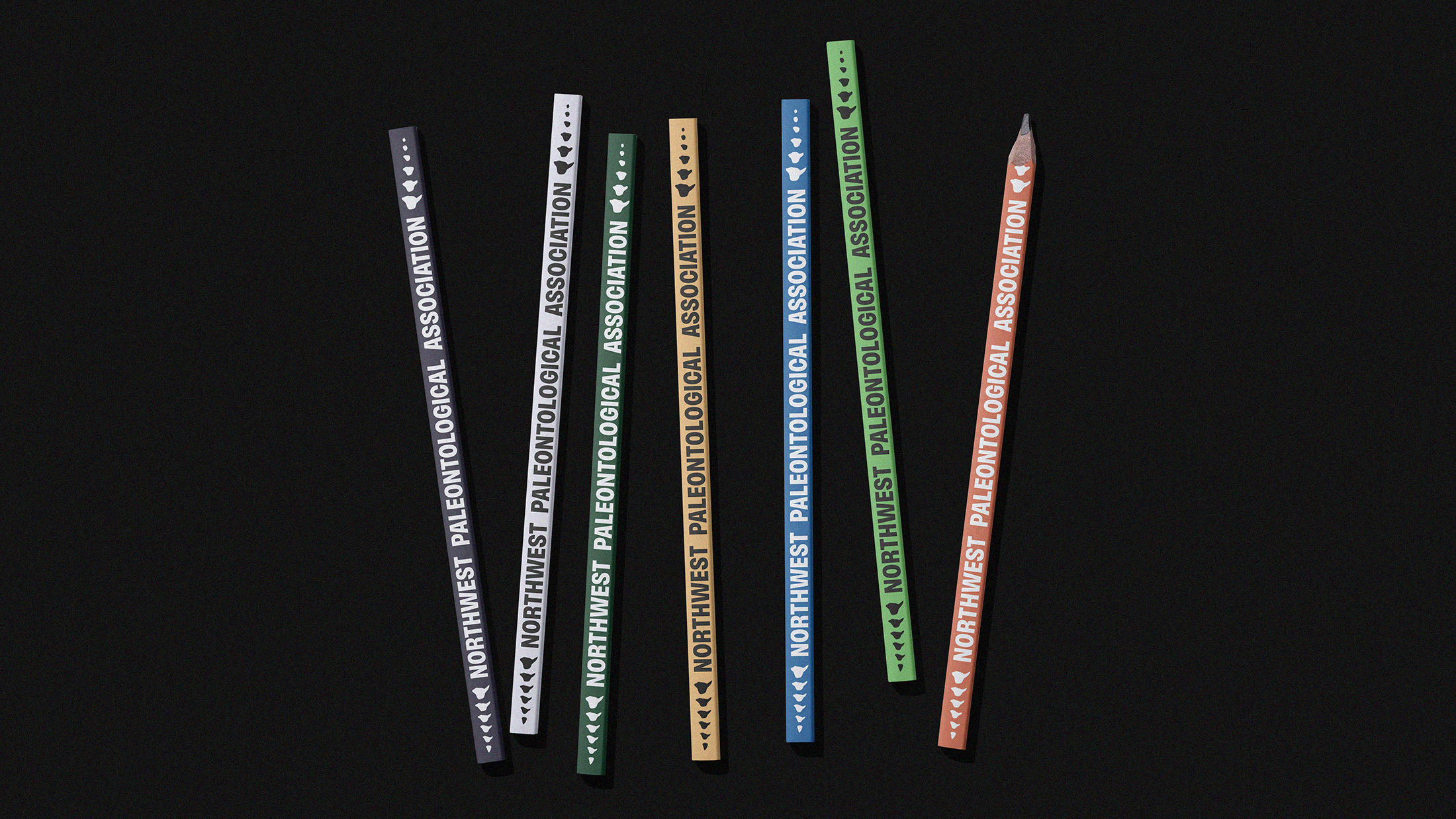
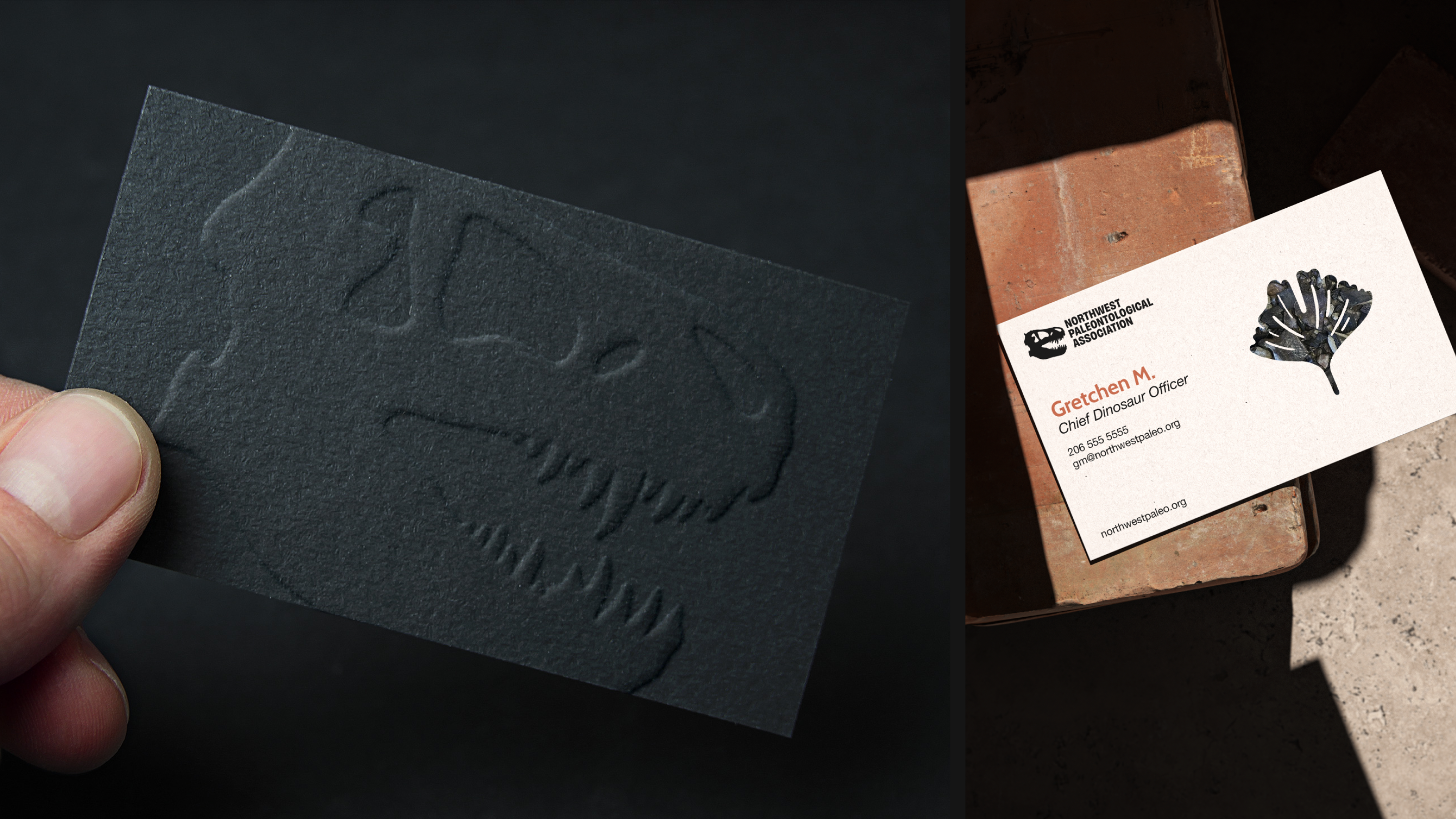
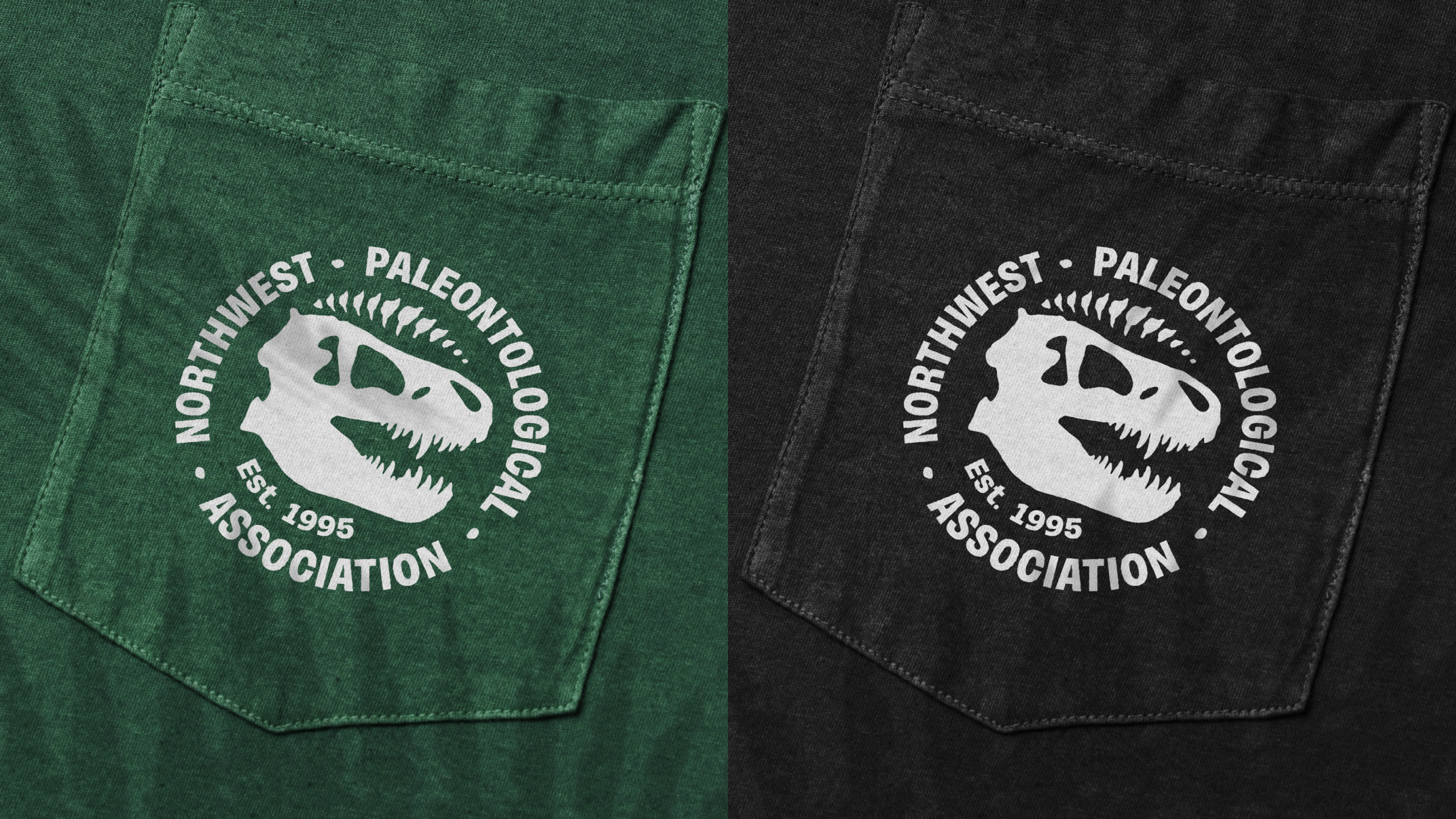
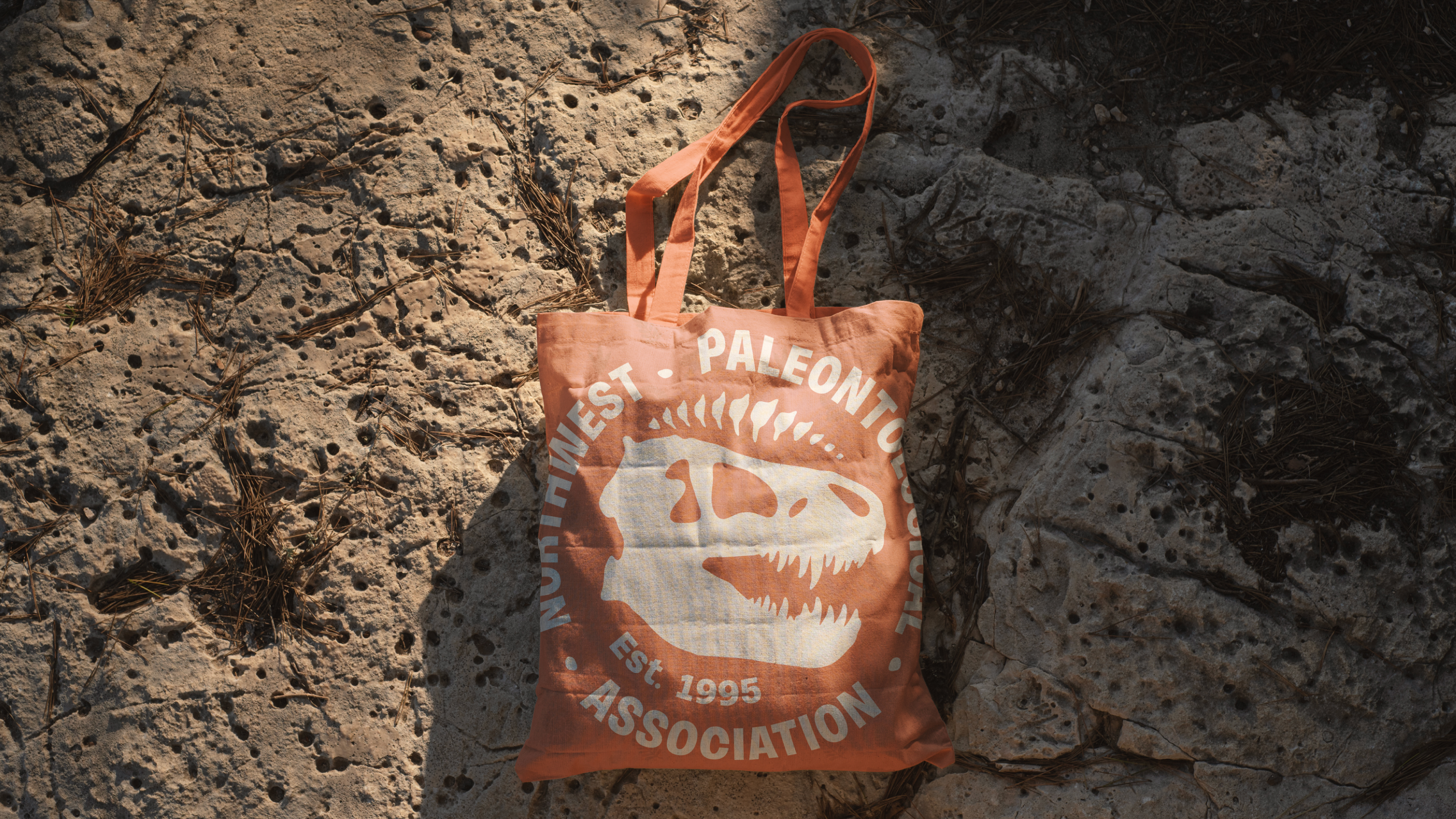
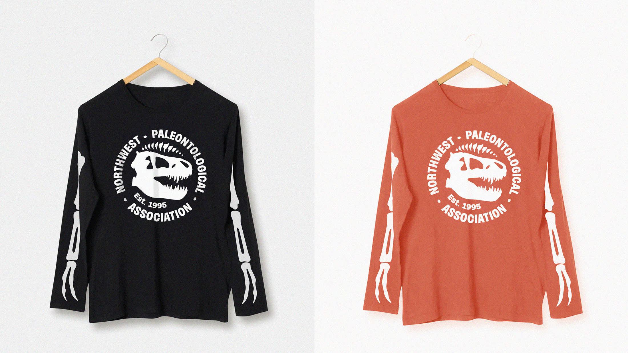
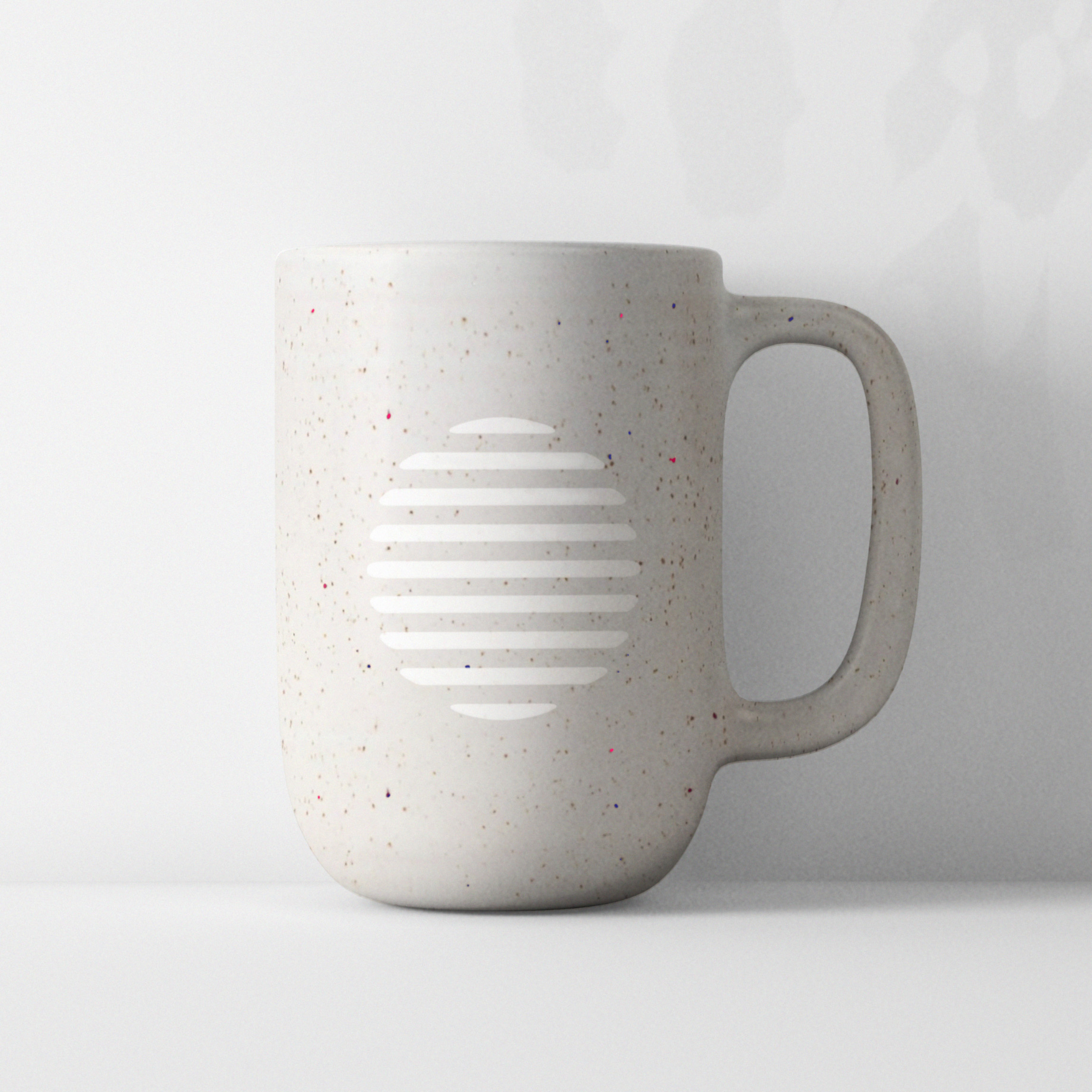
The brand was extended to physical applications to inspire the caretakers of the brand with a vision for how the identity can live in the real world and continue growing beyond the screen.