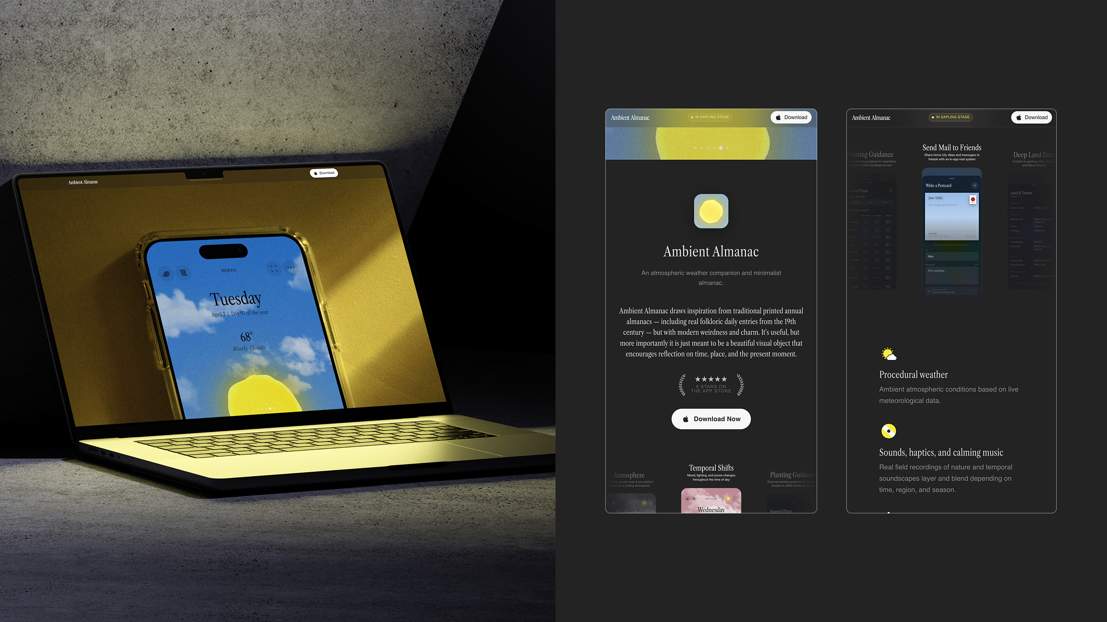
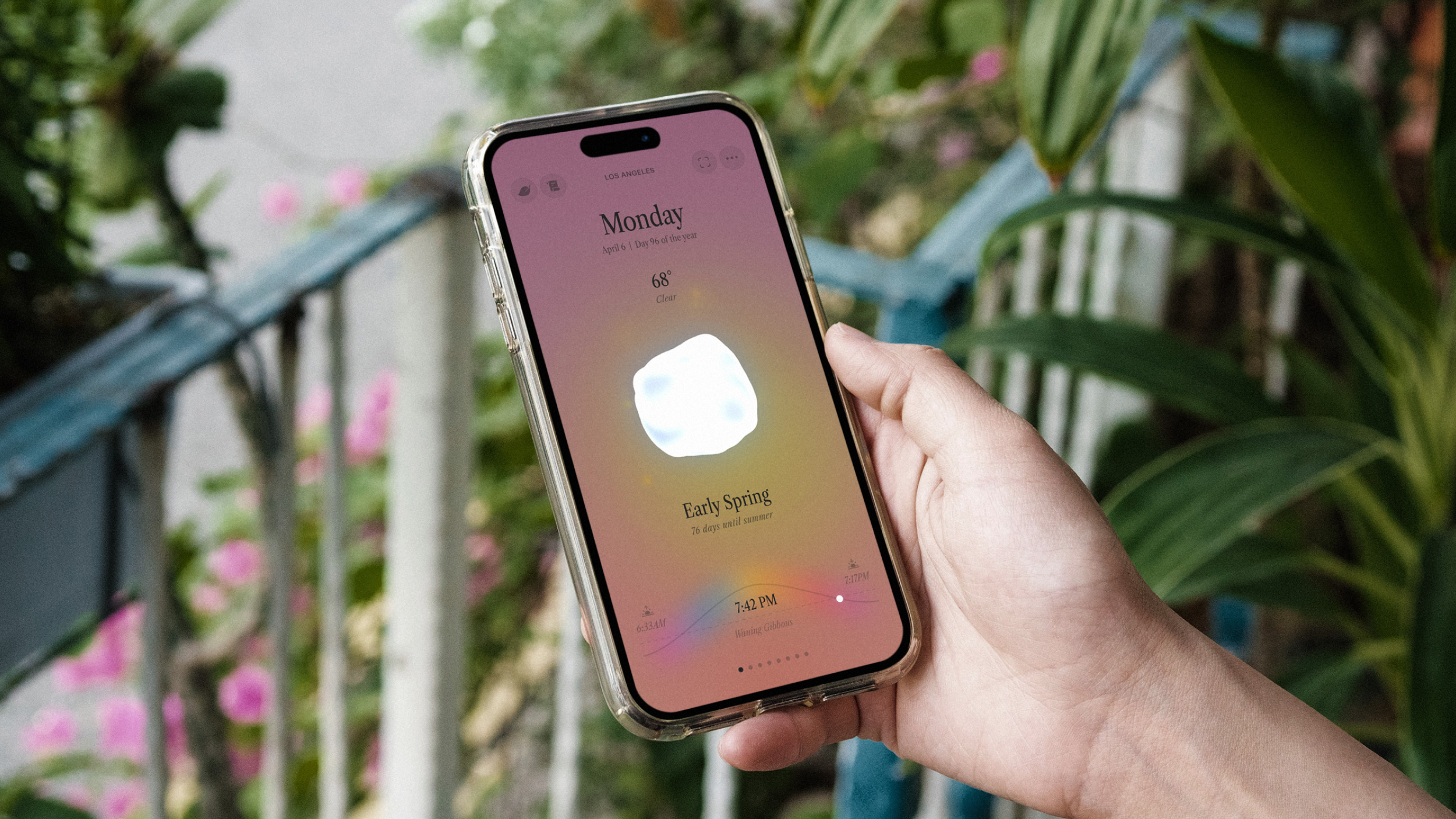
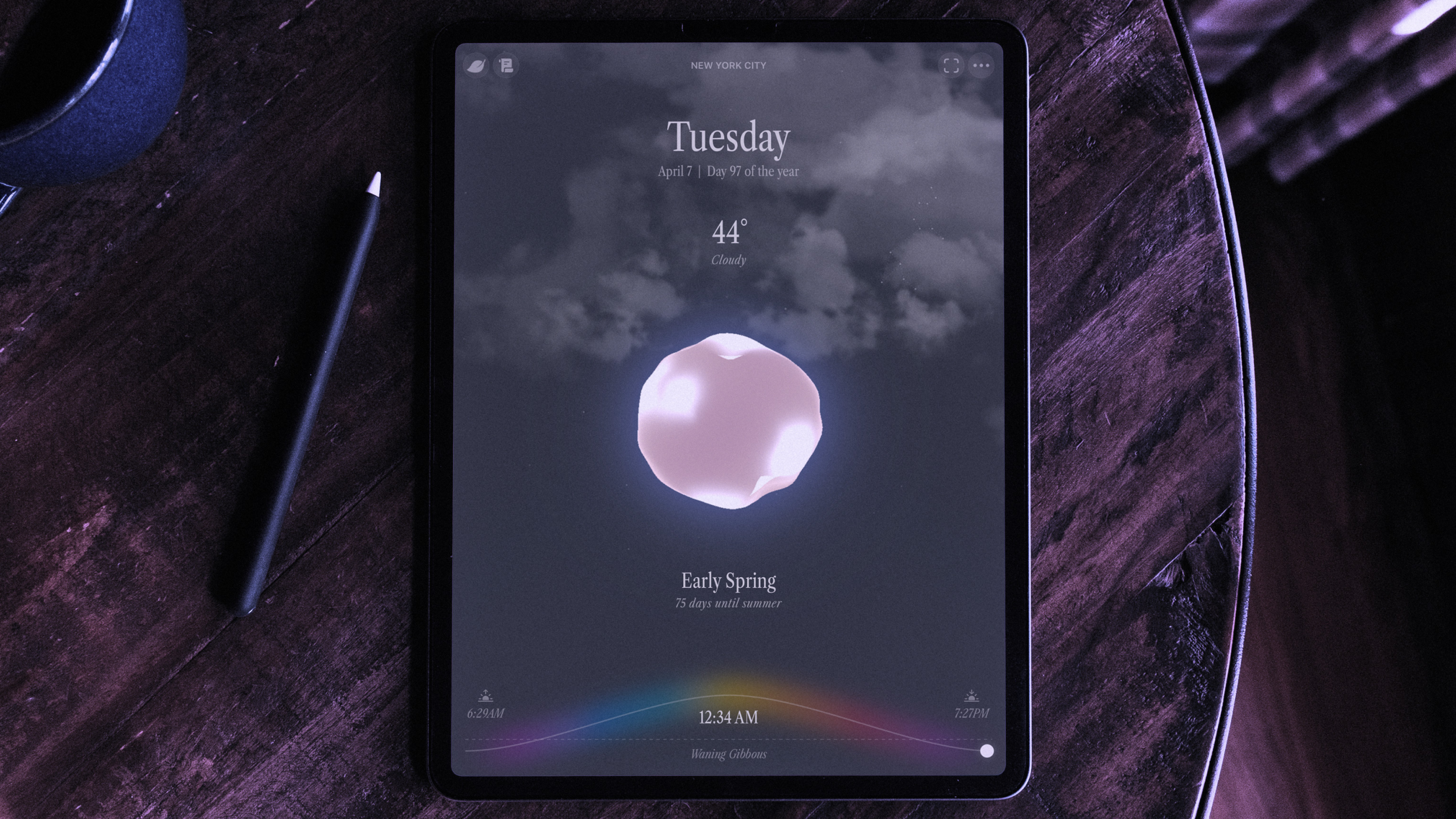
Ambient Almanac is a modern iOS app inspired by historic farmer’s almanacs. We conceptualized, designed, built, and launched the app in-house.
The Inspiration
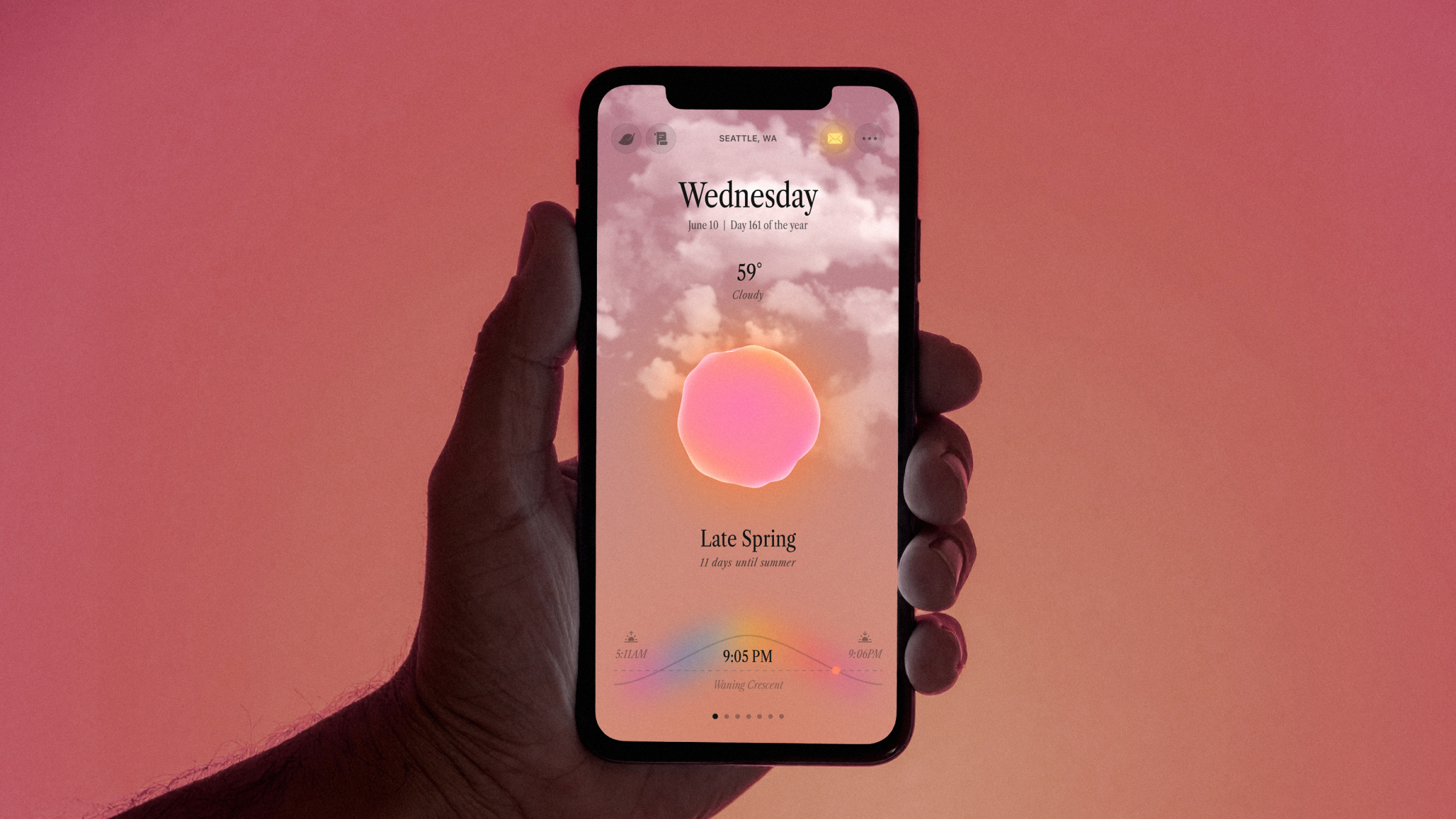
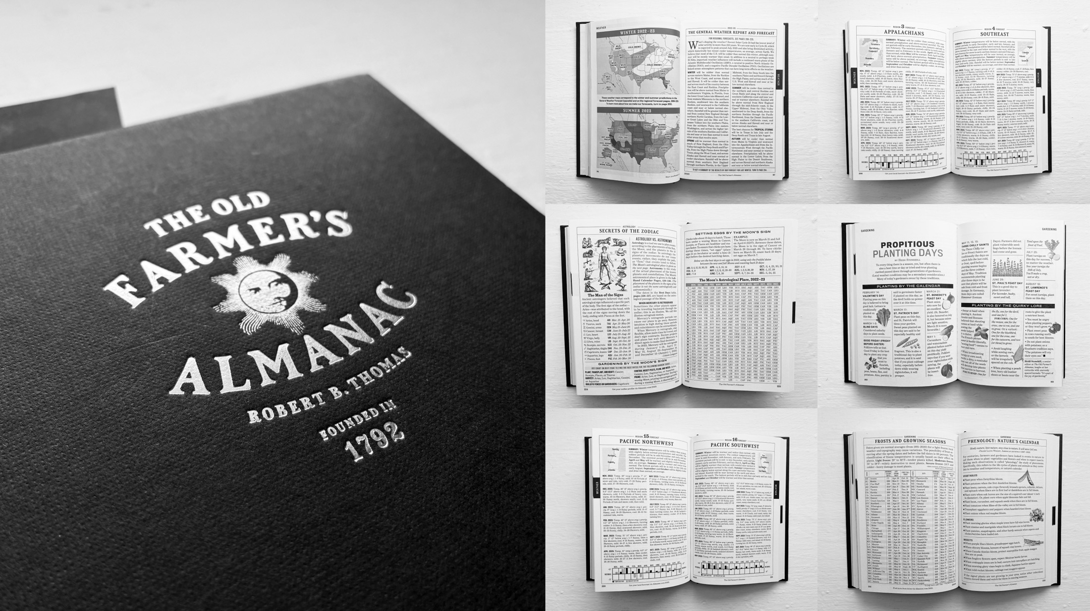
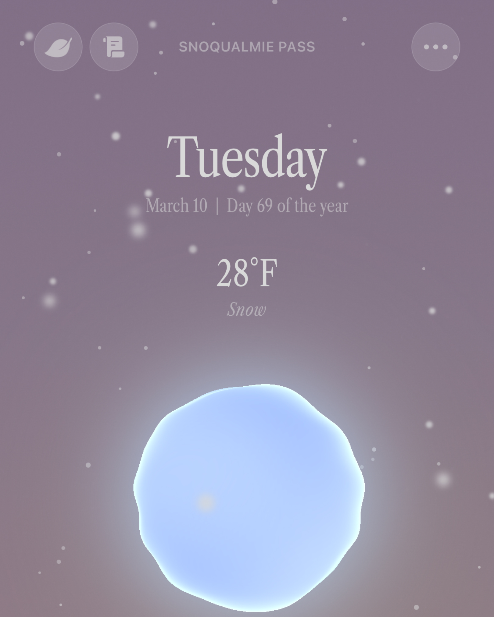
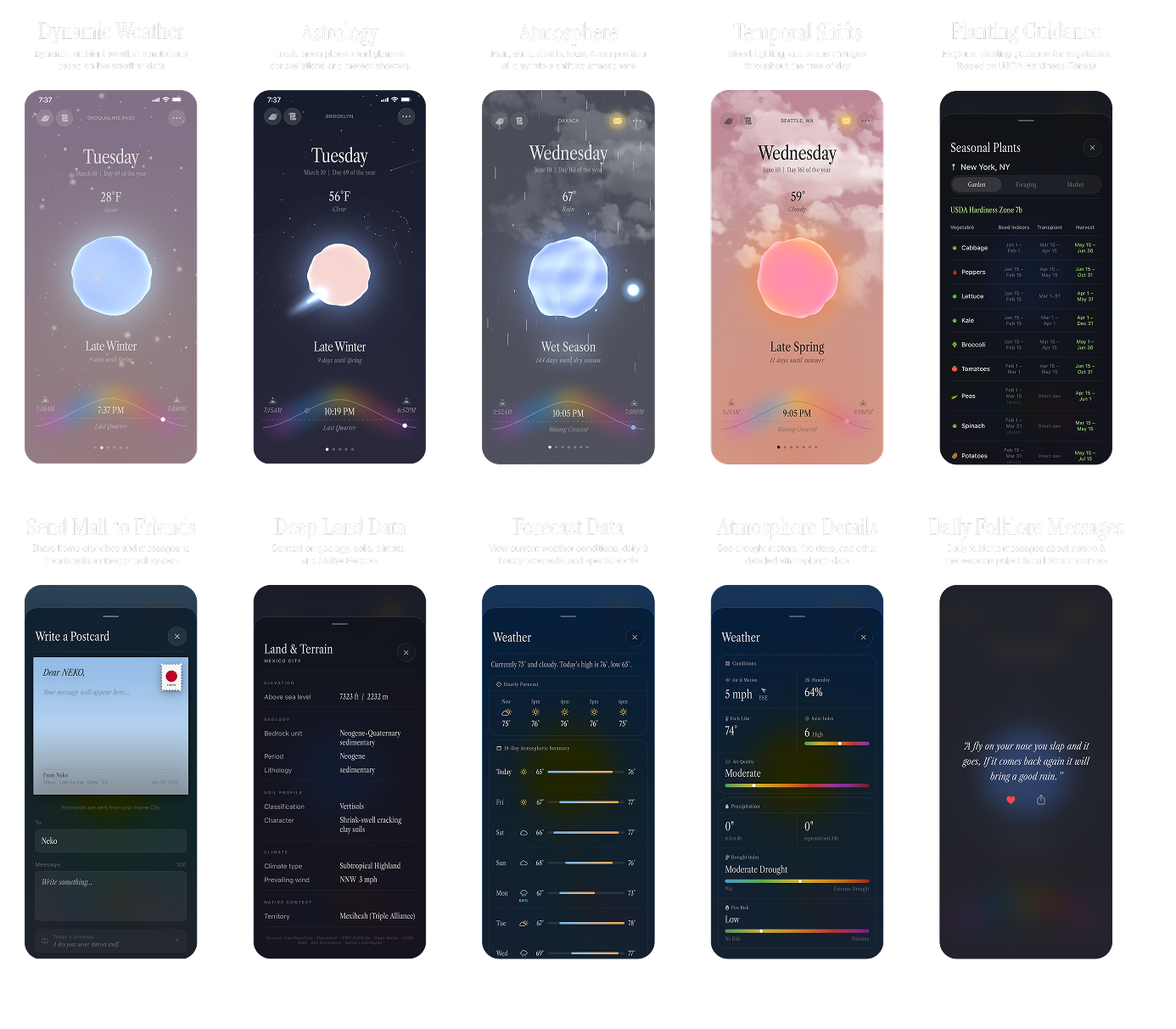
Ambient Almanac drew inspiration from traditional printed annual almanacs—but with modern weirdness, charm, and beauty. We wanted it to be as useful as an almanac, but more importantly we wanted it to be a magical visual object that encouraged reflection on time, place, and the present moment.
Inspirational material for Ambient Almanac
The Features
Through ambient moodscapes and gentle sounds—including real field recordings from nature—the app does its best to evoke the essence of a place. We wanted users of the app to be able to drop in on cities across the globe and immediately feel a connection.
A series of weather scenes (sound on!)
Sound on!
Promo and Marketing
A minimal but effective microsite was designed and built—including a suite of marketing materials.
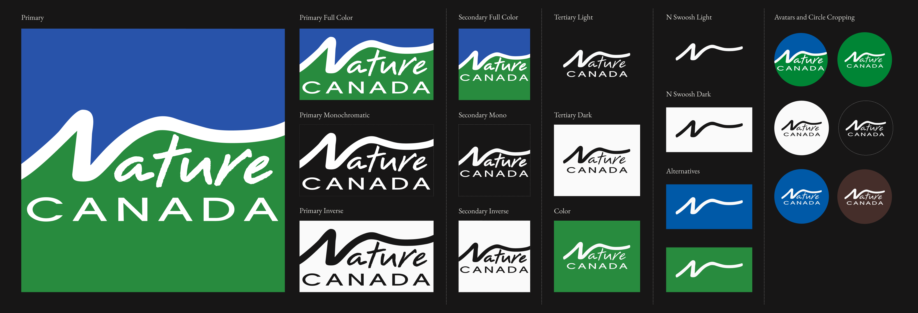
Nature Canada is an 87-year-old, member-based environmental organization whose supporters include more than 100,000 individuals and around 1,200 affiliated organizations. The organization’s mission is to “protect and conserve wildlife and habitats in Canada by engaging people and advocating on behalf of nature.”
We were trusted with leading a significant rebranding effort, to help modernize the organization’s public presence while paying homage to it’s editorial roots.
The Challenge
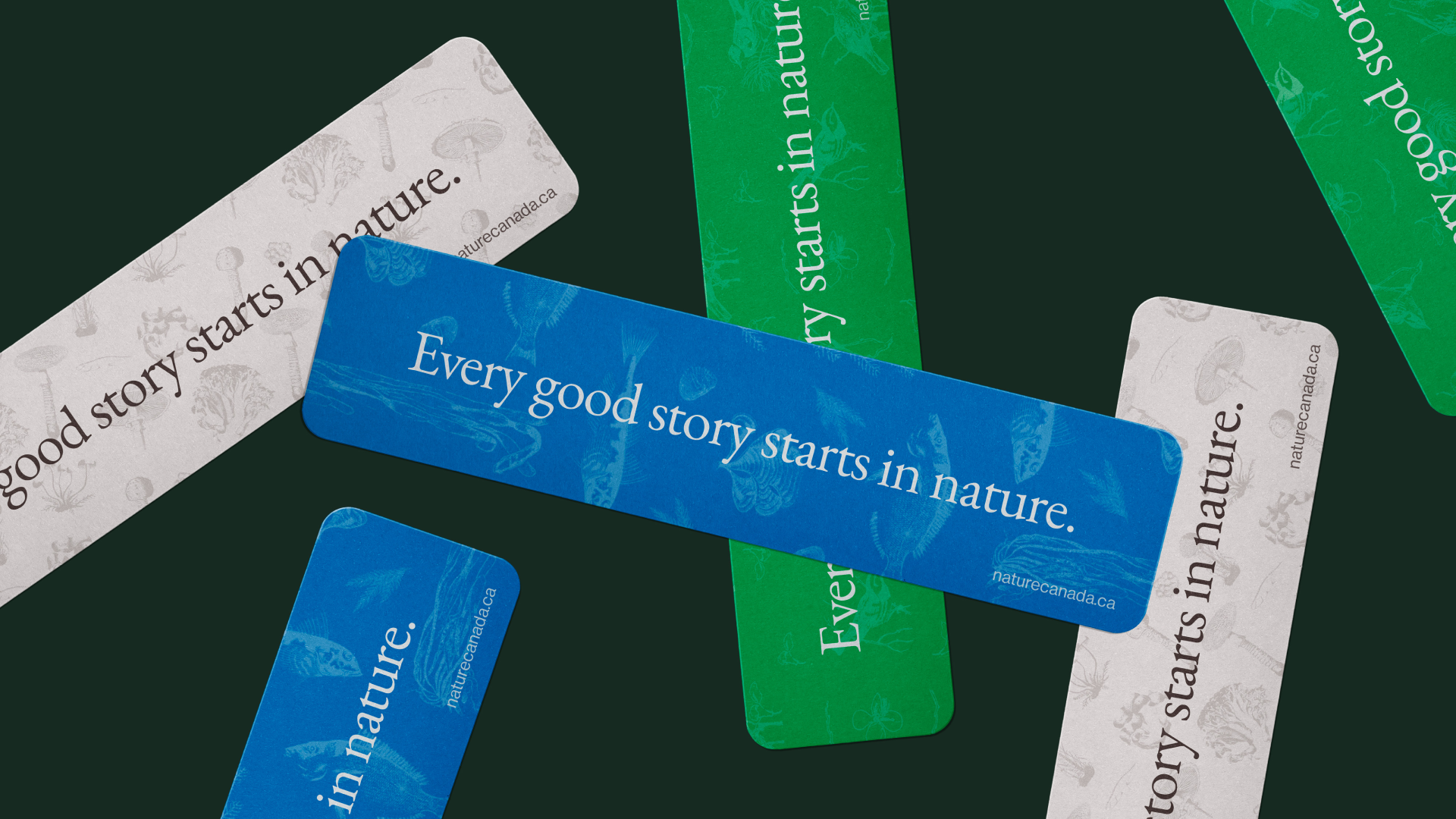
Elevate the organization’s visual identity by addressing an outdated color and typographic system. The brand already had a strong, recognizable logo so we started there and moved outward. A refined, flexible version of the logo was created for different modalities and updated to reflect accessible, modern colorways.
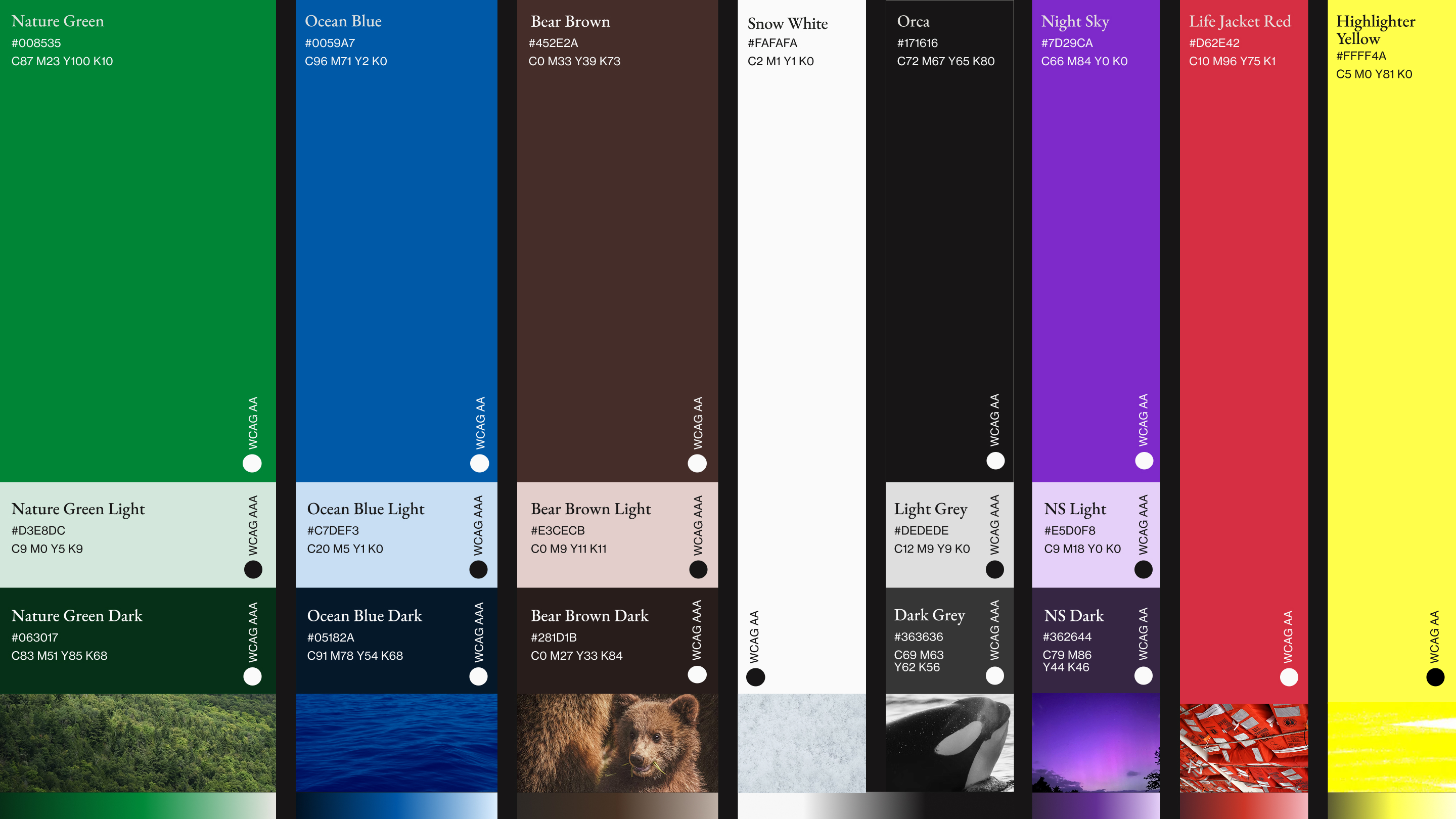
The Colors of Canadian Nature
Through arduous research into beautiful Canadian vistas and landscapes (someone had to do it) and conversations with stakeholders, we determined that a palette grounded in a couple core, recognizable, earthy brand colors was best complemented by bold accents that celebrated and bragged about the beauty of Canada’s natural world.
Typography with a Story
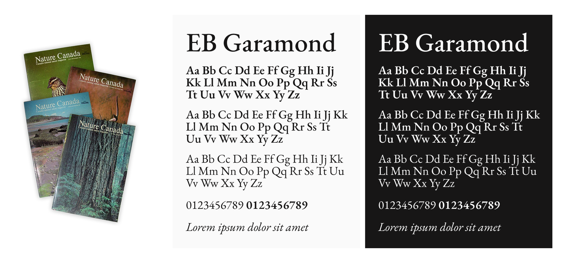
Nature Canada has been publishing, educating, and advocating for the natural world since the 1940s, and their typography needed to carry that weight while still feeling current.
After reviewing mastheads spanning decades of the organization’s history, the 1980s era emerged as the strongest typographic reference point, leading us to EB Garamond. A typeface that mirrors that editorial legacy while being a digitally remastered modern revival, with full French language support to reflect Canada’s bilingual identity.
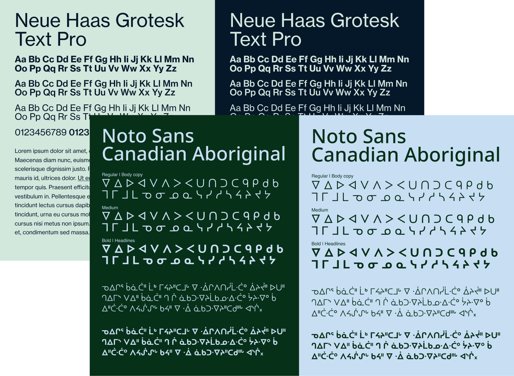
Neue Haas Grotesk was brought in as the workhorse for body copy, providing a clean, neutral counterbalance to Garamond’s editorial character, while Noto Sans Canadian Aboriginal was included to ensure the brand could authentically and respectfully represent Indigenous language and script across communications.
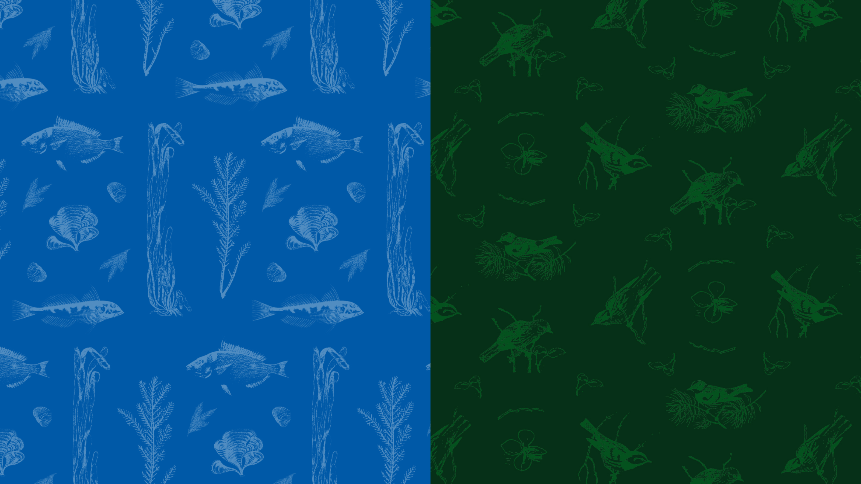
Old World Patterns, Modern Design
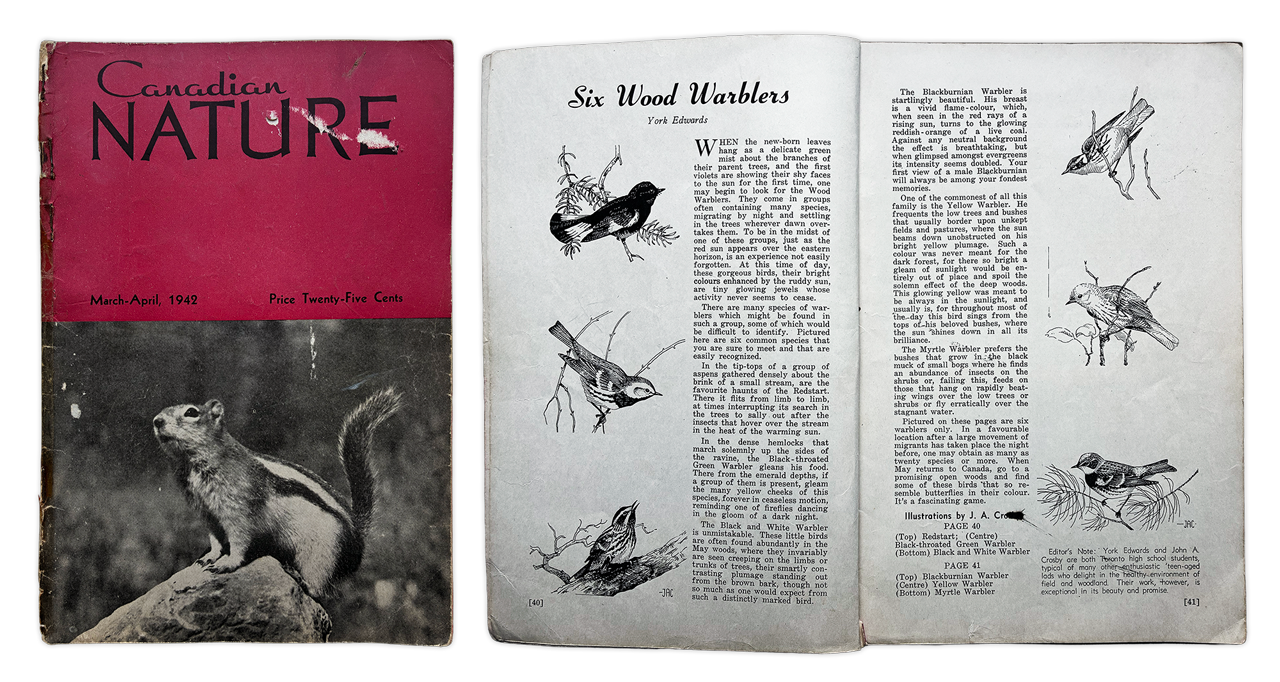
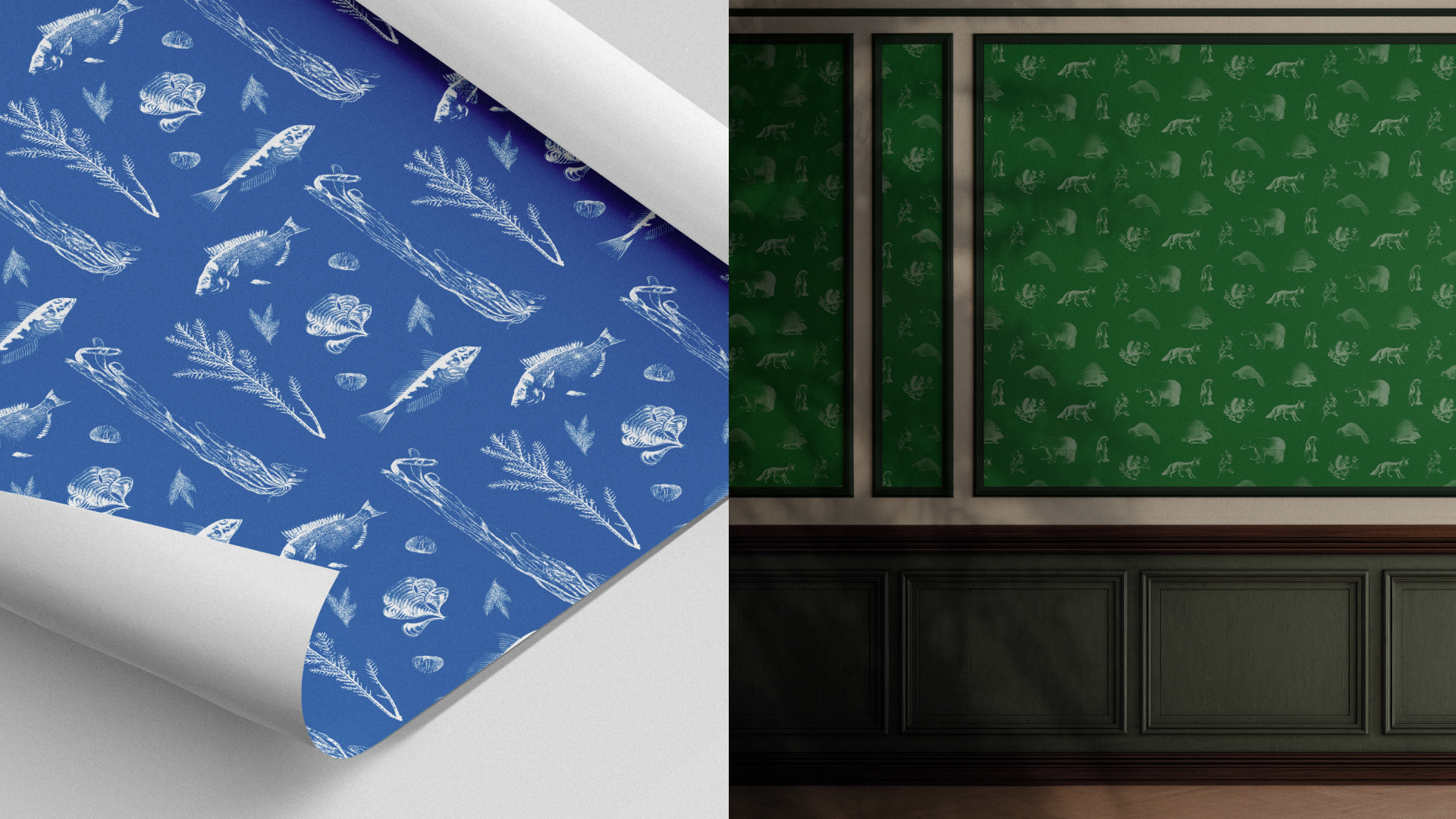
The pattern system draws directly from Nature Canada’s own archives, transforming scientific illustrations from their legacy publications into rich, wallpaper-inspired repeating patterns.
Canadian Nature, March-April 1942
Organized thematically around Canadian biodiversity, they work equally well as subtle background textures or bold standalone design elements, turning nearly a century of publishing into living visual identity.
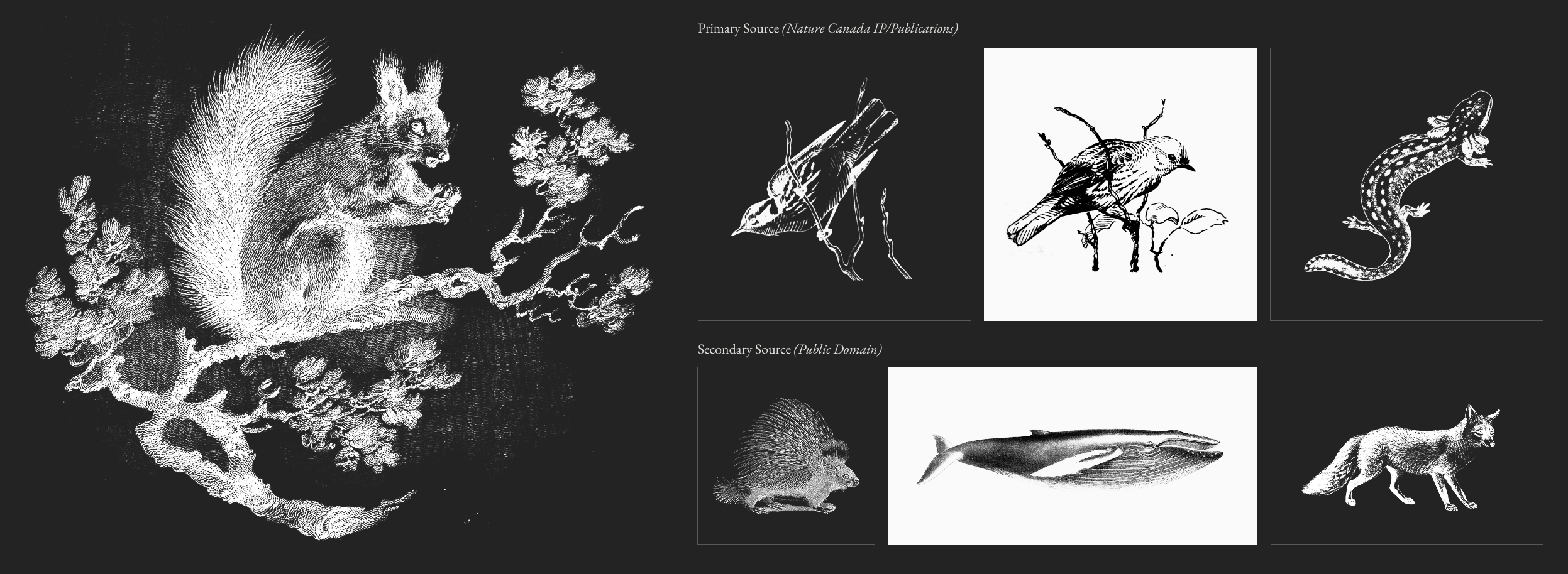
Illustrations from Another Era
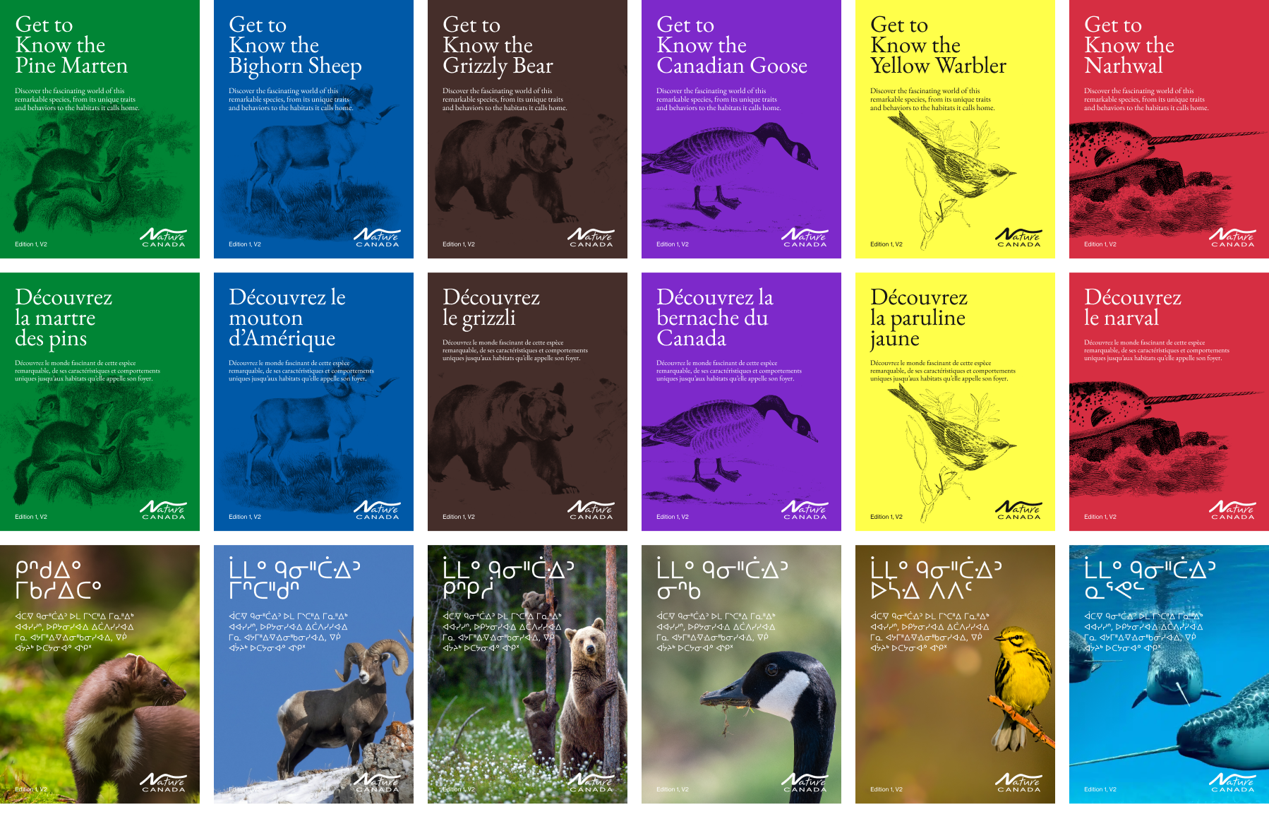
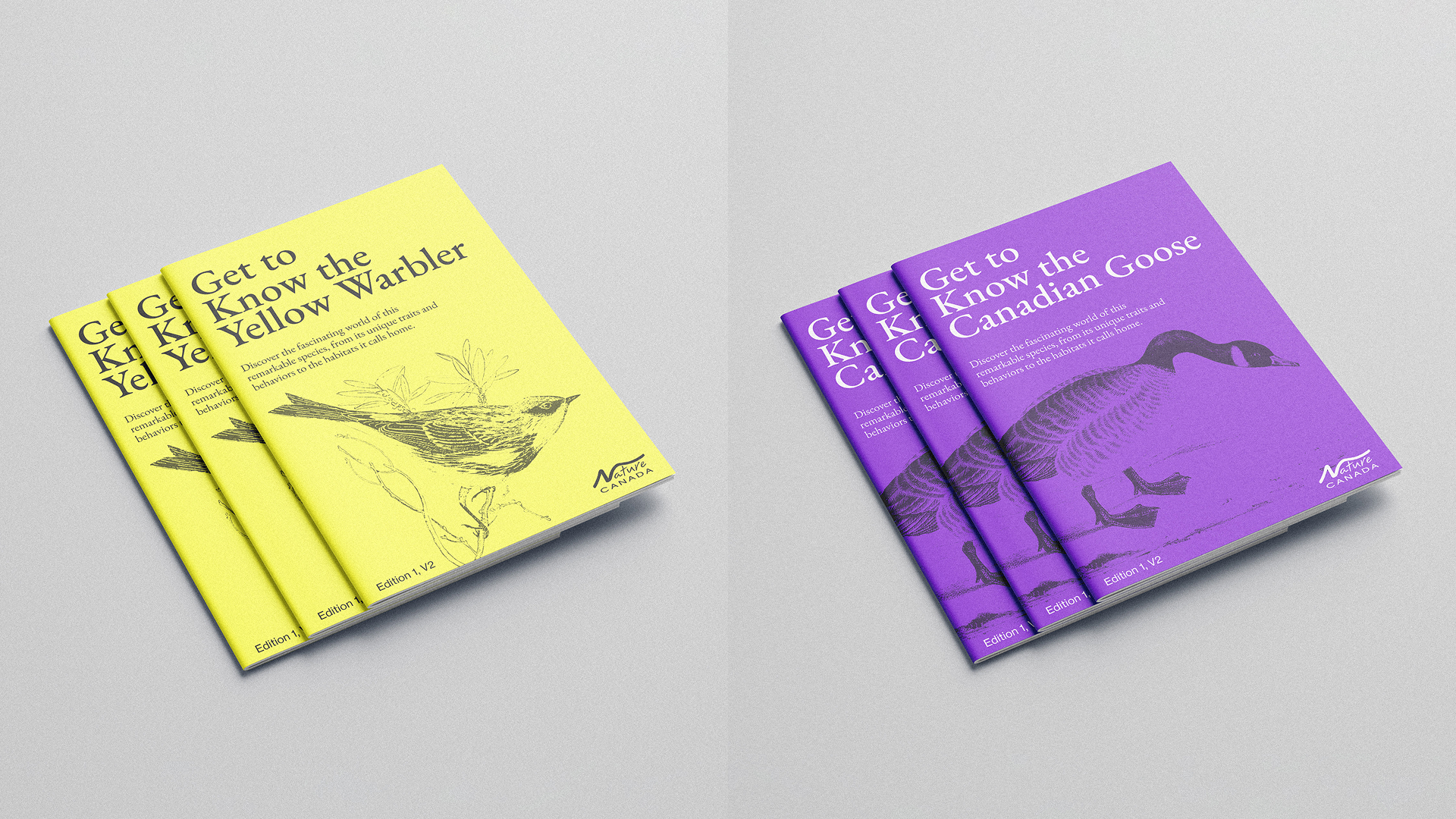
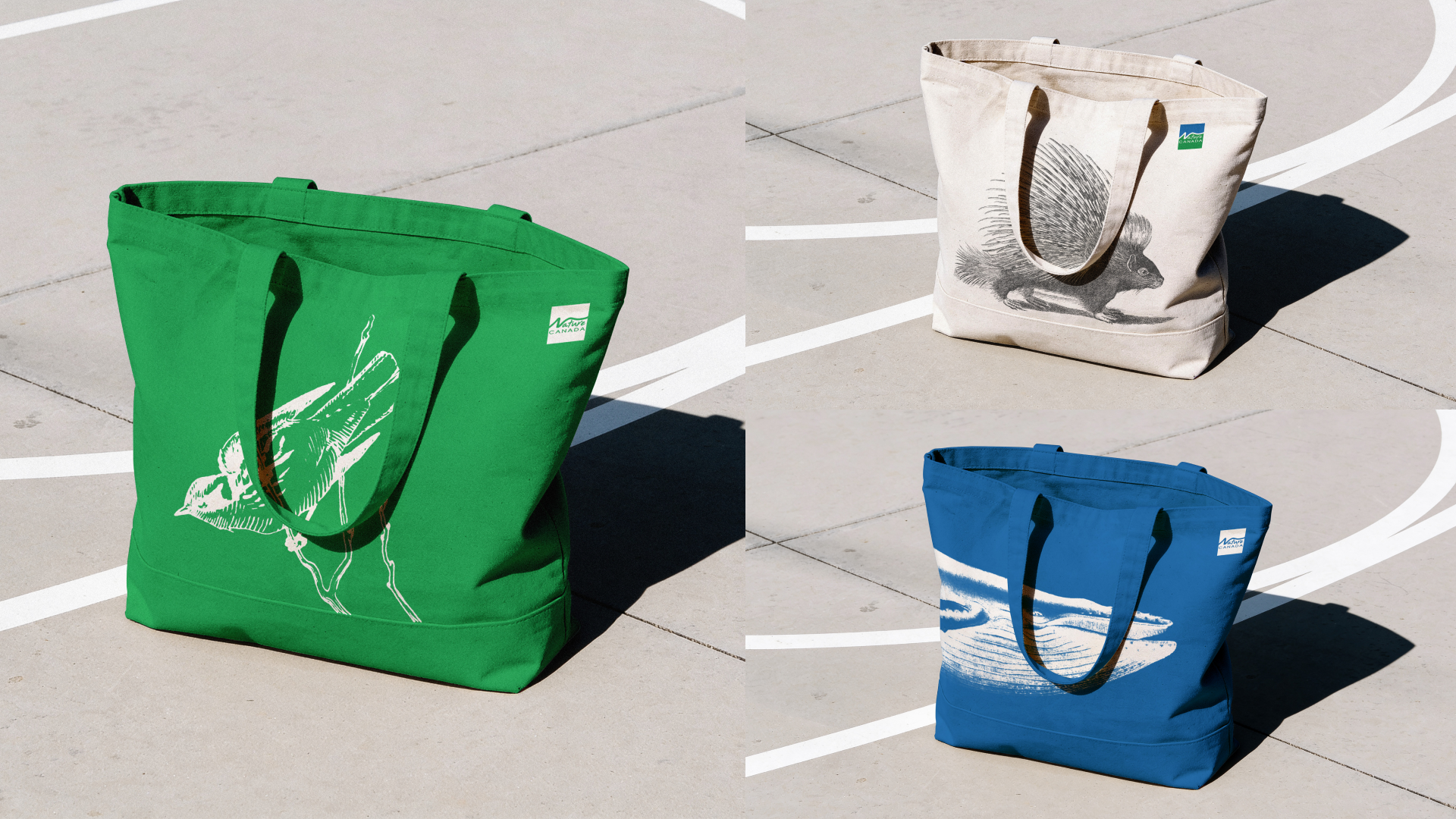
The illustration system follows the same philosophy as the patterns, rooted first in Nature Canada’s own archival publications and supplemented where needed by historic scientific drawings from public domain repositories like the Biodiversity Heritage Library. Used as standalone elements across social, web, and print, they bring a naturalist editorial character to the brand that reinforces what Nature Canada is at its core: an organization with nearly a century of knowledge and credibility behind it.
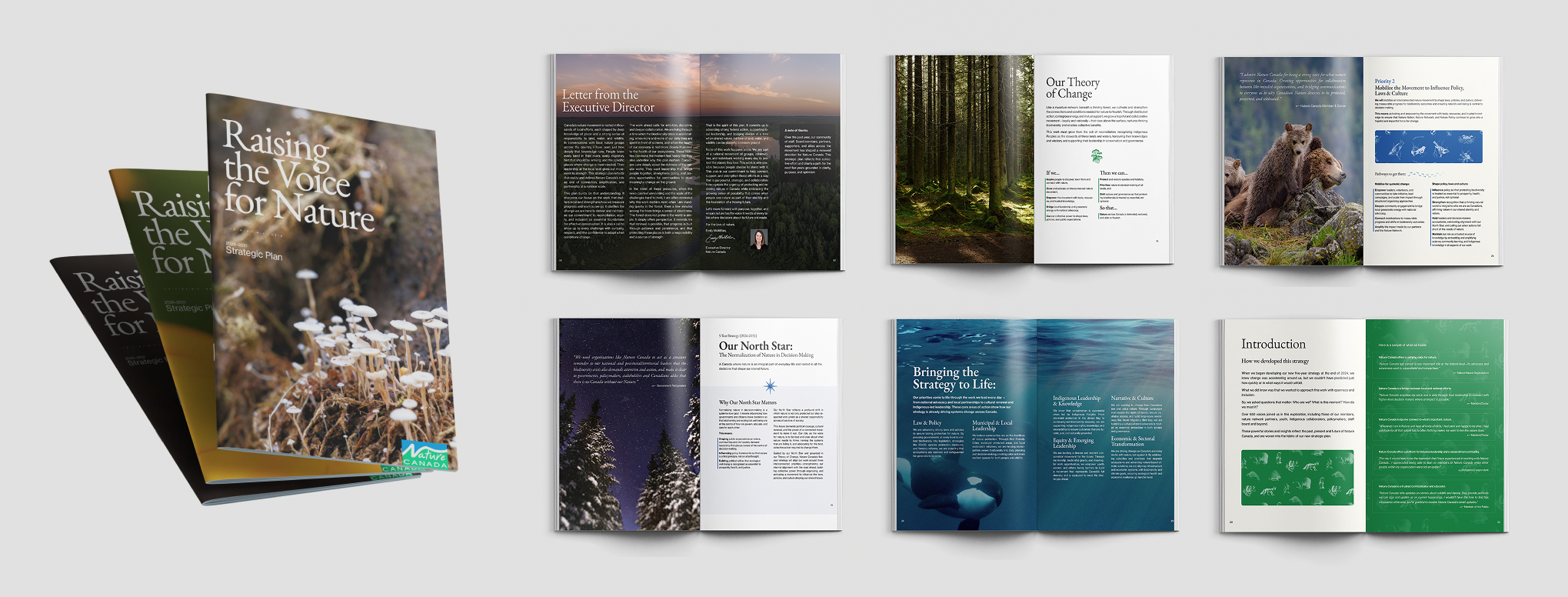
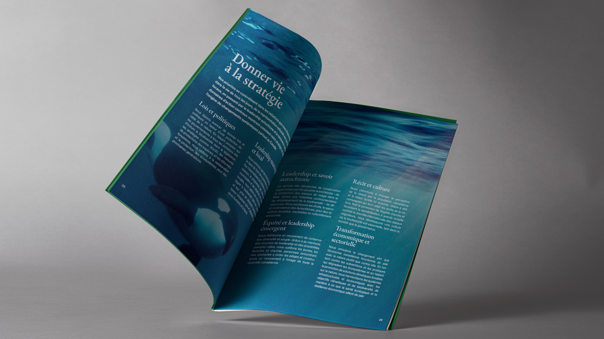
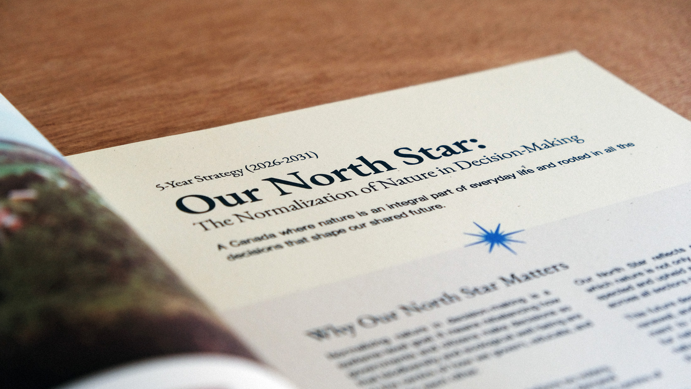
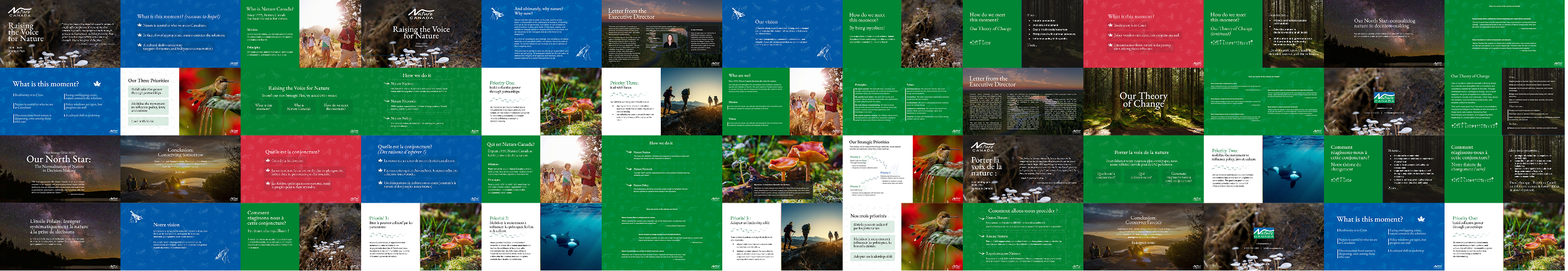
Strategic Plan & Editorial Direction
Beyond the brand system itself, we designed Nature Canada’s 2026-2031 Strategic Plan as a fully realized editorial publication—a printed booklet built for donors, board members, and supporters that lays out the organization’s vision and priorities for the next five years.
This wasn’t a templated report; it was designed from the ground up, with the full brand system doing real work across every spread: the archival patterns as textural backgrounds, the illustration system woven throughout, typography setting the tone between gravitas and warmth, and photography anchoring the emotional weight of the mission.
The result is a piece that feels as considered as the strategy it contains. It was also adapted into a presentation deck, and establishes a strong foundation for Nature Canada’s future print work, proving the brand can carry itself confidently across long-form editorial formats.
Web Guidance
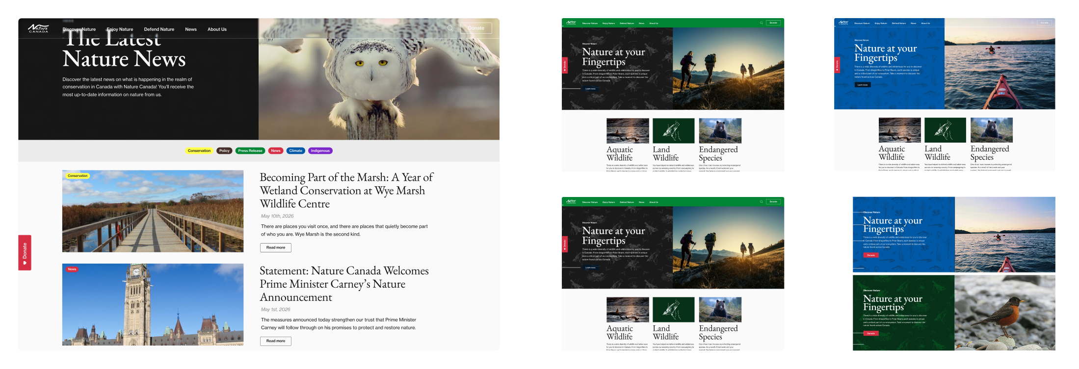
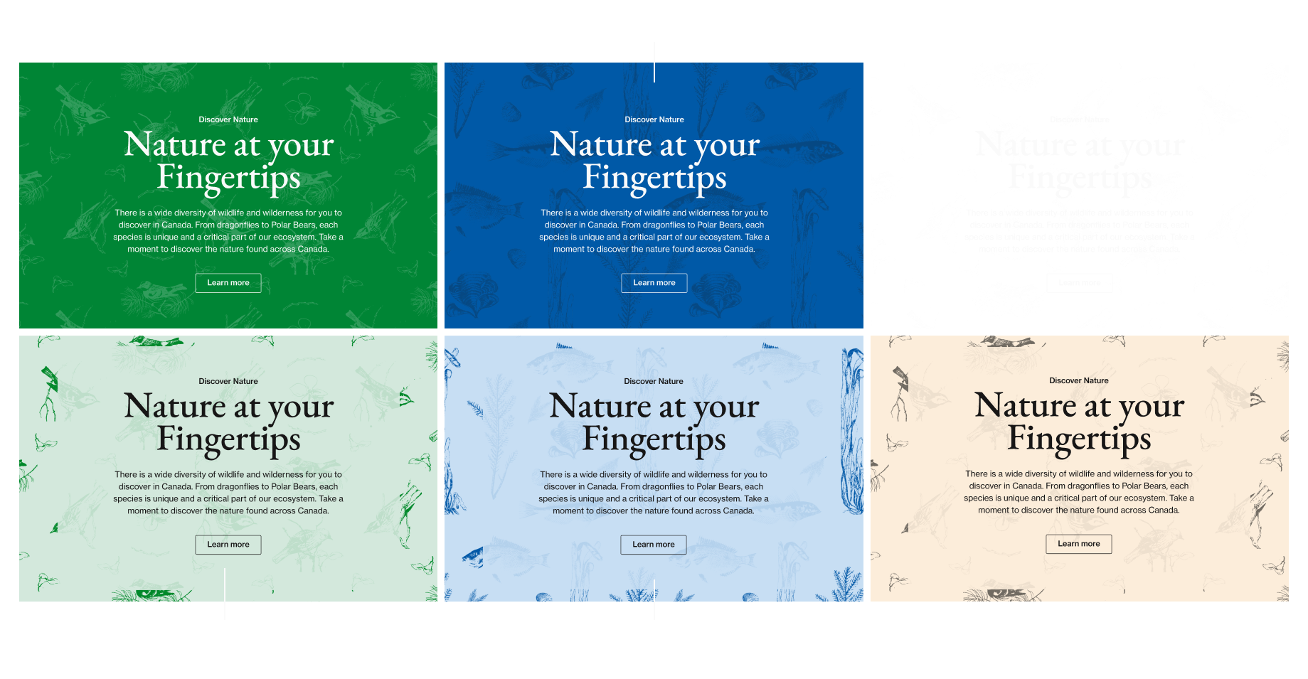
The brand system also included web guidance to carry the new identity into Nature Canada’s existing digital presence ahead of a full redesign in 2026. Rather than a full overhaul, this work showed how updated colors, typography, spacing, and content hierarchy should apply across key site elements, giving Nature Canada and their incoming web team a clear foundation for consistent online expression in the interim.
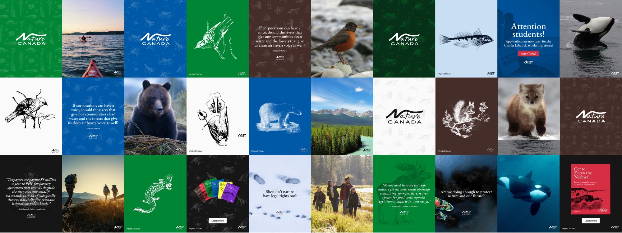
Social Animals 🦊 🐻 🐸
Social media templates were developed to show the brand system in action across a range of content types: photography, illustration, advocacy messaging, quotes, and announcements. These demonstrate how the color palette, patterns, and illustration system flex across formats while maintaining a cohesive and recognizable presence at the scroll.
Deck Support
Presentation and data visualization templates extend the brand into Nature Canada’s reporting and advocacy work, covering bold stat slides, charts, and dashboards in both light and dark colorways, with the expanded accent palette doing the heavy lifting across all of it.
Additional Applications
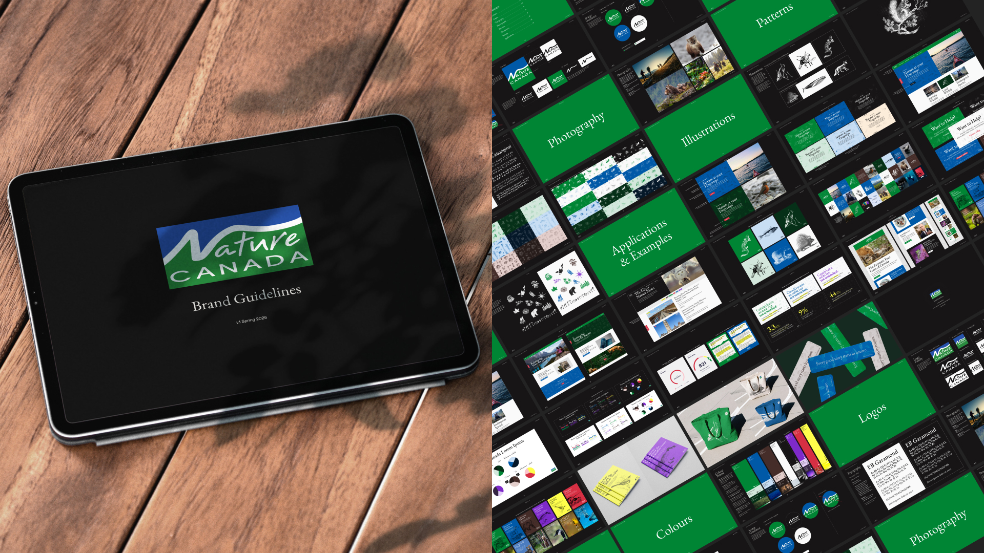
A full brand book was developed and guidance was extended to physical applications to inspire the caretakers with a vision for how the identity can live in the real world and continue growing beyond the screen.
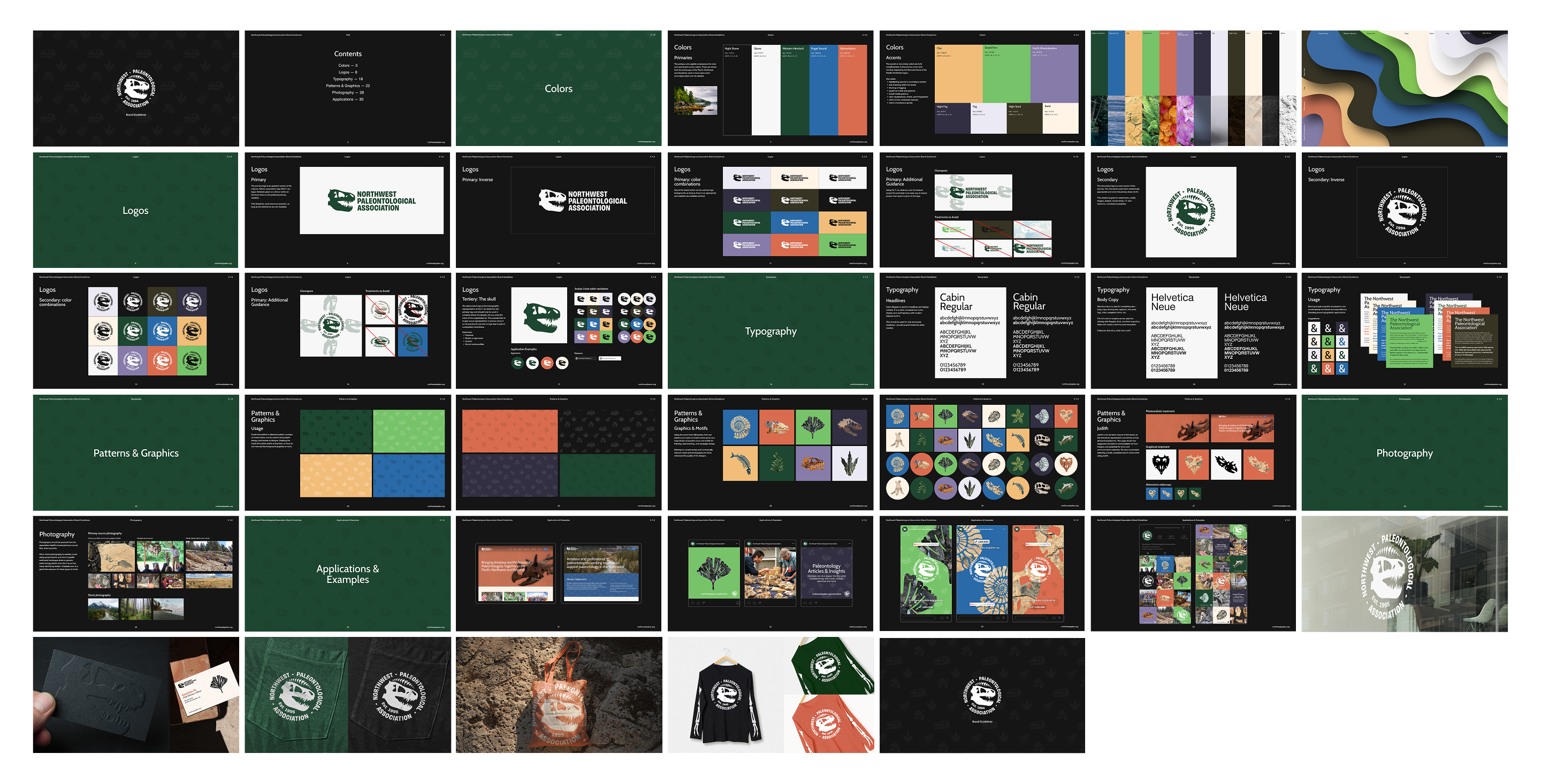
Founded in the mid-1990s and associated with the Burke Museum, the Northwest Paleontological Association (NPA) brings together amateur and professional paleontologists across the Pacific Northwest to advance the science and appreciation of paleontology.
We were approached to design a new website for the organization, which evolved into a broader engagement addressing larger identity needs.
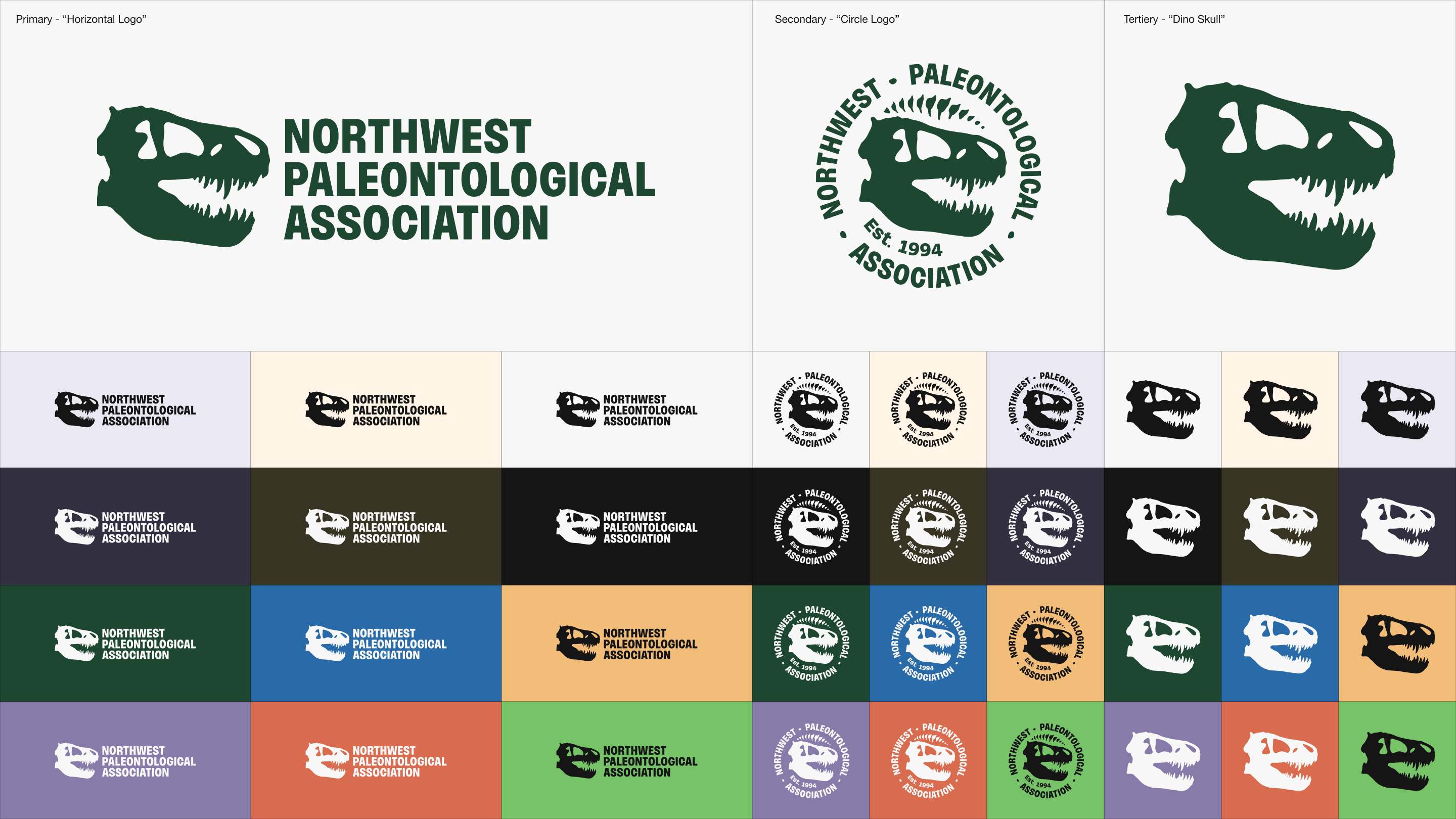
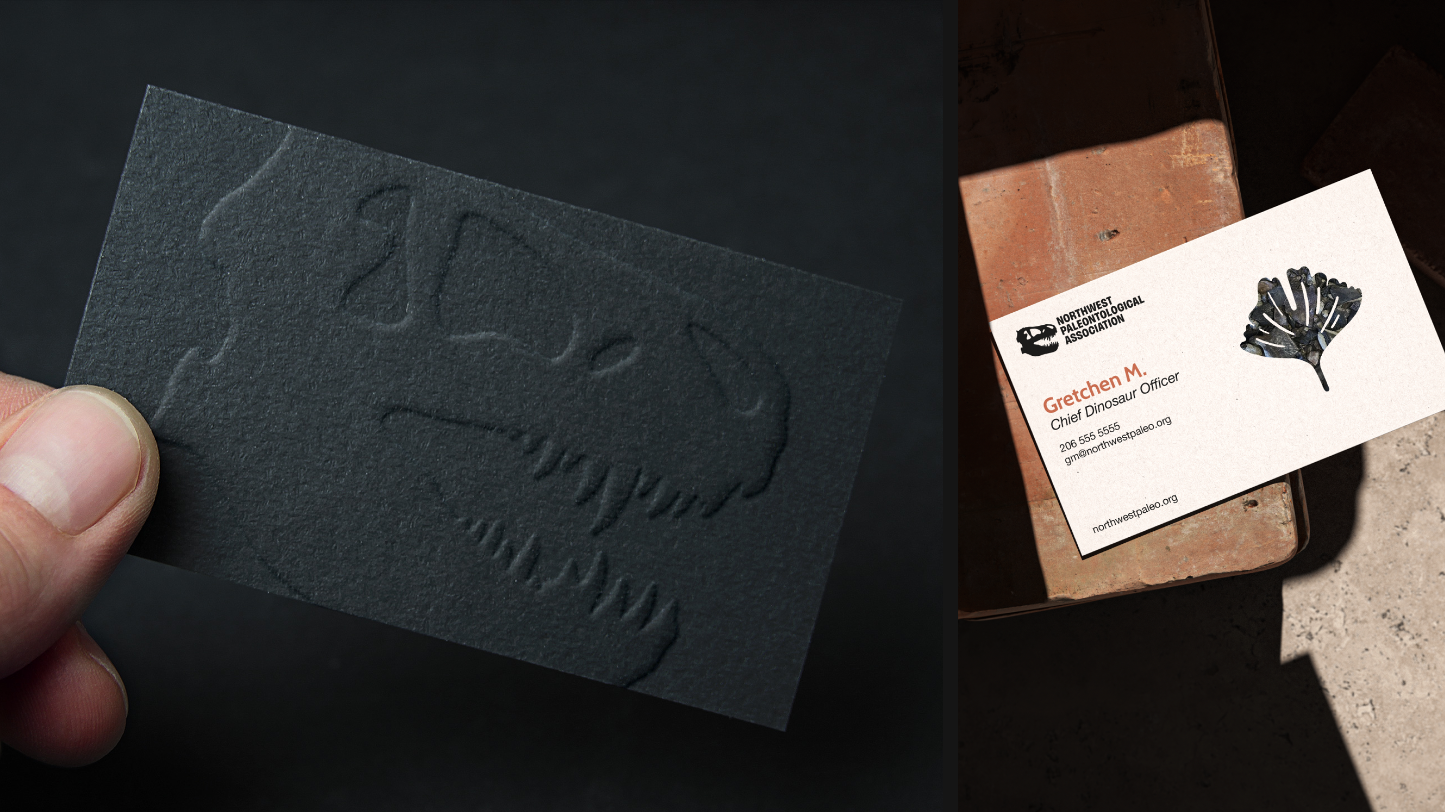
Logo Excavation & Reconstruction
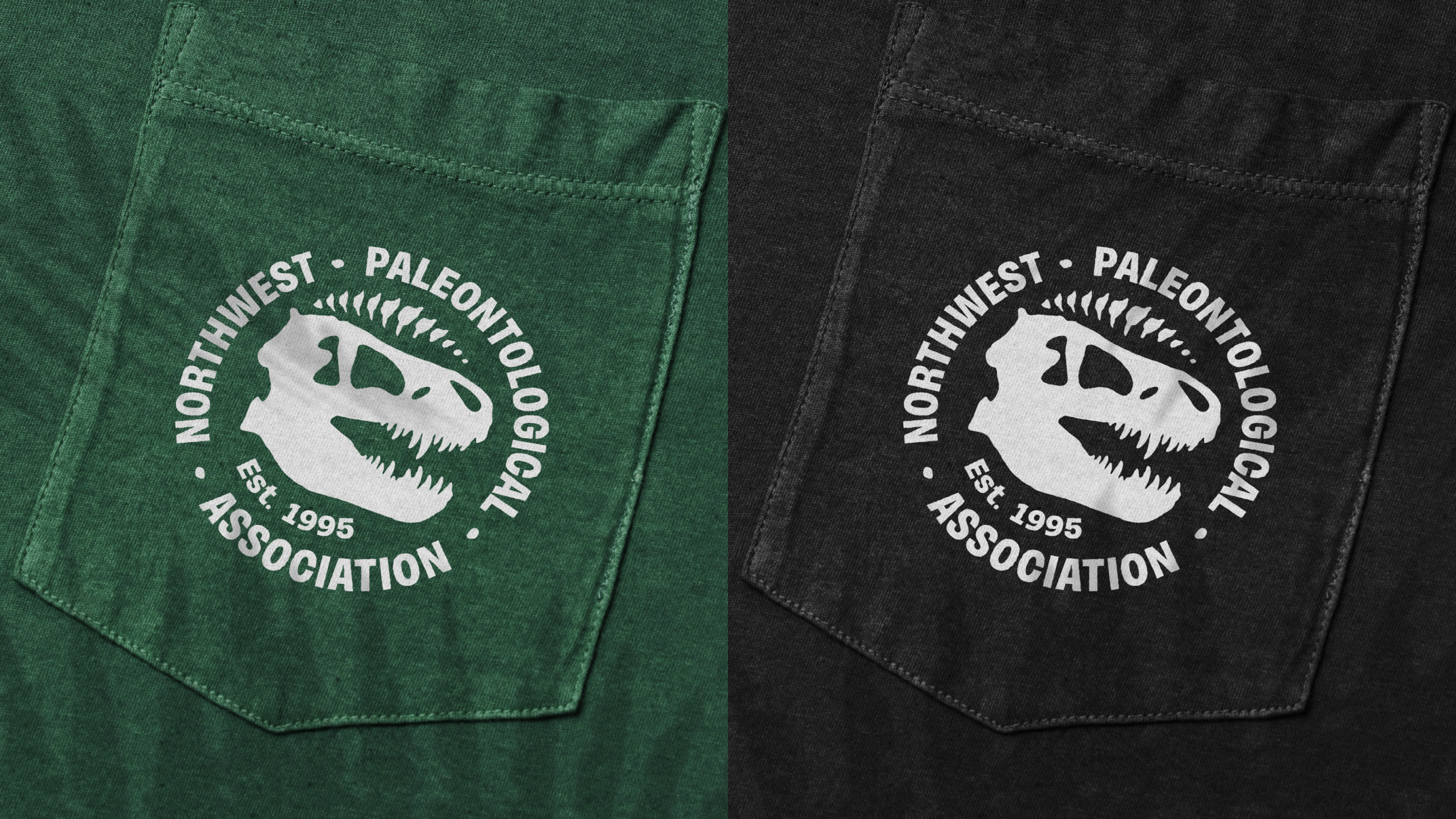
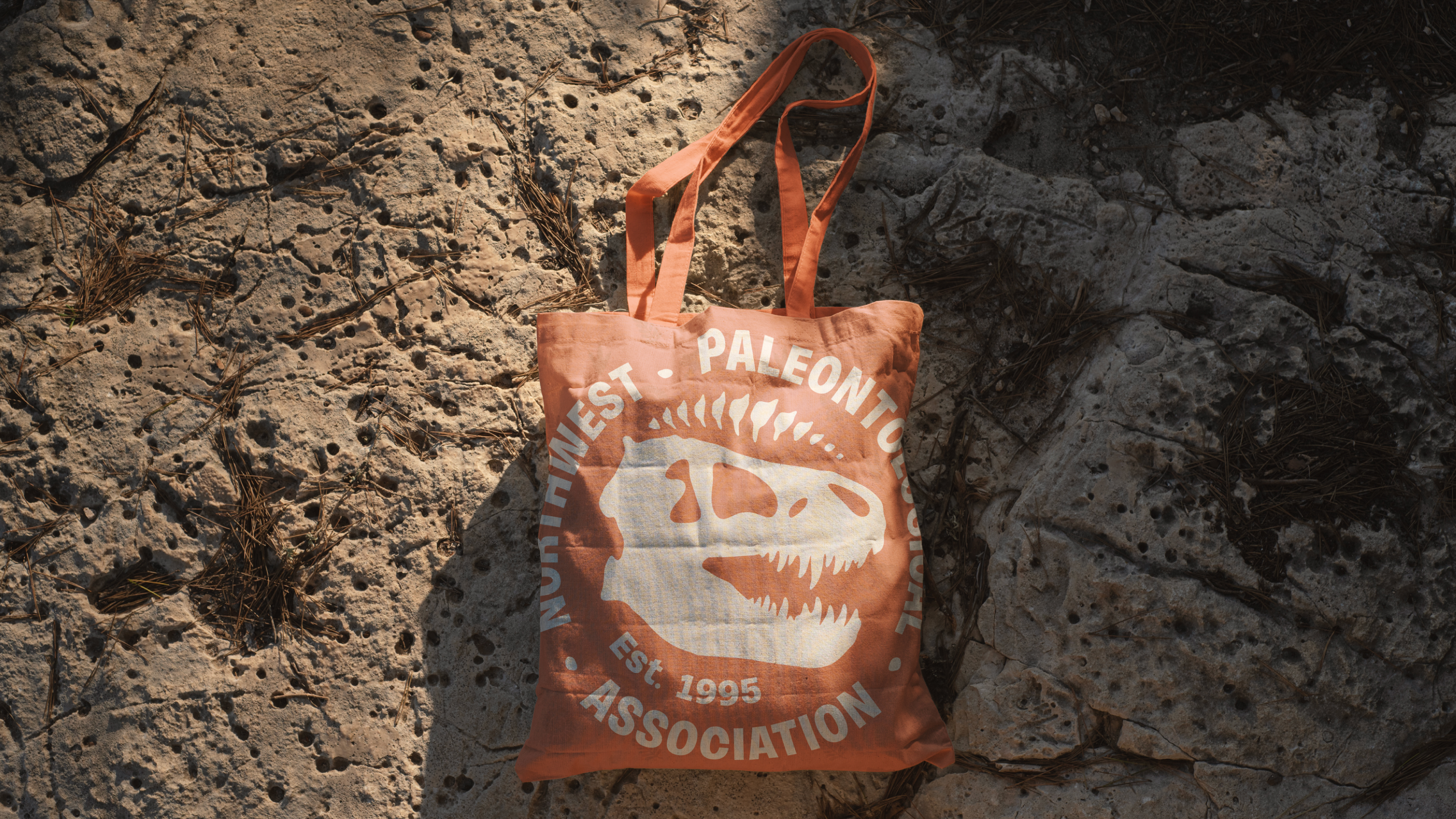
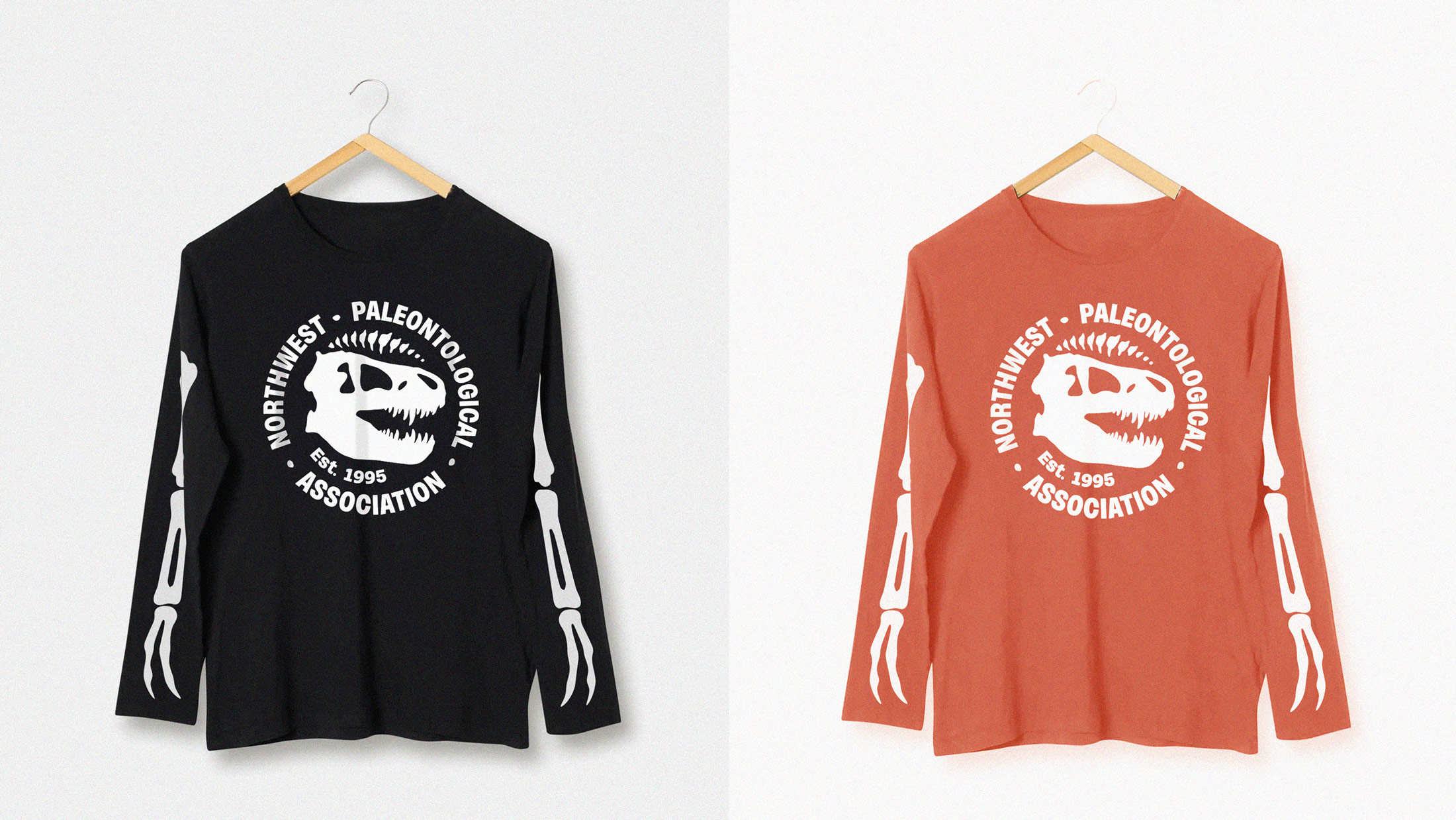
NPA already had a familiar, well-worn logo. It just needed a little typographic help and mark refinement. We took the existing logo, completely redrew the T-rex silhouette, and chose a modern, well-kerned sans-serif wordmark to stomp the whole thing into place.
(sound on!)
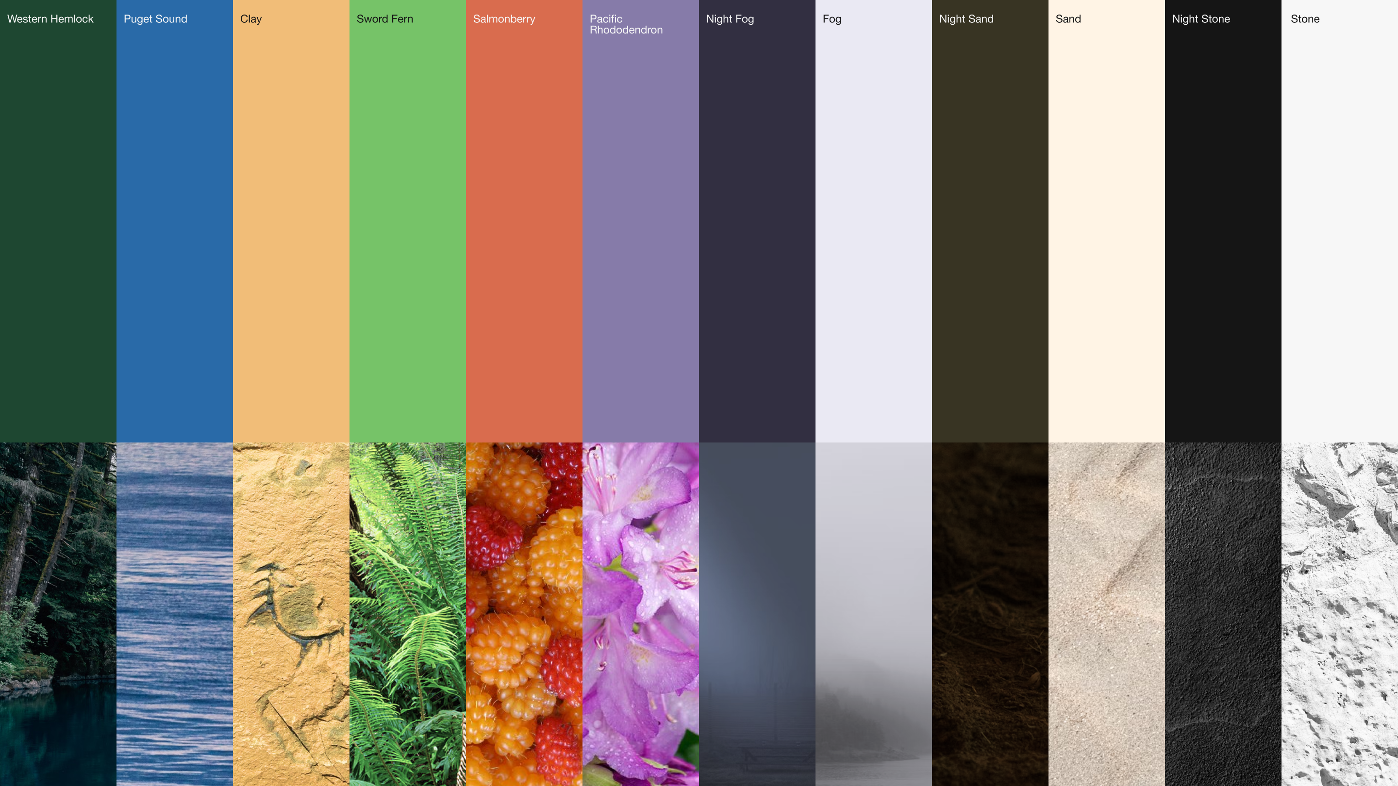
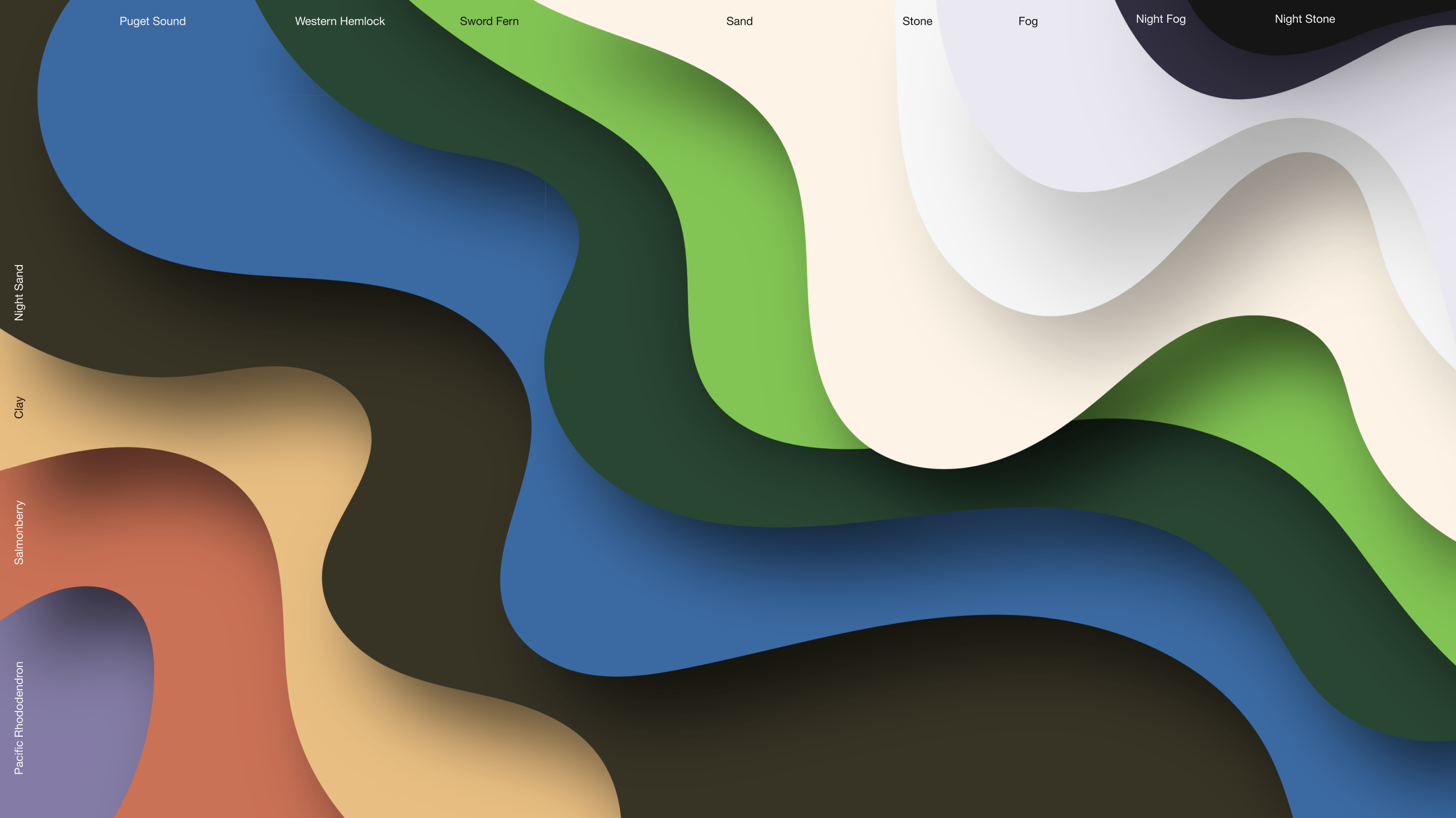
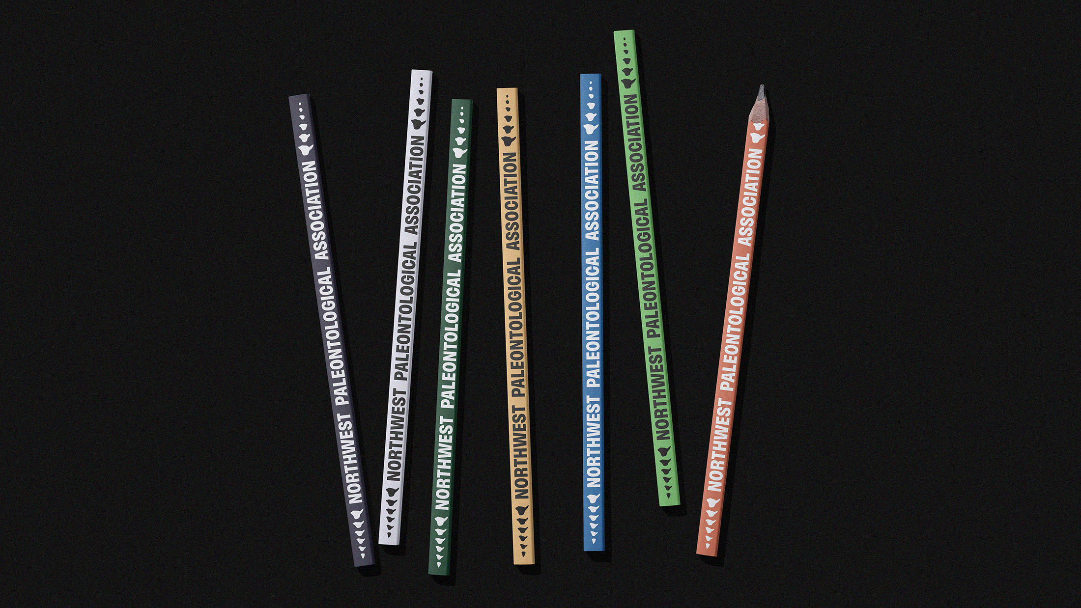
The Colors of the Pacific Northwest
Everyone involved in this project wanted to work with the natural colors of the Pacific Northwest: Puget Sound’s deep, moody blues; the saturated orange of wild salmonberry; the eerie, looming greens of western hemlock; the vivid brightness of prehistoric sword fern; and the atmospheric glow of fog, stone, and sand.
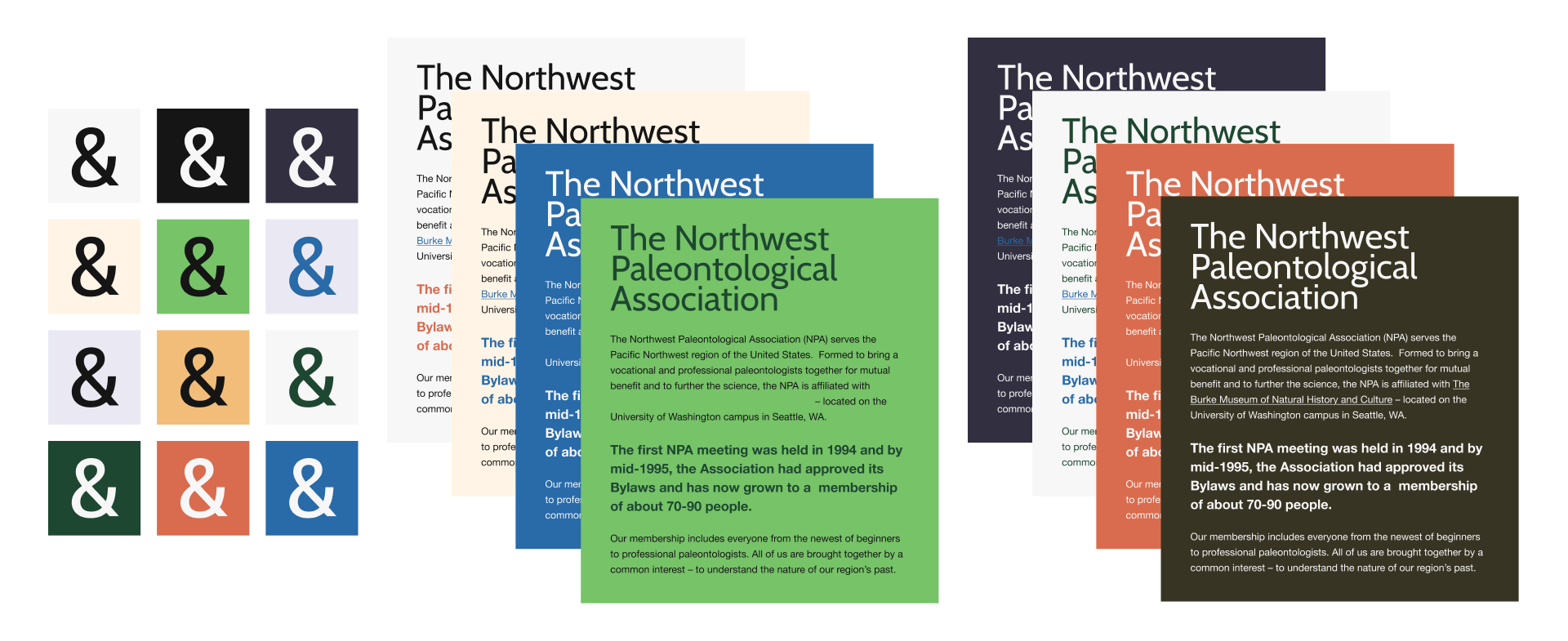
A Design System with Good Bones 🦖
We chose the humanist sans-serif typeface, Cabin, for headlines and titles. The optically-adjusted font stands tall and demands attention and respect while still having a little organic, woodsy personality.
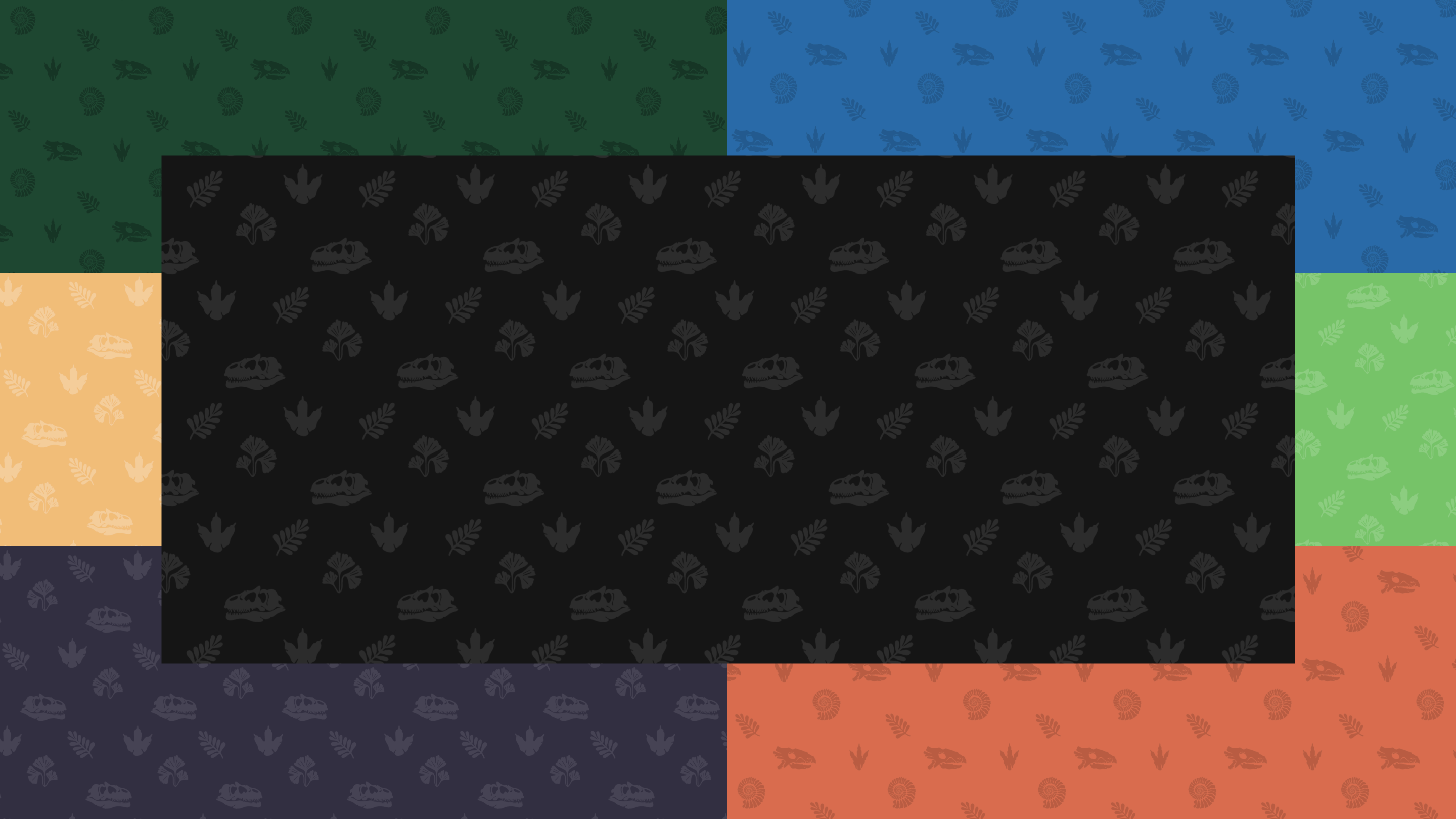
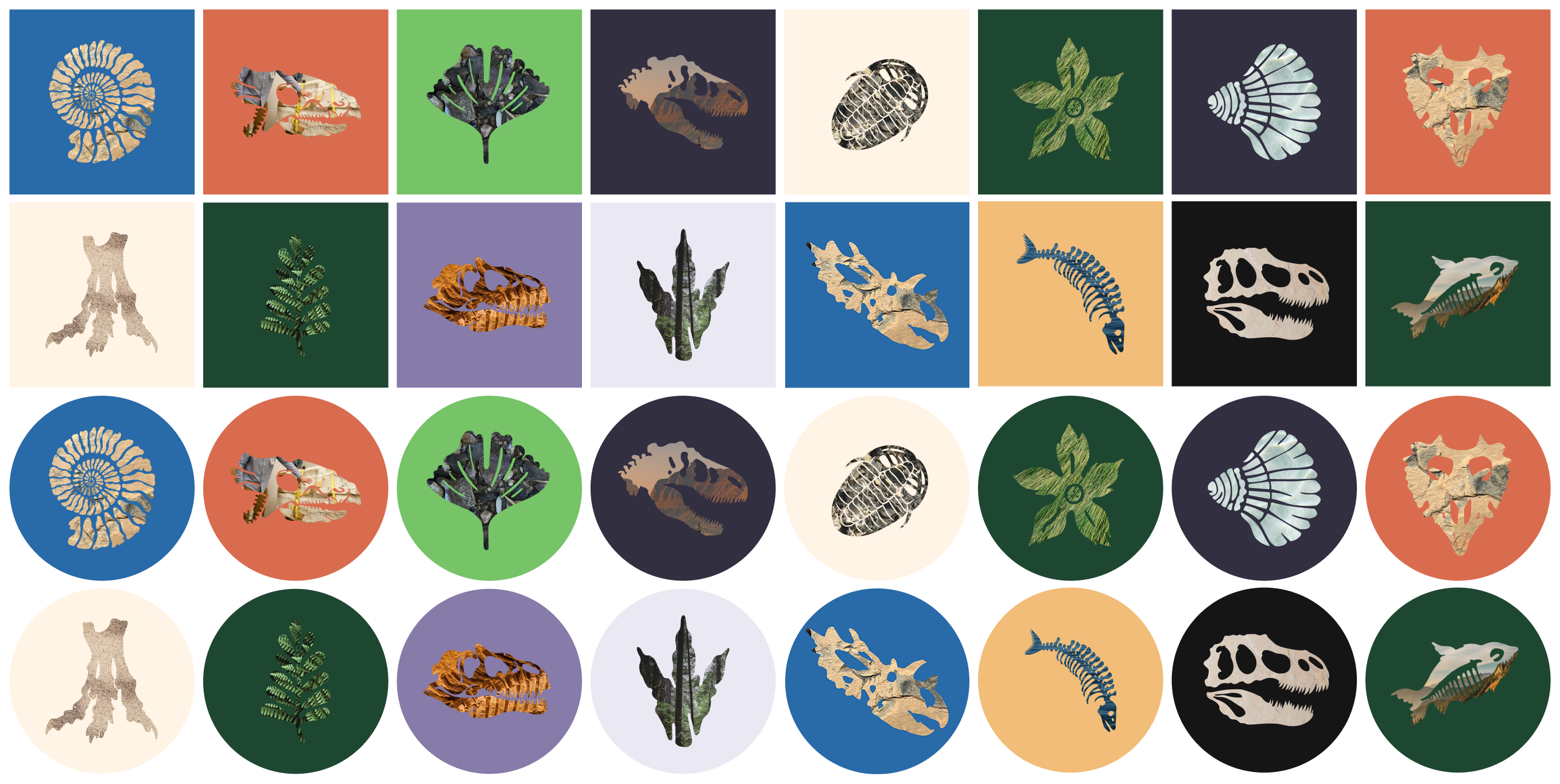
To fill out the design system with texture, depth, and versatility, we created pattern libraries using fossil silhouettes—including the organization’s own prized specimen, Judith (Spiclypeus shipporum)—along with simple, bold masking techniques.
From Fossil Bed to LED Screen 🦕
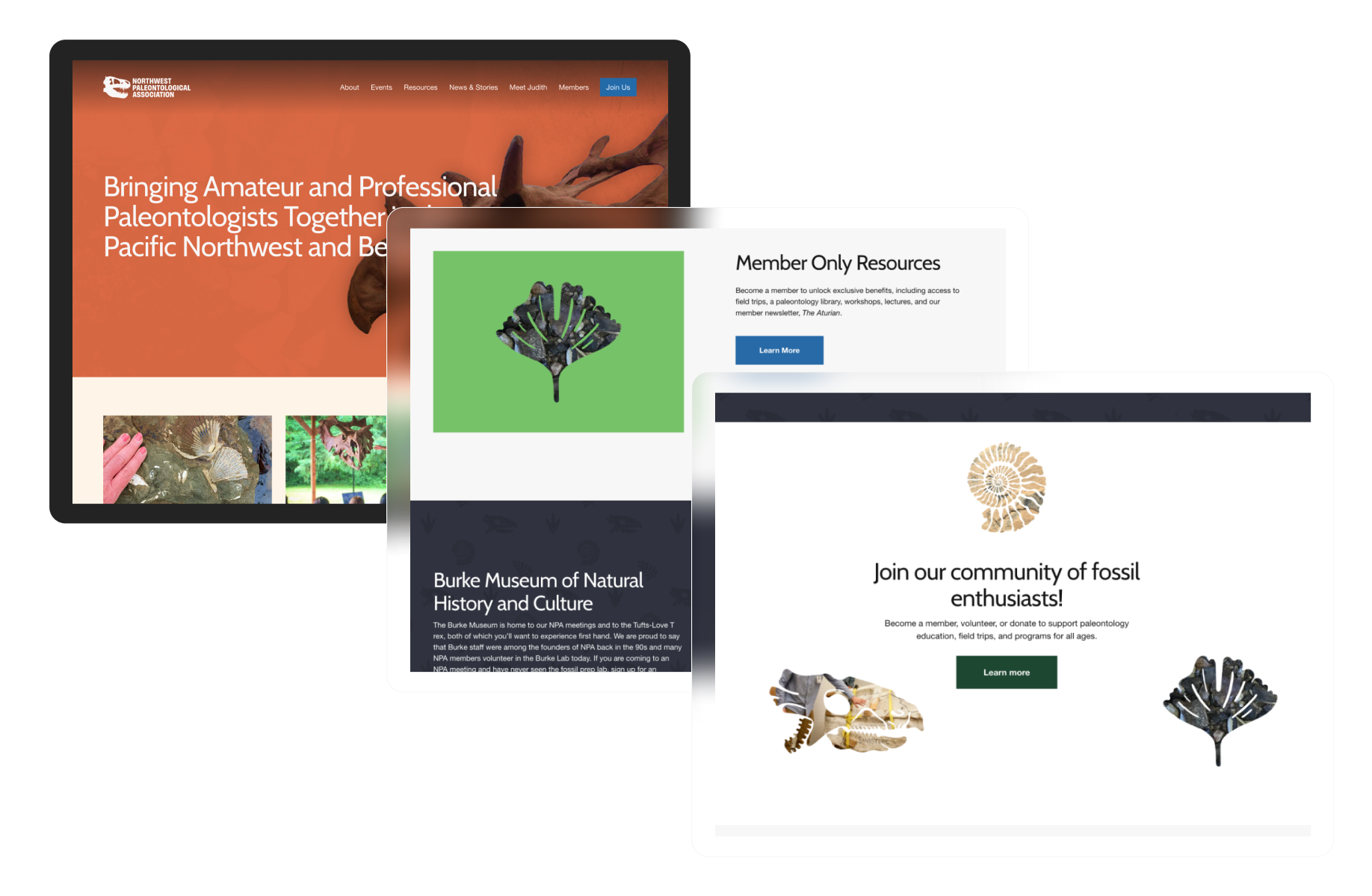
A modern, responsive website was designed and built to accommodate the growing organization’s current and future needs. The modular, inviting site includes multiple archive and publishing workflows, an event calendar system, and a paid-tier membership feature. A content and existing-member migration was also undertaken as part of the initial launch process.
Jurassic to the Holocene 🦕
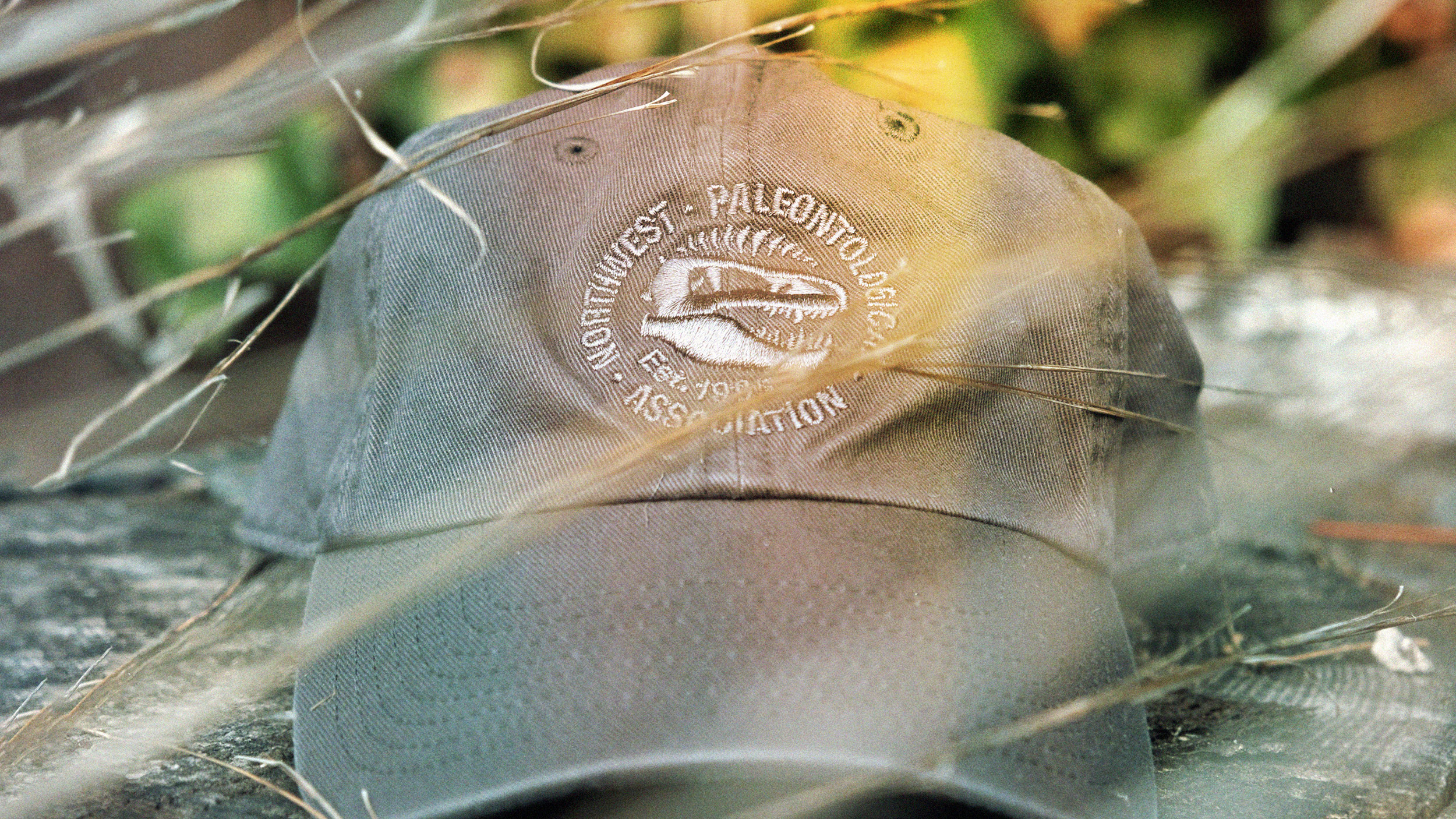
Physical applications and demos were built out to inspire the brand’s caretakers to have fun with the new branding.
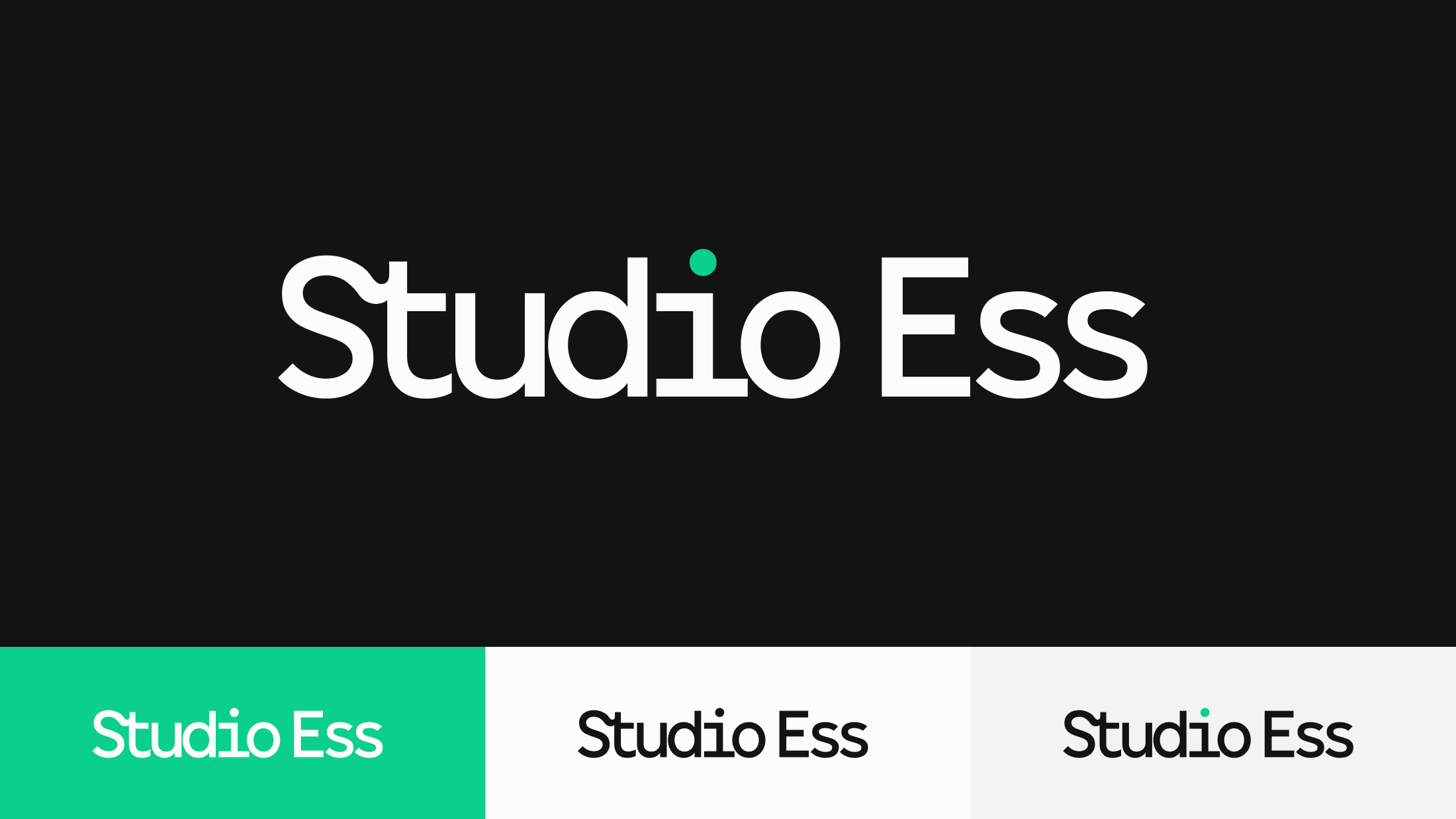
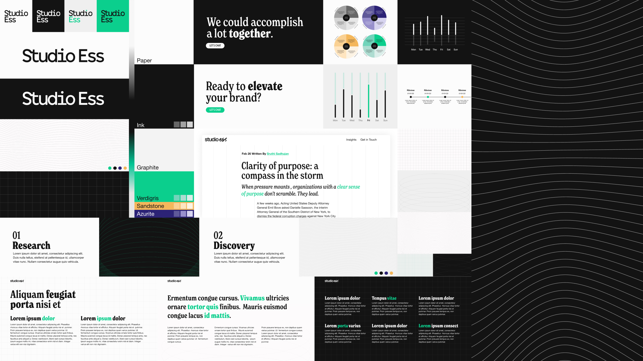
Studio Ess is a brand strategy practice based in Amsterdam, focused on transformation within the non-profit and mission-driven space. A logo, identity system, comprehensive presentation deck, and brand guide were developed to build upon the studio’s already strong foundation.
A Logo of Essential Form
Given the restrained, organic nature and playfulness of the brand’s visual assets and pattern library, it made sense to establish a solid, supportive mark for everything else to lean on. A custom ligature was crafted within a geometric sans serif, and the form was adapted across various modalities as part of a holistic, responsive logo system.
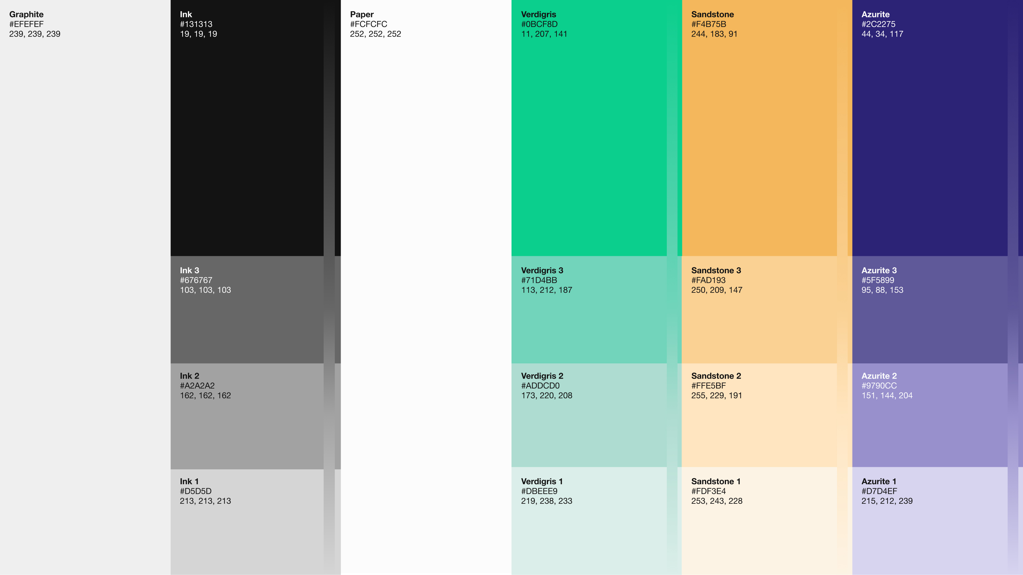
A Color Made from Change
Verdigris, the color of copper after it oxidizes, was chosen as a minimally utilized yet powerful brand-enhancing color. It is both a symbol of transformation and a fun nod to the iconic architecture found around the Dutch canals and the historic city.
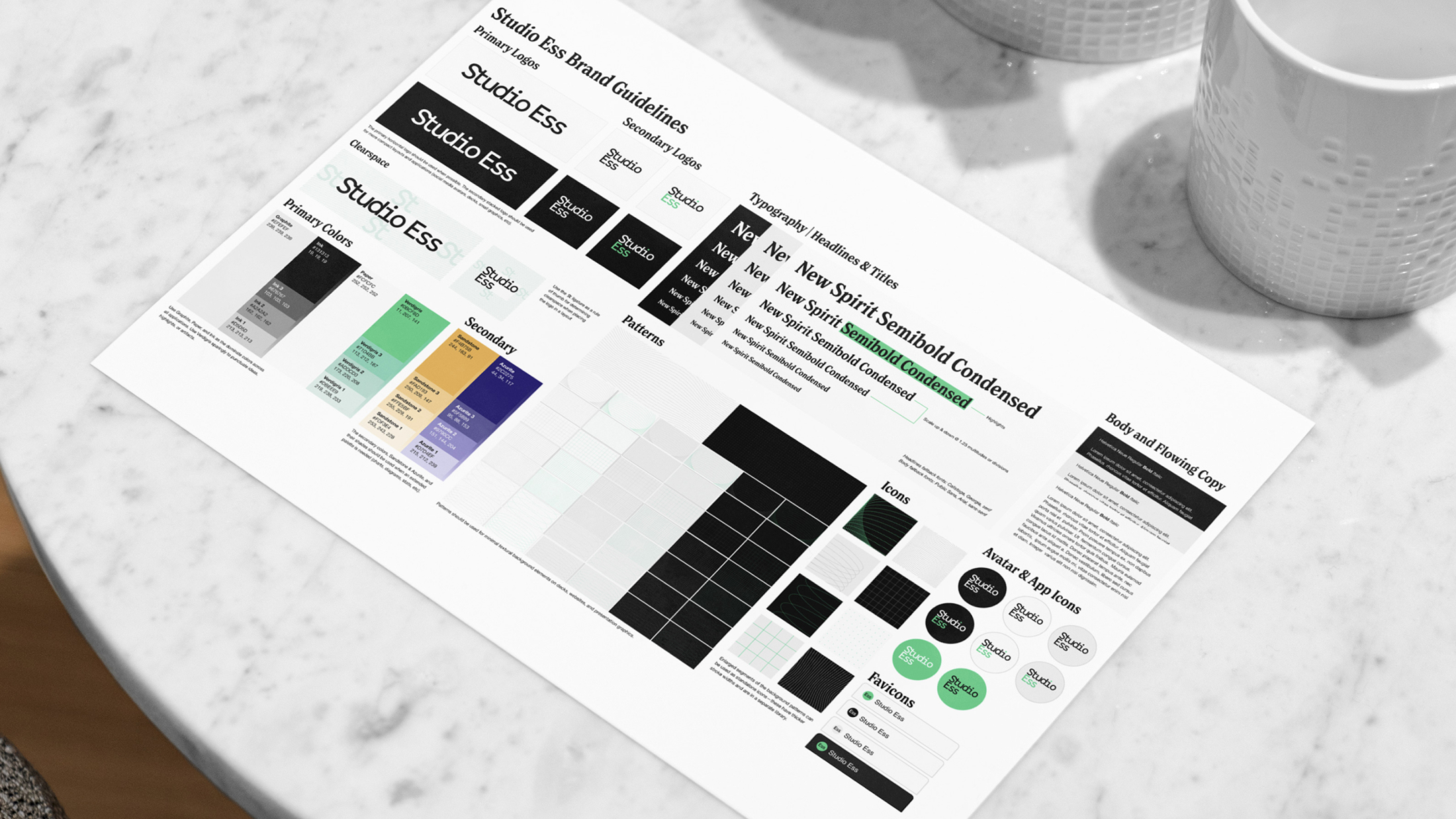
A Framework for Clarity and Consistency
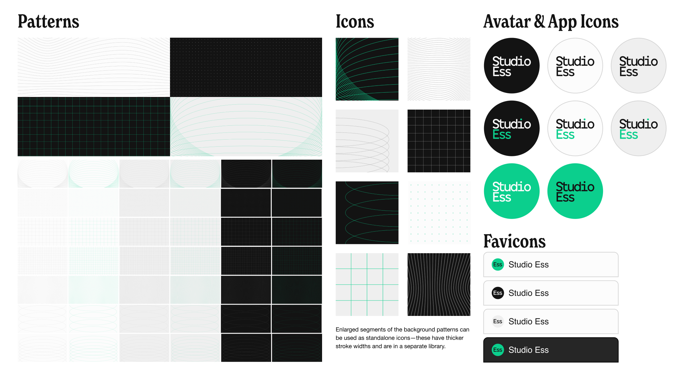
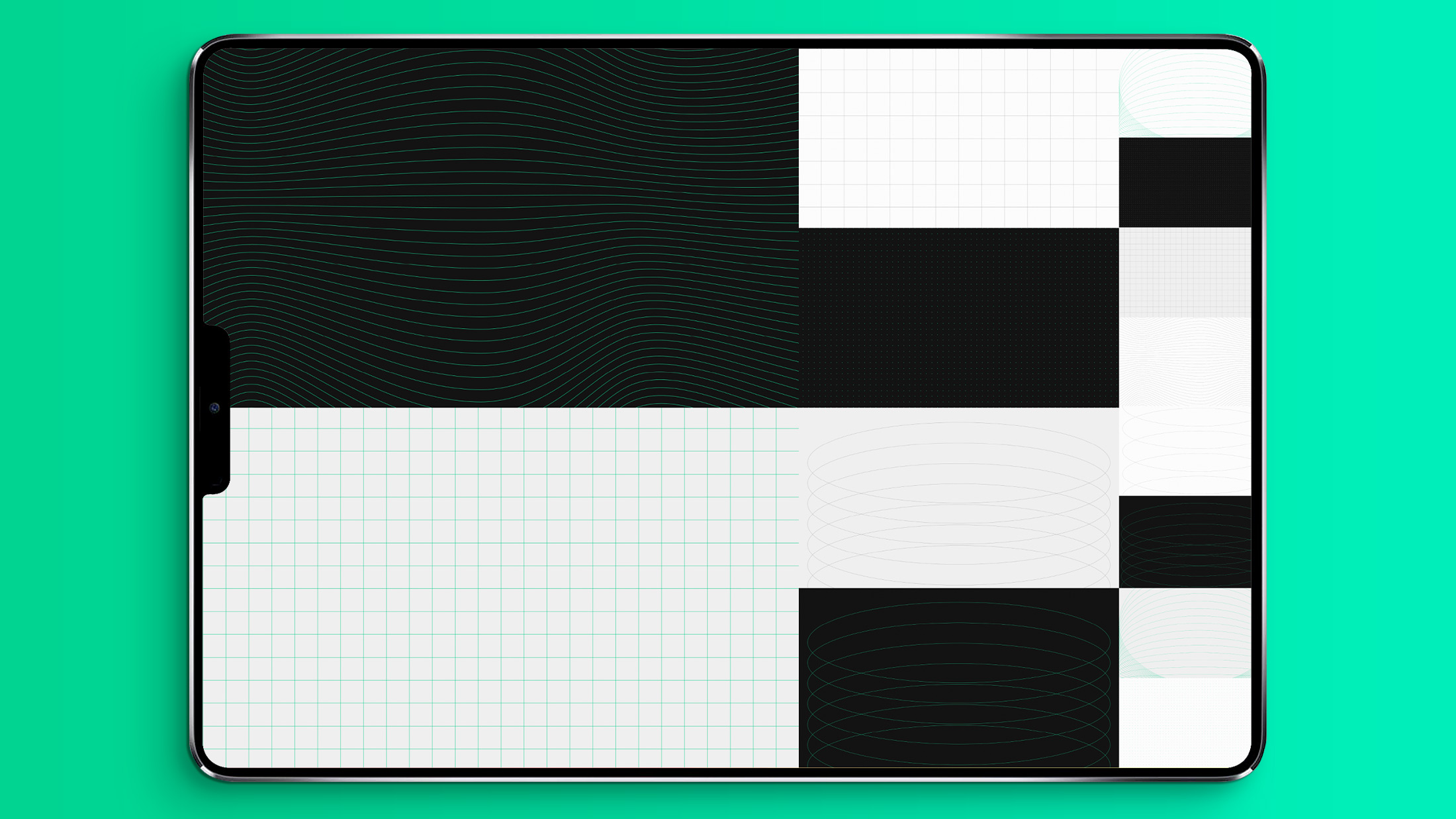
An identity framework was developed to ensure visual and tonal consistency across mediums and presentation environments. The system prioritizes clarity and coherence, offering a modular, minimalist, yet organic and expressive pattern library that scales naturally with the brand.
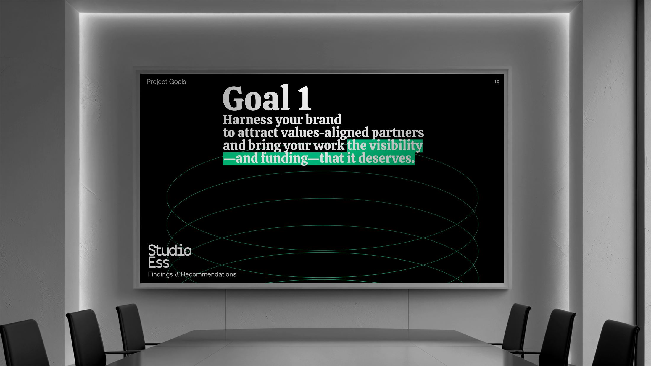
A Robust & Adaptive Deck
A comprehensive presentation deck was developed to unify Studio Ess’s communications across proposals, workshops, and brand presentations. Built on the same modular grid and typographic system, the deck balances consistency with flexibility.
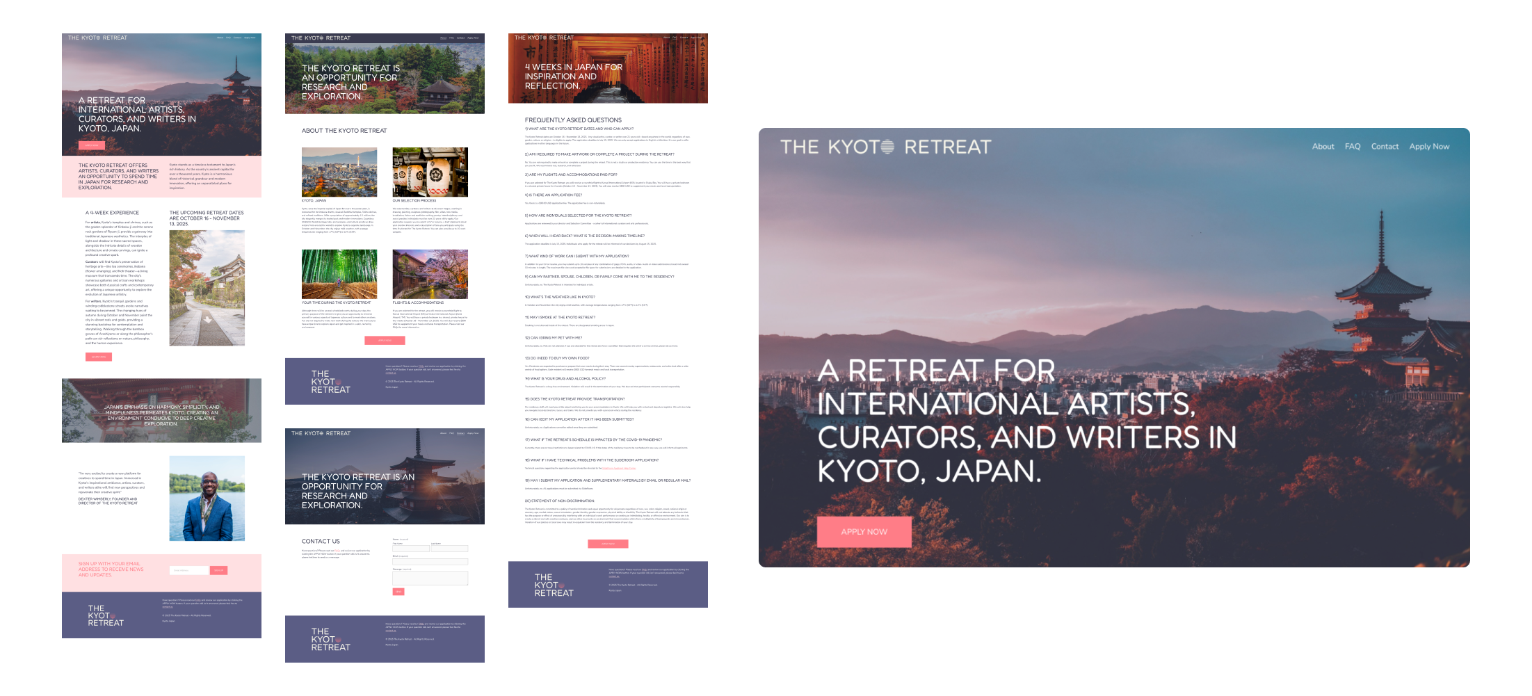
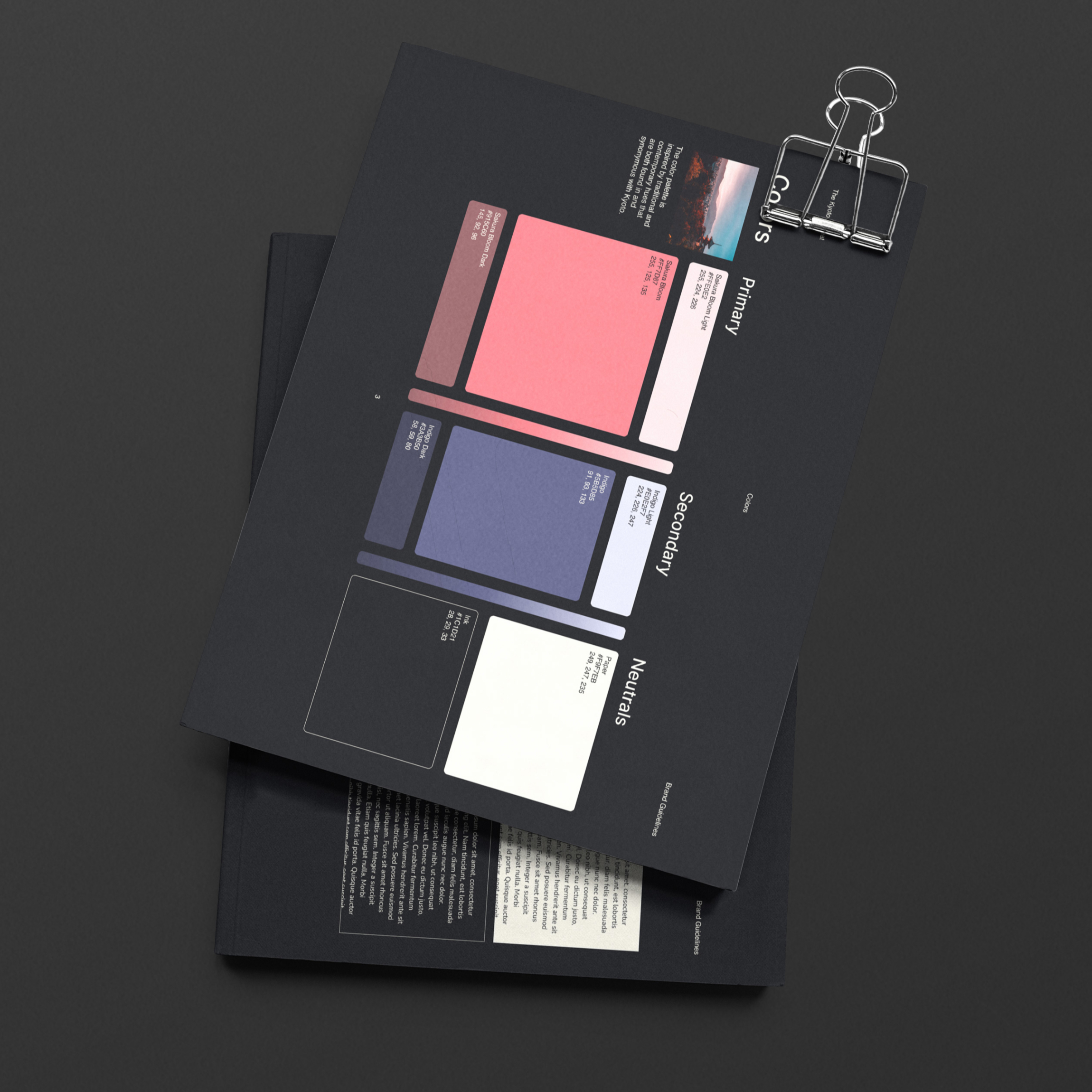
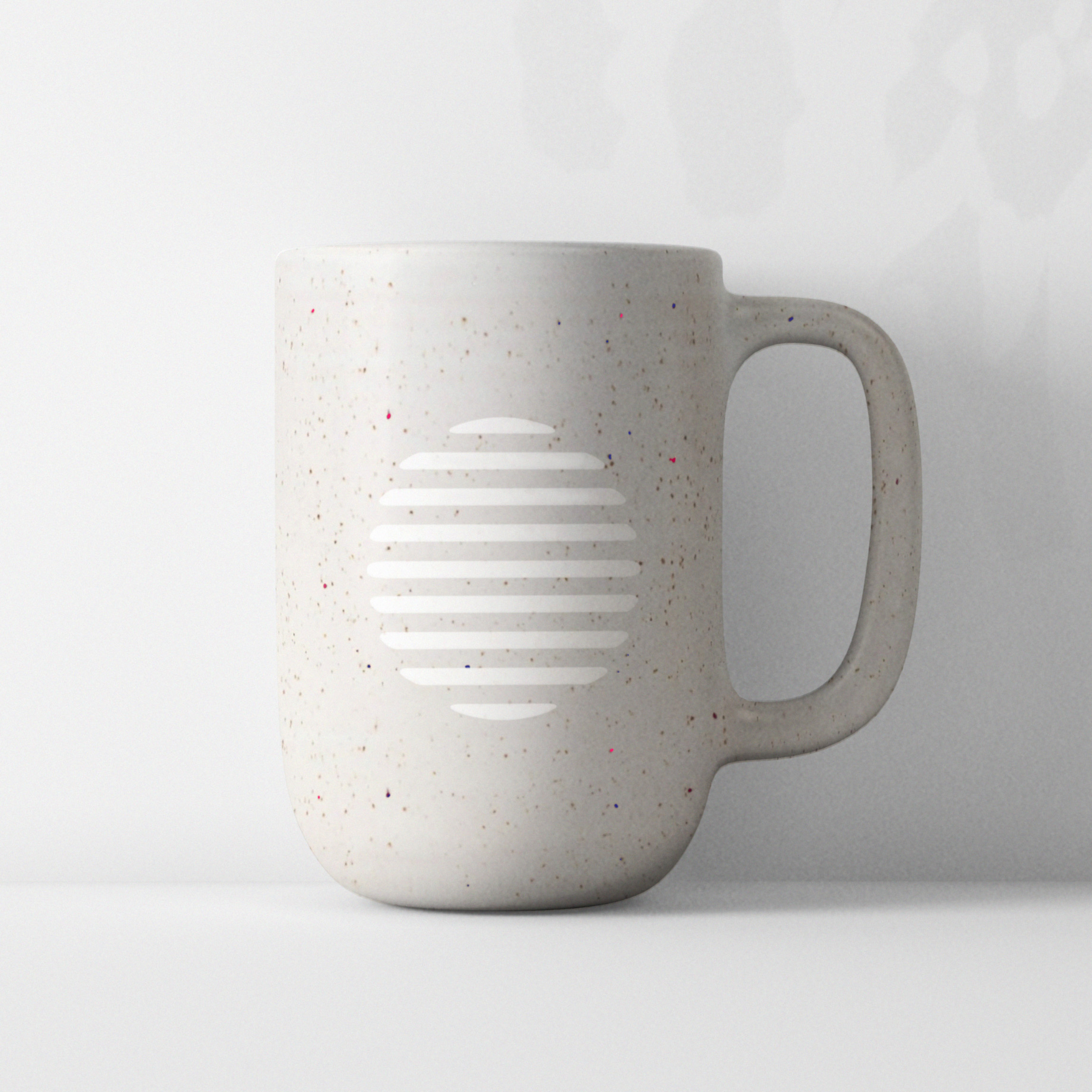
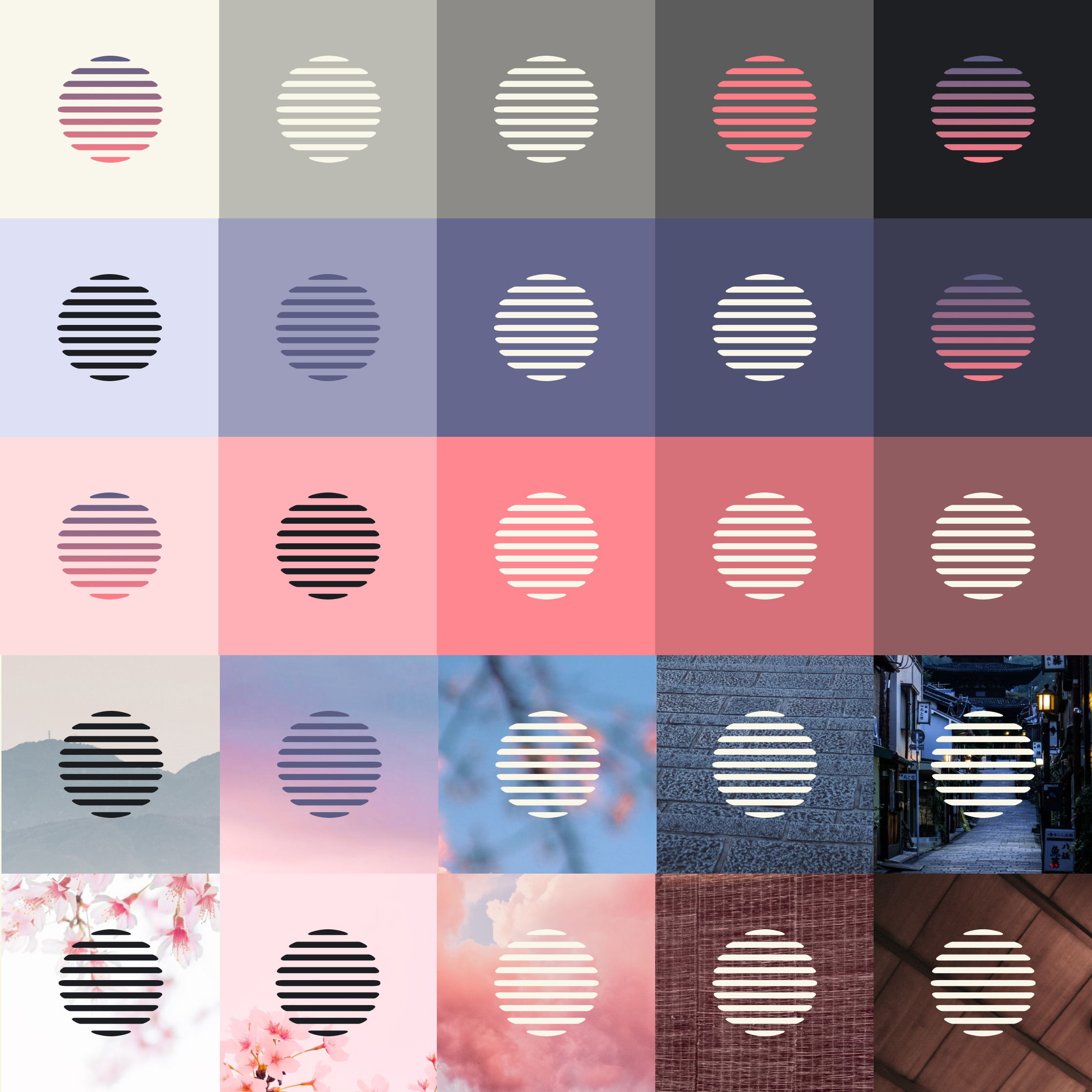
The Kyoto Retreat is a retreat for international artists, curators, and writers in Kyoto, Japan. A logo, brand guide, and website was designed and developed to launch the program.
USDA Fresh Fruit and Vegetable Wholesale Market Prices
Design, Production
Since 1915, the United States Department of Agriculture Agricultural Marketing Service division has published Fruit and Vegetable Market News reports. Through the Department of Information, Tomato Lab lovingly (and mostly-faithfully) brought these public domain archived reports back to life to inspire and educate.
NYC, 1969
The New York City edition features USDA fruit and vegetable price indexes for 1969. The pamphlet features a screen printed cover on evergreen linen 100lb French Paper Co stock. On neon pink paper, an inside spread utilizes archival photographs from the Library of Congress and the New York Public Library of the historic Hunts Point Produce Market. Additionally, printed lettuce seed paper was bound into the book.
Los Angeles, 1972
The Los Angeles edition features USDA fruit and vegetable price indexes for 1972. The pamphlet features a screen printed cover on bright yellow French Paper Co stock. The interior spreads use accounts from archival news articles and the Los Angeles Public Library to paint a picture of market life for laborers and workers in the early morning hour shifts of the 1960s and 70s. Vibrant red tomato seed paper was included as well.
Seattle, 1971
The Seattle edition features USDA fruit and vegetable price indexes for 1971. This version features a screen printed cover on craft black French Paper Co stock. The interior neon green spreads document the flyers and advocacy work local activists and community members engaged in to successfully save the historic Pike Place Market from destruction in 1971. Carrot seed paper was included in the Seattle book.
A modular logo was developed for an artist residency based out of Hayama, Japan. The concept was loosely pulled from the illustrative, eccentric, and delightful manhole covers found throughout the seaside town as well as from the rounded typography used on the iconic local post office facade.
Part conceptual art project, part new media organization, the Department of Information was inspired by the Environmental Protection Agency, the International Typographic Style, the Public Broadcasting System, and the multitude of bureaucratic, disfunctional, government-parallel institutions we’ve worked for in the past.
The Concept
The idea for a place to review art and design publications—mainly weird books and zines—was the starting point. With a shared interest and fascination with modernism, minimalism, and non-corporate entities; a concept for an authoritative, ambiguously-governmental brand was conceived.
From this the Department of Information (essentially an art blog) was born. It would need an engaging and comprehensive brand story and world-building schema to calcify it as a believable, respectible, and often comedically-bureaucratic, Kafkaesque entity.
The Brand
Ultimately, the Department brand is a medium for experimenting with new media, art, and design. The style, or modality, is defined through the well-worn lenses of modernism, minimalism, government-space, and bureaucracy.
Direct influences included the United Nations, the Environmental Protection Agency, governments in general, the International Typographic Style, the Public Broadcasting System, the 1960’s/70’s/80’s, and visual culture at large.
A comprehensive brand guide was developed and printed as an A4 newsprint saddle-stitched pamphlet. However, the entire brand is a living, ever-evolving and expanding world-building exercise.
A Digital Front
A brand-appropriate website (think a cross between the New York Times and an obscure blackbox government department website) was built to house articles on art books, zines, and interesting content at the intersection of public services, science, governance and visual culture. Accompanying digital applications and strategies would include social media, email newsletters, video, and audio content.
An Expansive Brand
The brand’s physical presence was intended to be just as important as it’s virtual presence. An information awareness campaign poster series was printed on newsprint and given out promotionally during the brand’s first year.
Other physical applications include and have included multiple vinyl album releases, mailable postcards, screen printed shirts and posters, a robust stationery suite, stamps, and a variety of other strange limited run editions.
Green Star Schools is a zero-waste, recycling, and environmental education program by the Colorado-based non-profit Eco-Cycle. A new logo and identity system was developed to help distinguish the program from it’s parent brand while linking the two together for improved public awareness.
The Logo
There was a real concern that the highly visible program Green Star Schools was not being linked to or associated with it’s parent brand, Eco-Cycle—successful and well known in it’s own right since the 1970s when it was founded. The k-12 zero-waste school program also lacked a cohesive visual identity even though it has enjoyed operational success and familiarity for 15+ years as the first comprehensive zero-waste schools program in the U.S.
The end result was a new family of logos that combined the parent logo—a requirement—with a unique, k-12-vibe-friendly, and thematically appropriate mark.
Symbiotic Color Theming
The color palette was borrowed from the existing parent brand which already had six accent colors, in addition to five primaries. The accent green was the perfect choice for the brand which opened up avenues for other sub-branding opportunities amongst the remaining accent colors. Additionally, the use of a brand blue, green, and brown were mobilized for waste-stream-specific theming (paper/cardboard, rigid plastics, and compost respectively).
A New but Familiar Identity
A basic but intentional brand guide was created to outline the new logo family, typography, colorways, illustrations, icons, and layout/asset suggestions.
The strange but lovable star character that has been featured on Green Star Schools assets for years was re-drawn and vectorized. Some new Star Buddy friends were also introduced to expand the illustration family and add some variety to the character toolkit.
All Together
Example applications were provided to mix up all of the new elements together in potential real world creations and scenarios.