Northwest Paleontological Association
Logo, Branding, Website
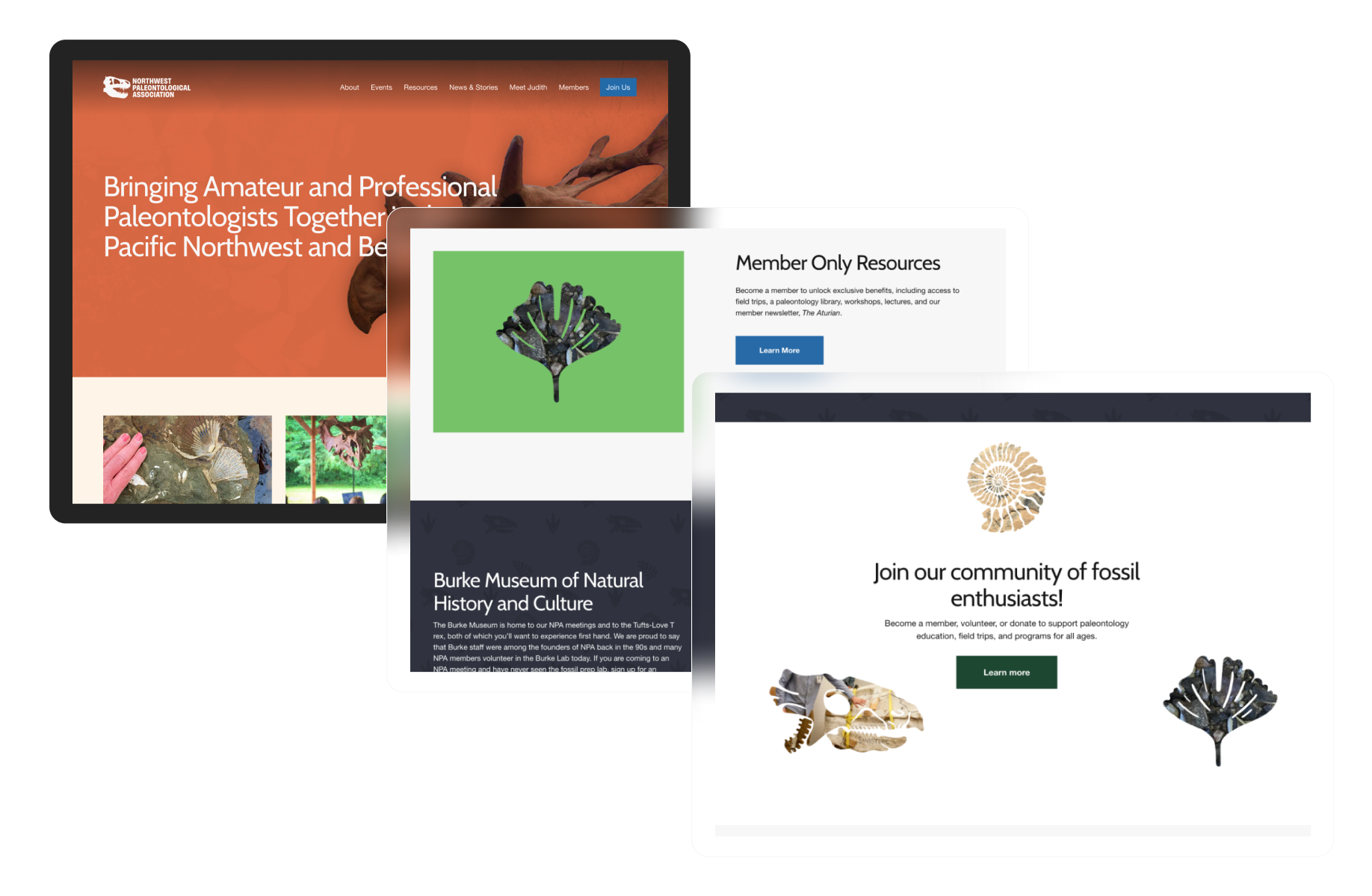
Founded in the mid-1990s and associated with the Burke Museum, the Northwest Paleontological Association (NPA) brings together amateur and professional paleontologists across the Pacific Northwest to advance the science and appreciation of paleontology.
We were approached to design a new website for the organization, which evolved into a broader engagement addressing larger identity needs.

Logo Excavation & Reconstruction
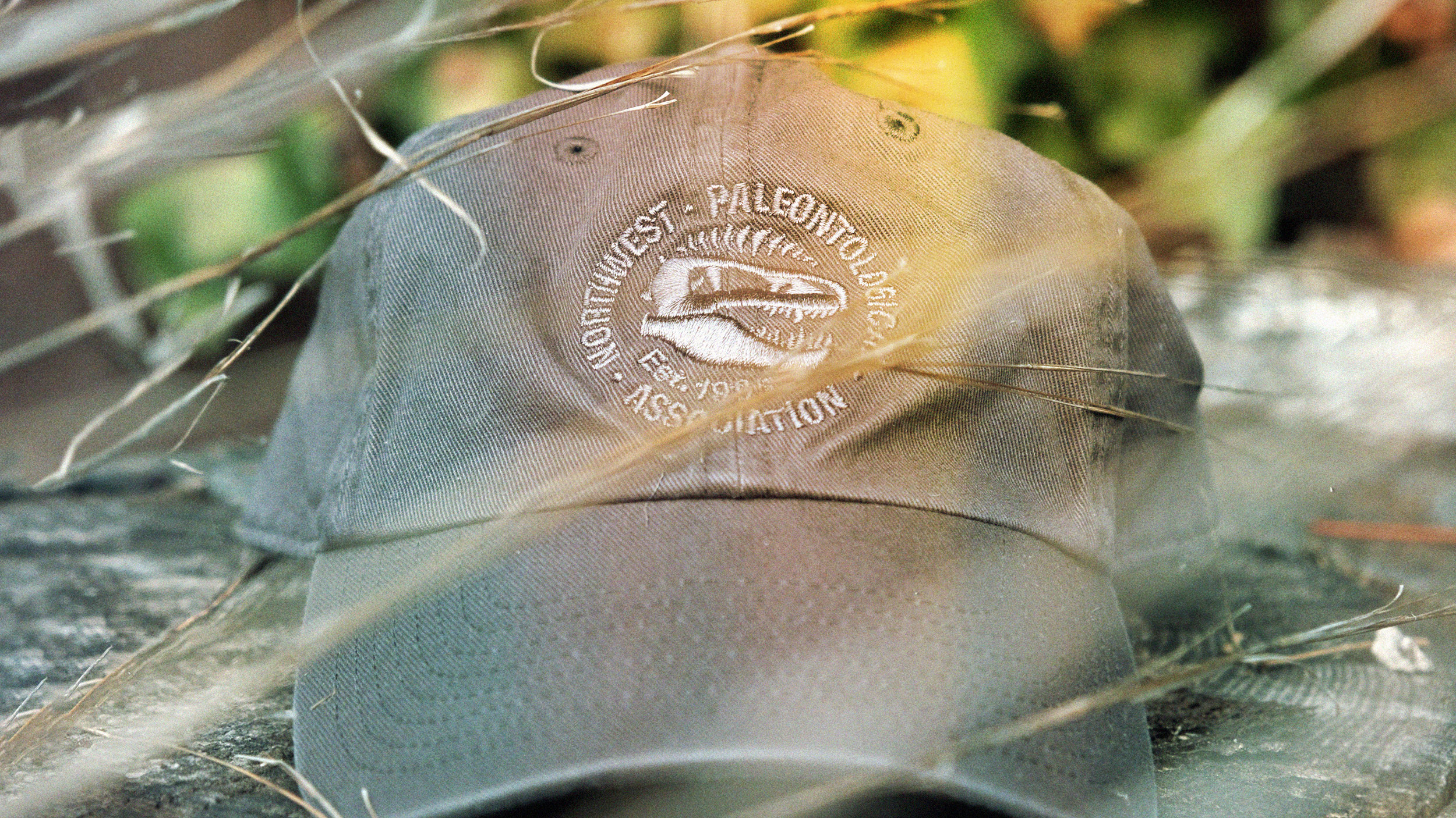
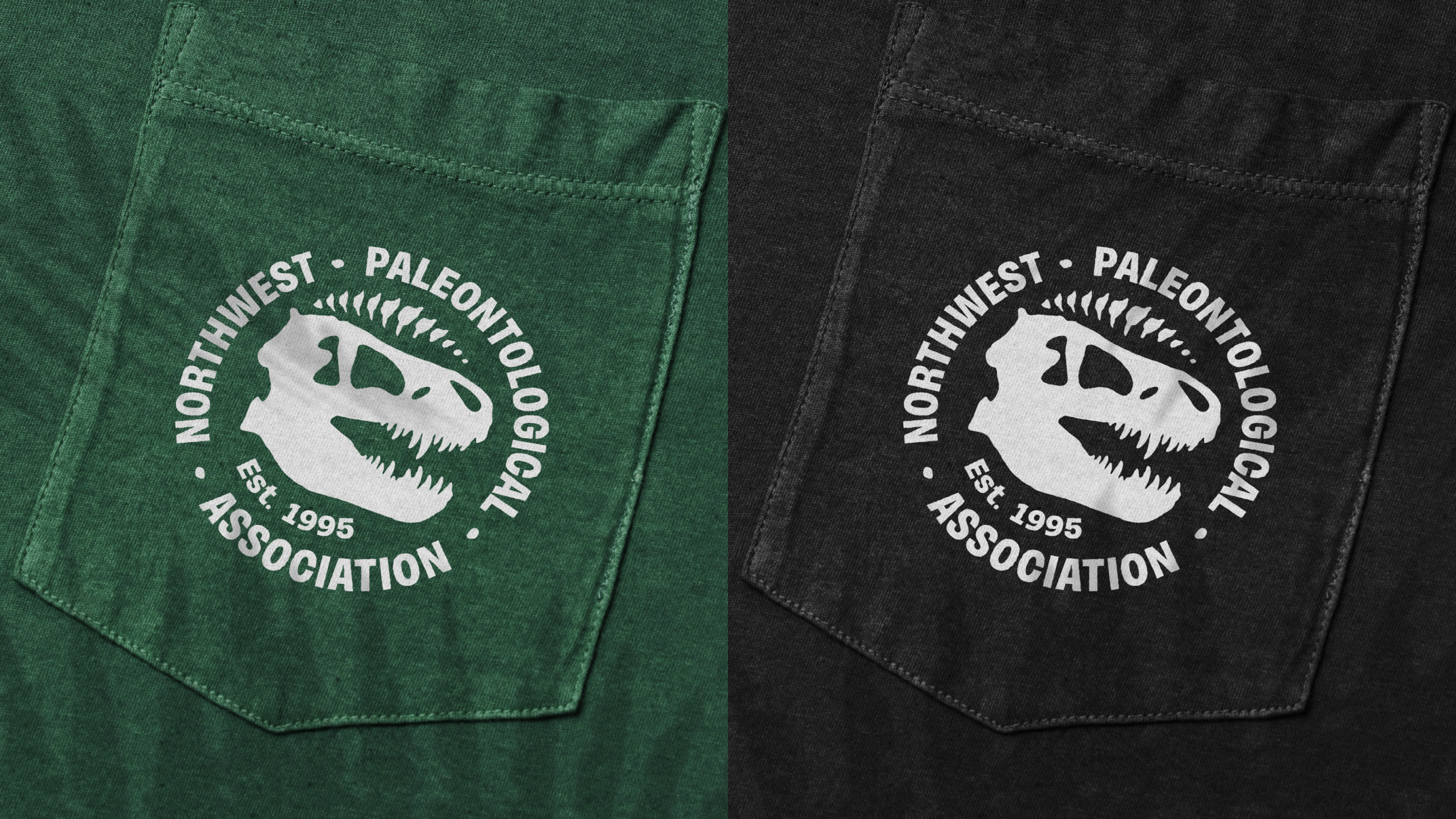
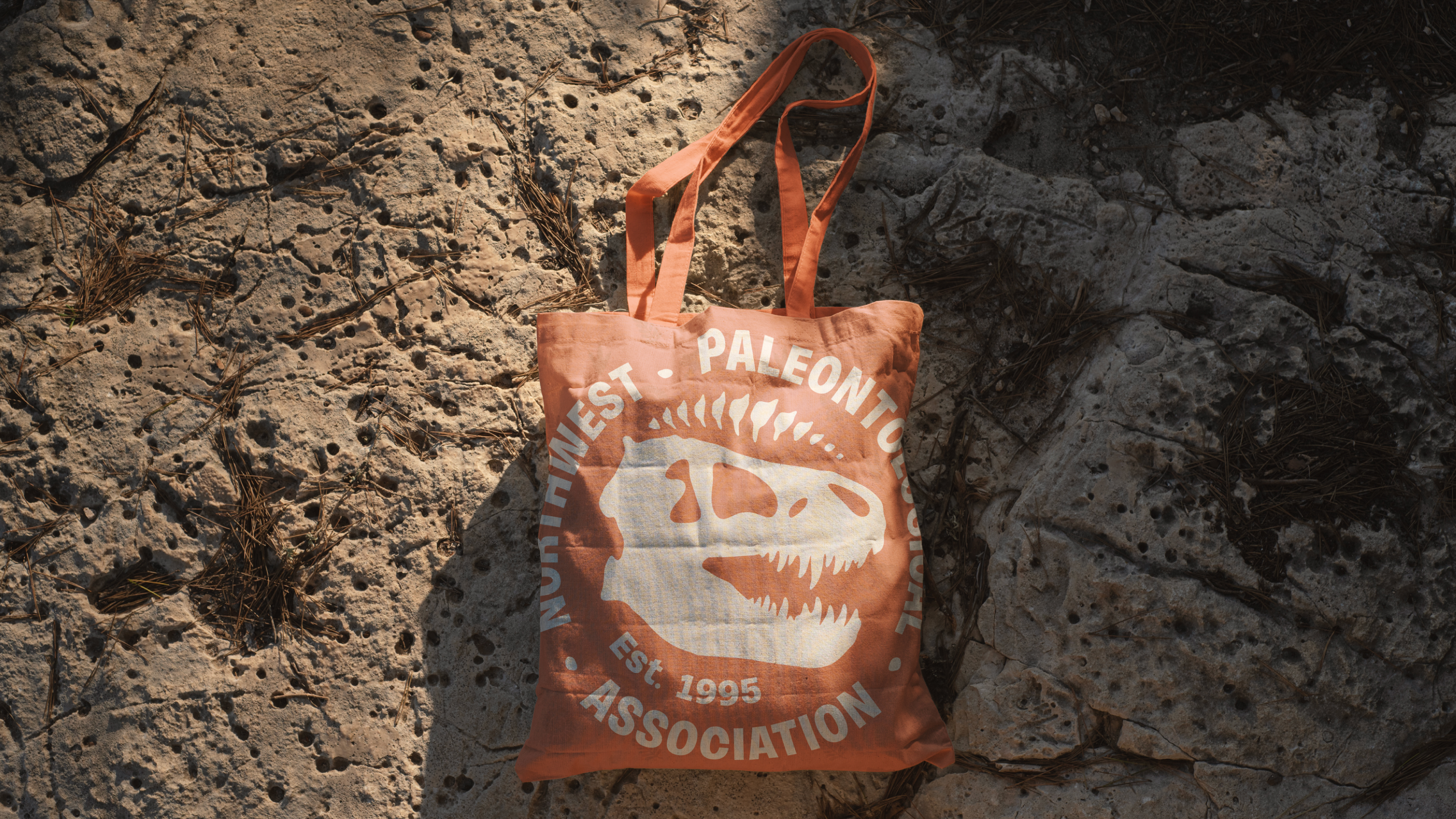
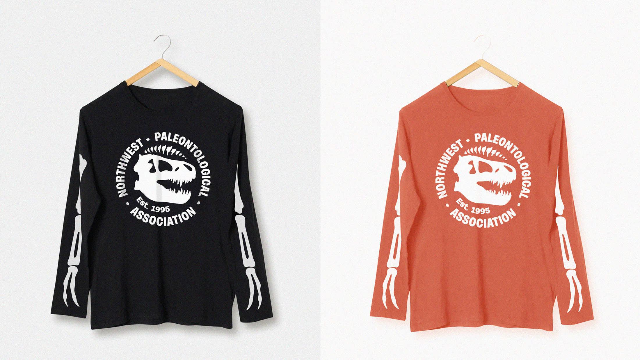
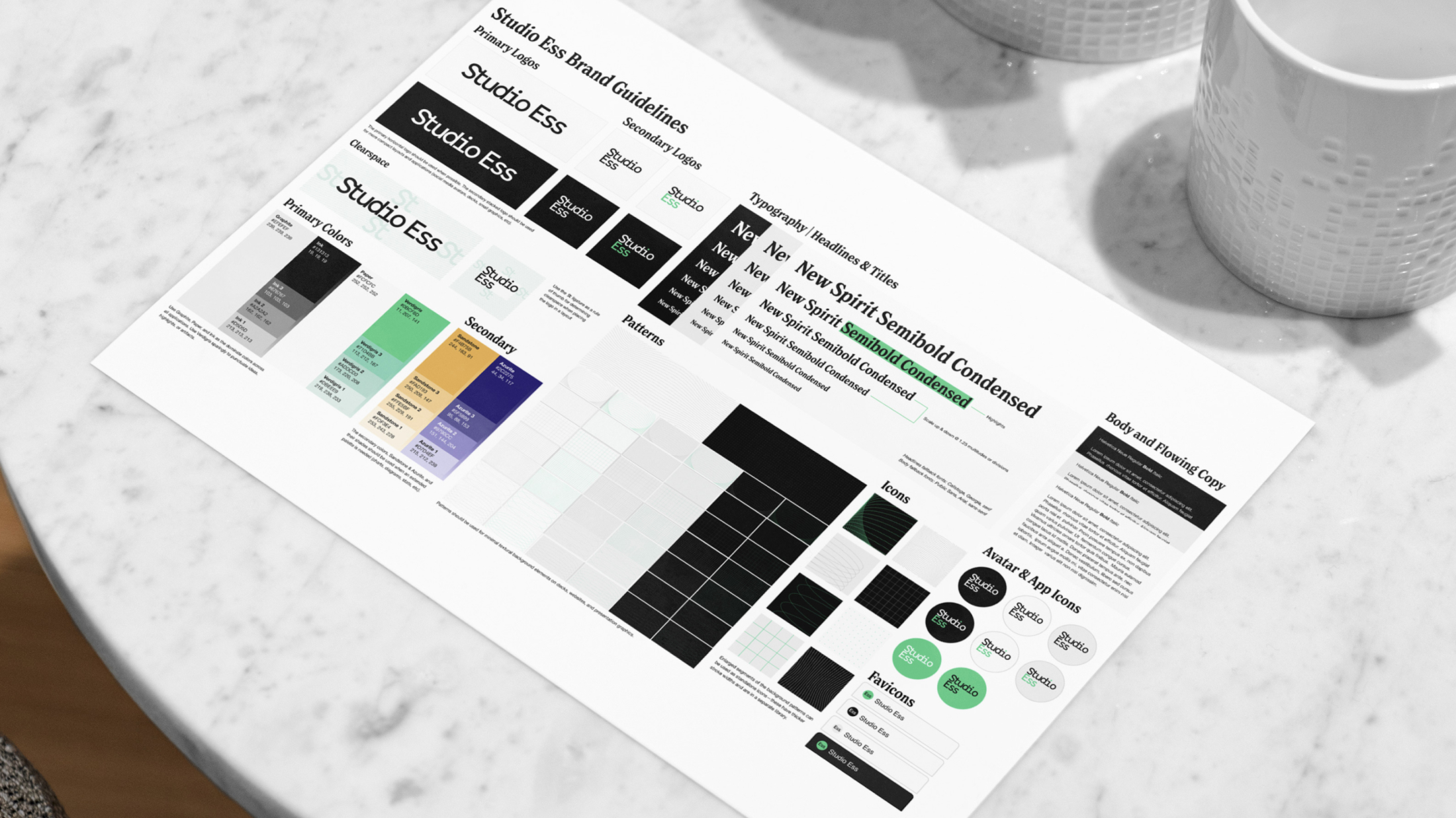
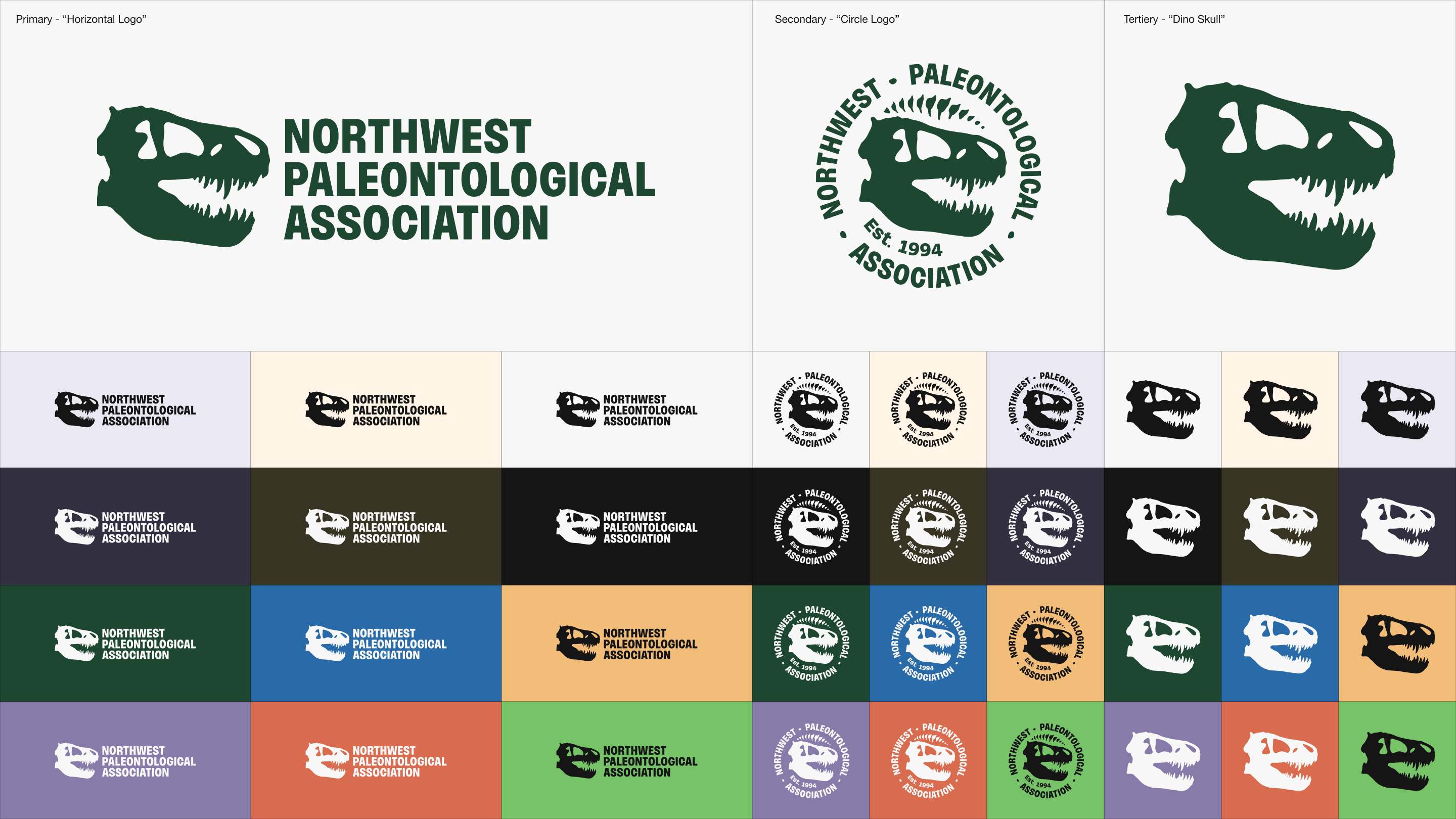
NPA already had a familiar, well-worn logo. It just needed a little typographic help and mark refinement. We took the existing logo, completely redrew the T-rex silhouette, and chose a modern, well-kerned sans-serif wordmark to stomp the whole thing into place.
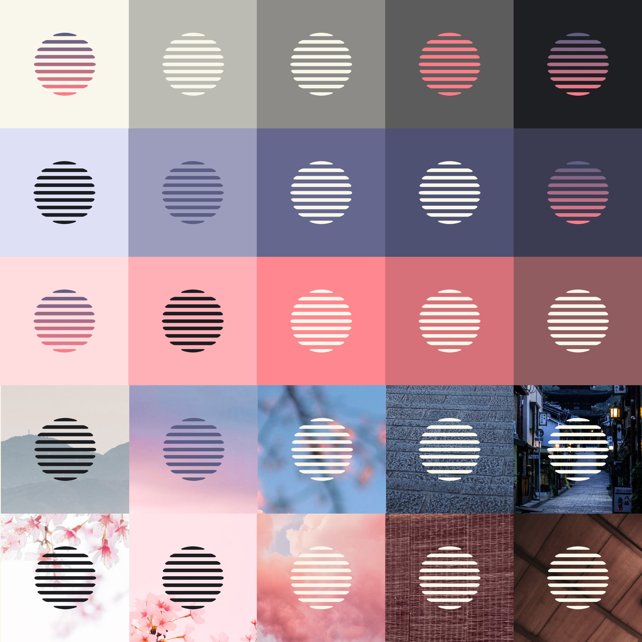
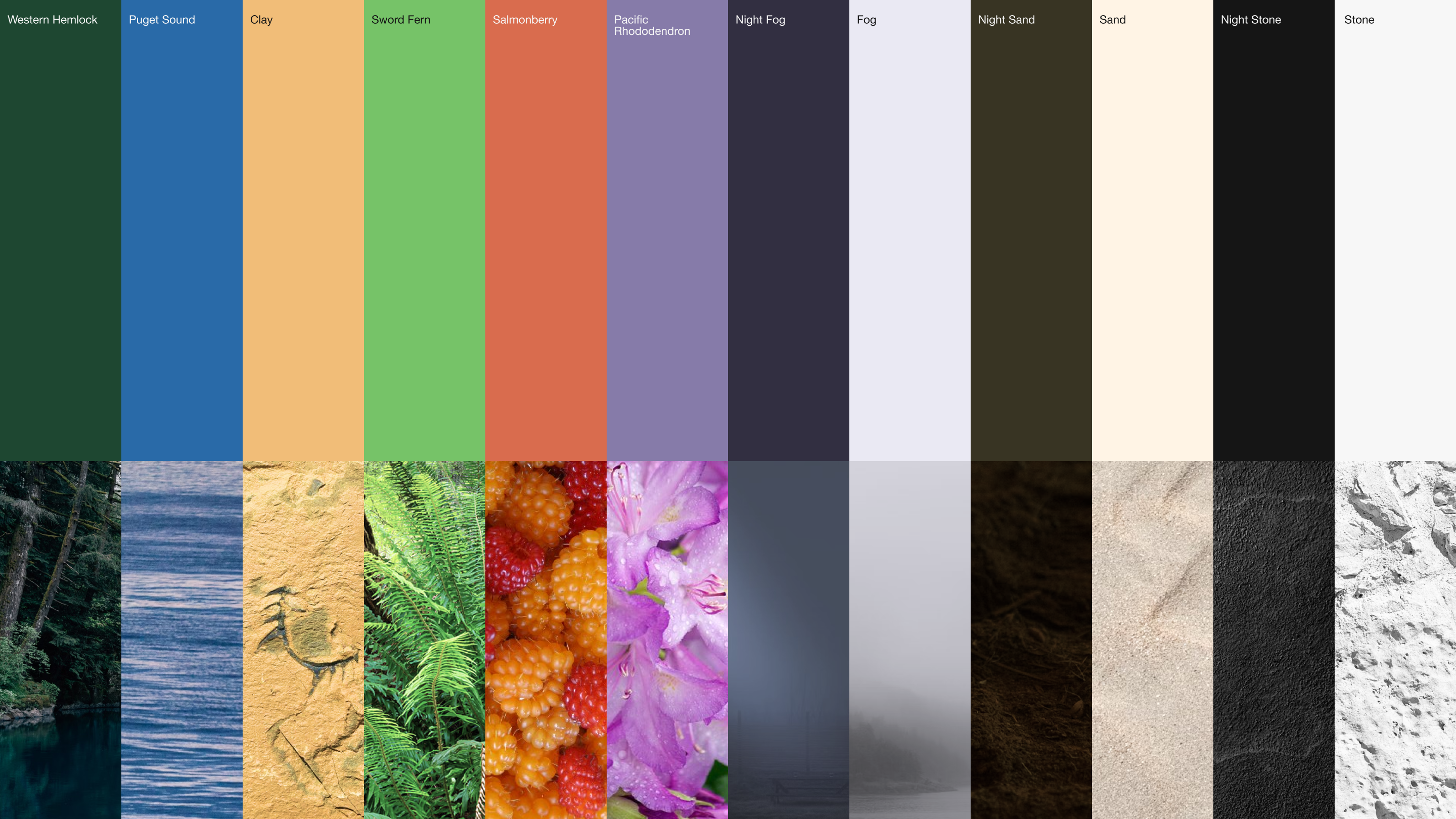
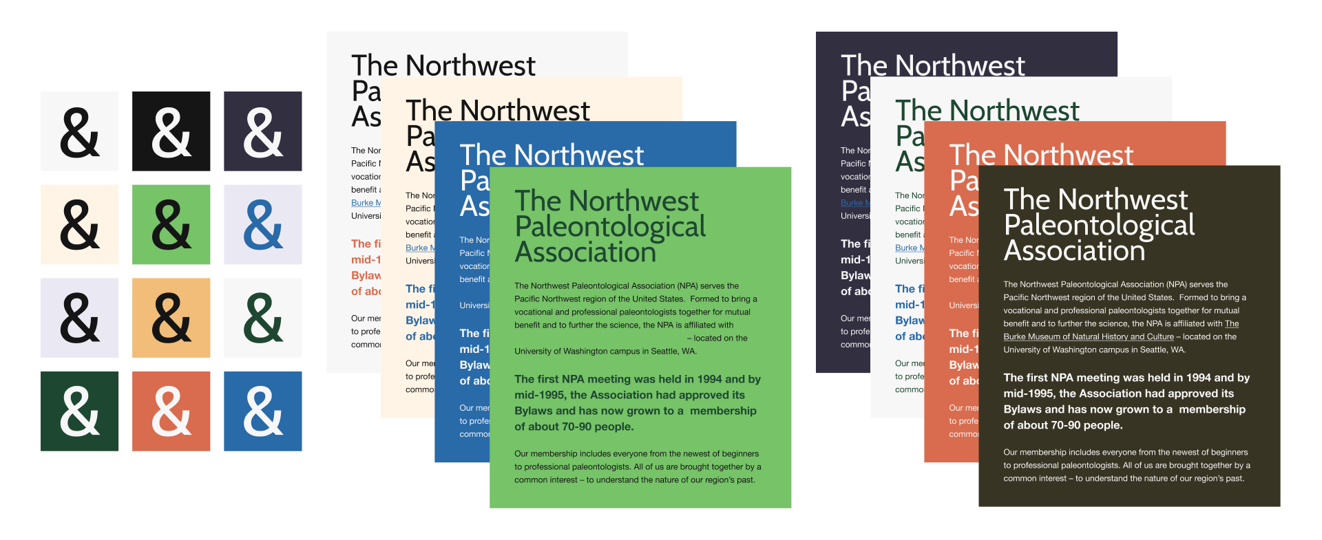
The Colors of the Pacific Northwest
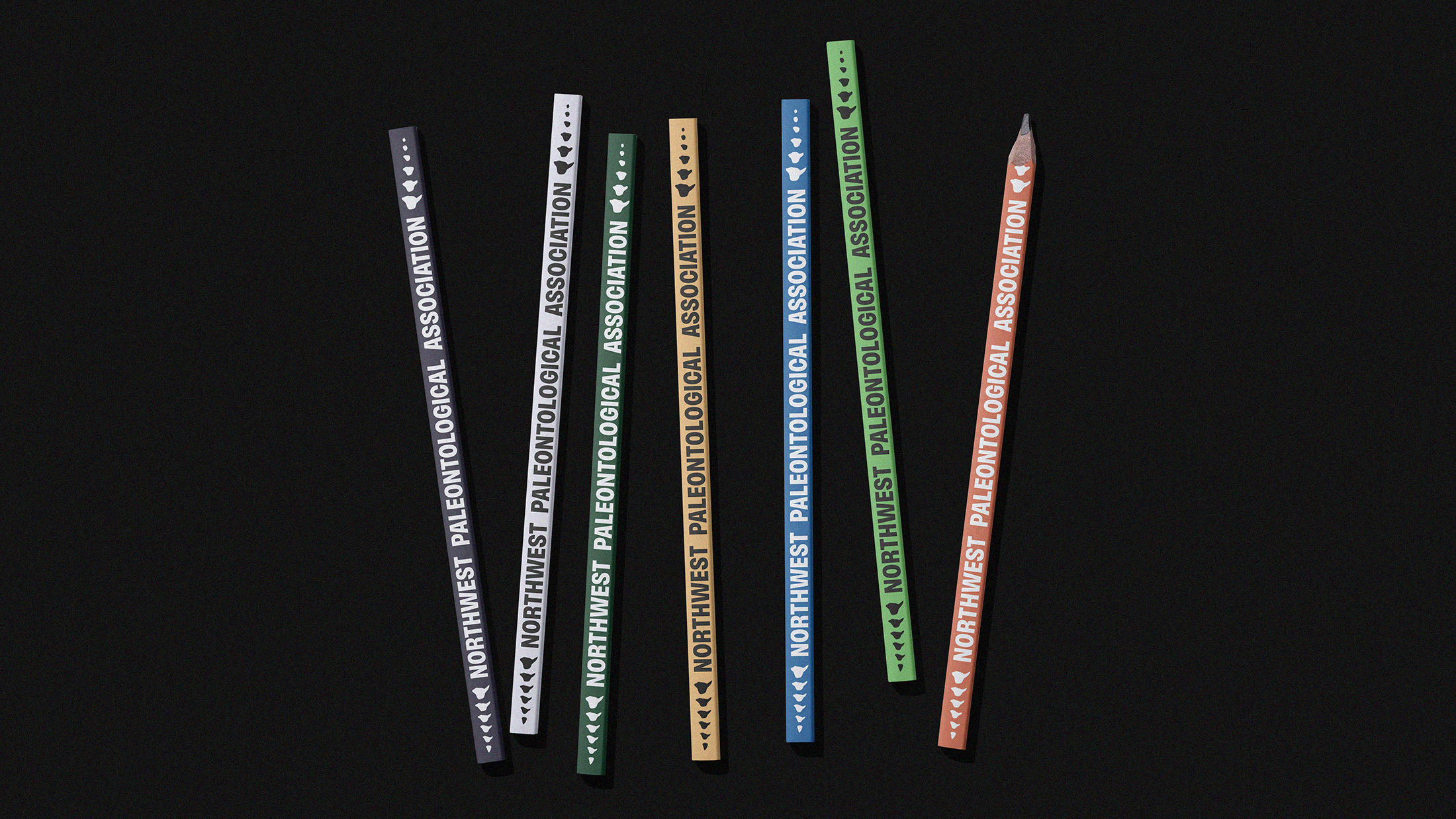
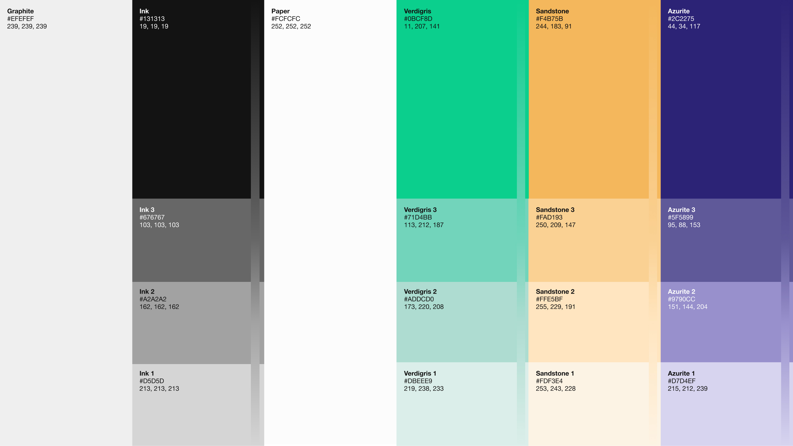
Everyone involved in this project wanted to work with the natural colors of the Pacific Northwest: Puget Sound’s deep, moody blues; the saturated orange of wild salmonberry; the eerie, looming greens of western hemlock; the vivid brightness of prehistoric sword fern; and the atmospheric glow of fog, stone, and sand.
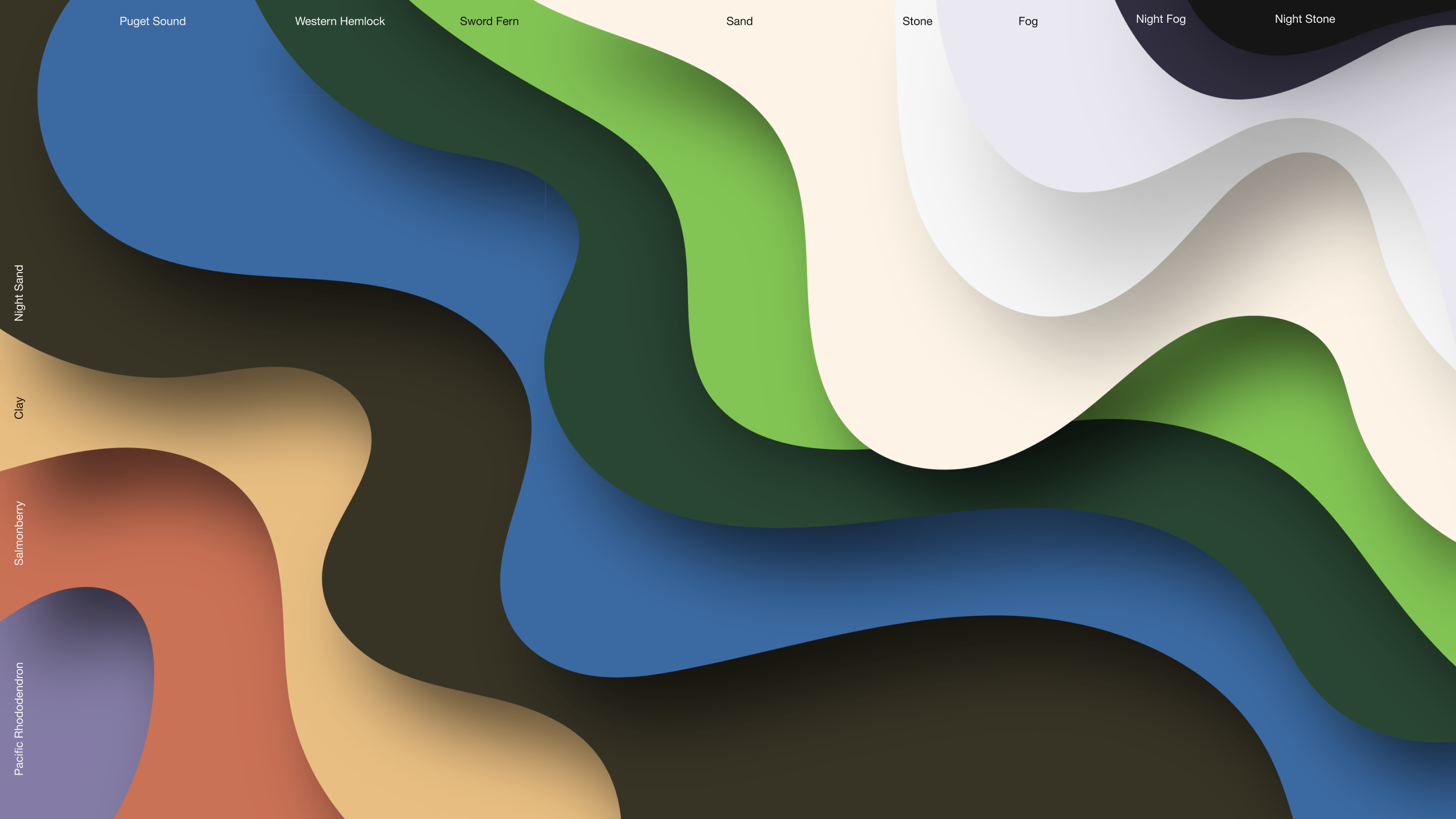
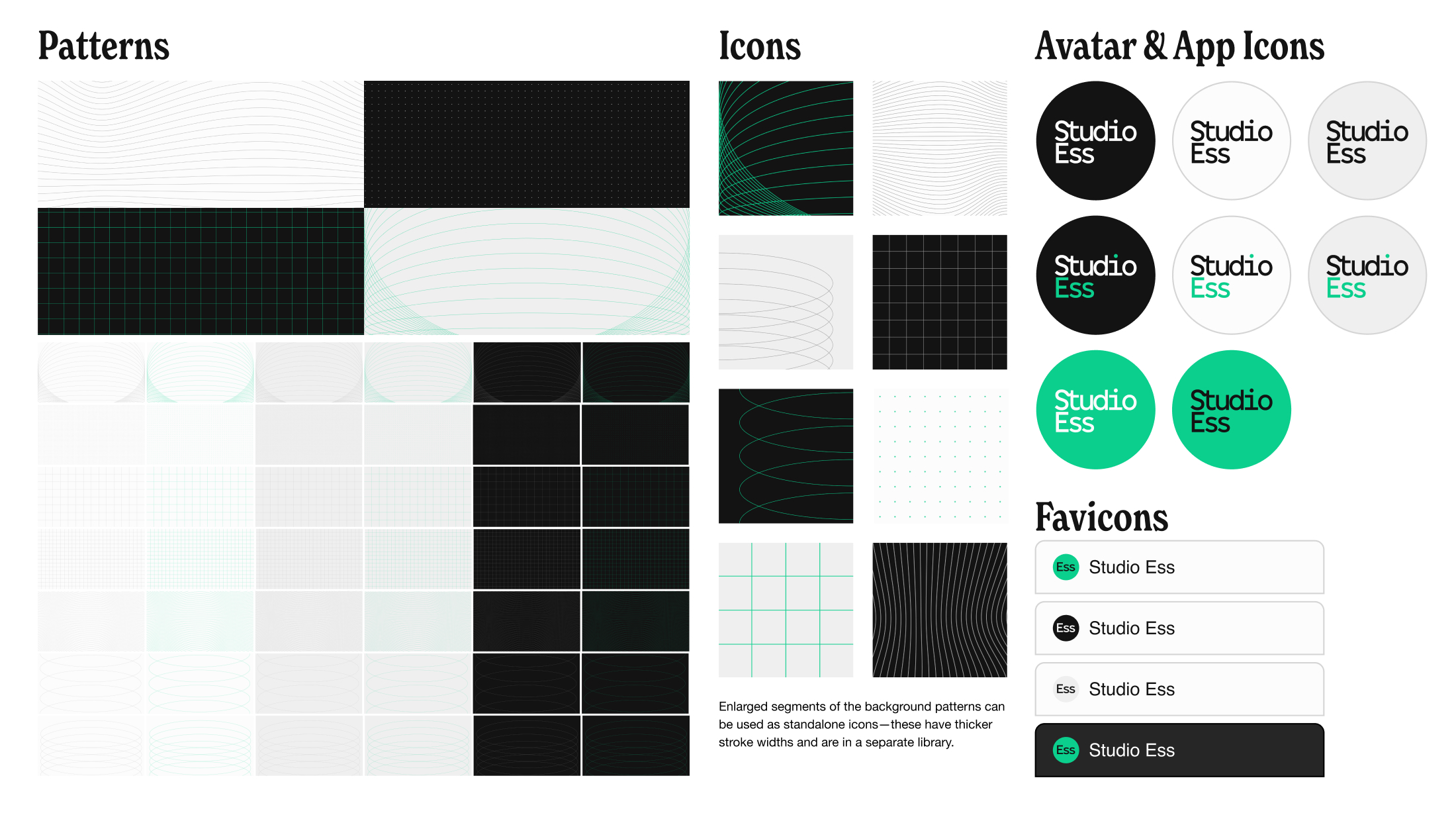
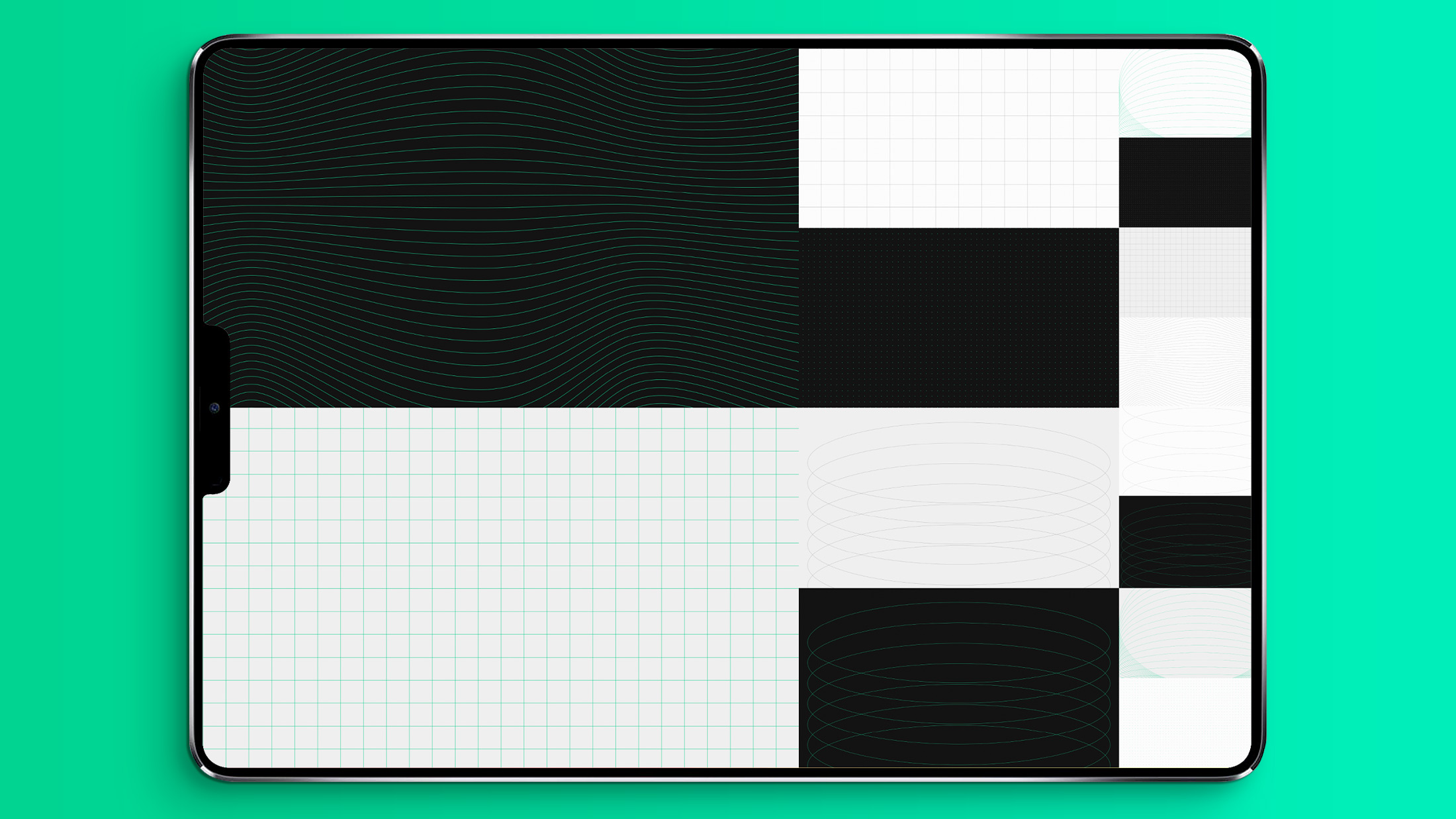
A Design System with Good Bones 🦖
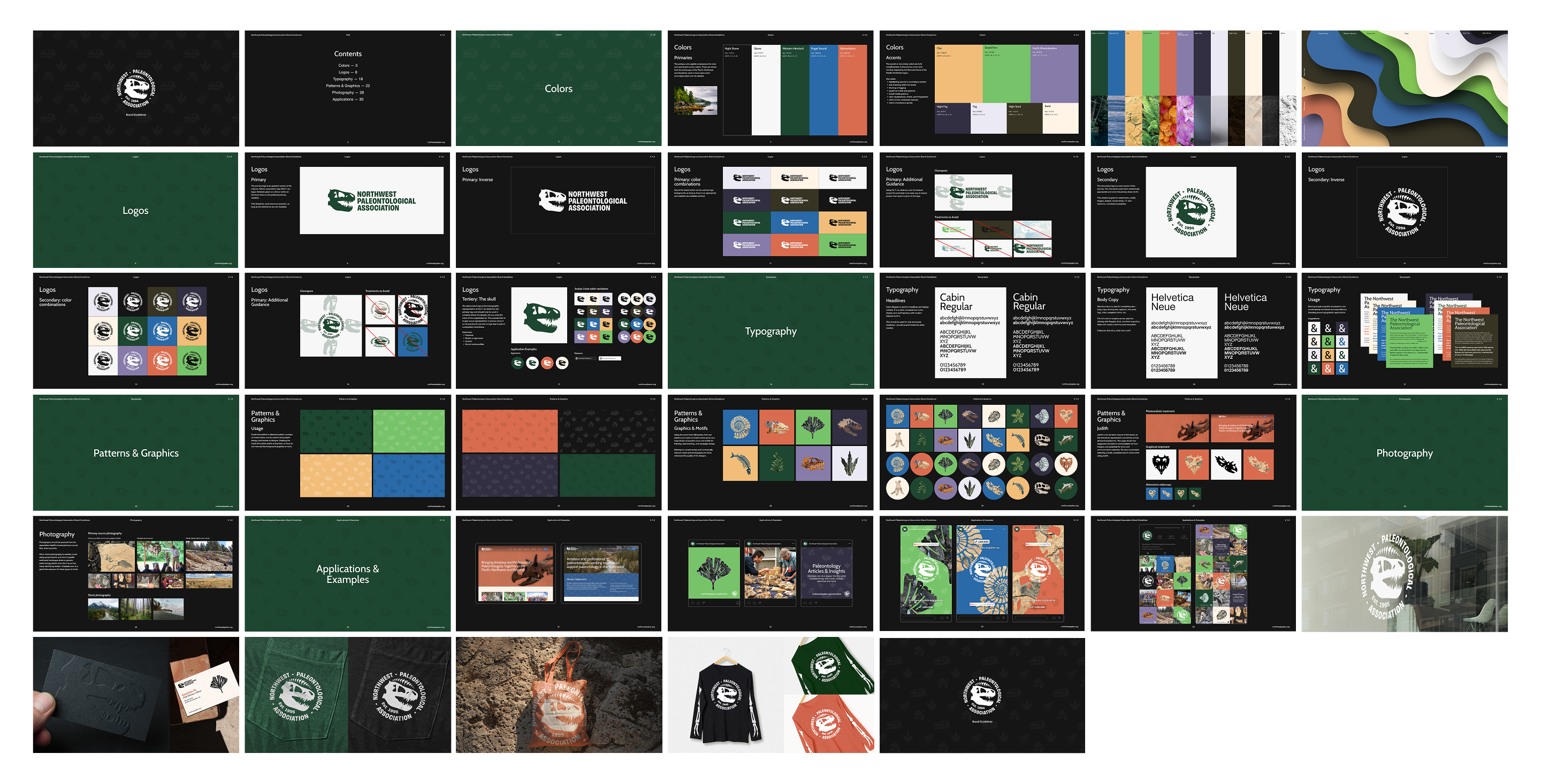
We chose the humanist sans-serif typeface, Cabin, for headlines and titles. The optically-adjusted font stands tall and demands attention and respect while still having a little organic, woodsy personality.
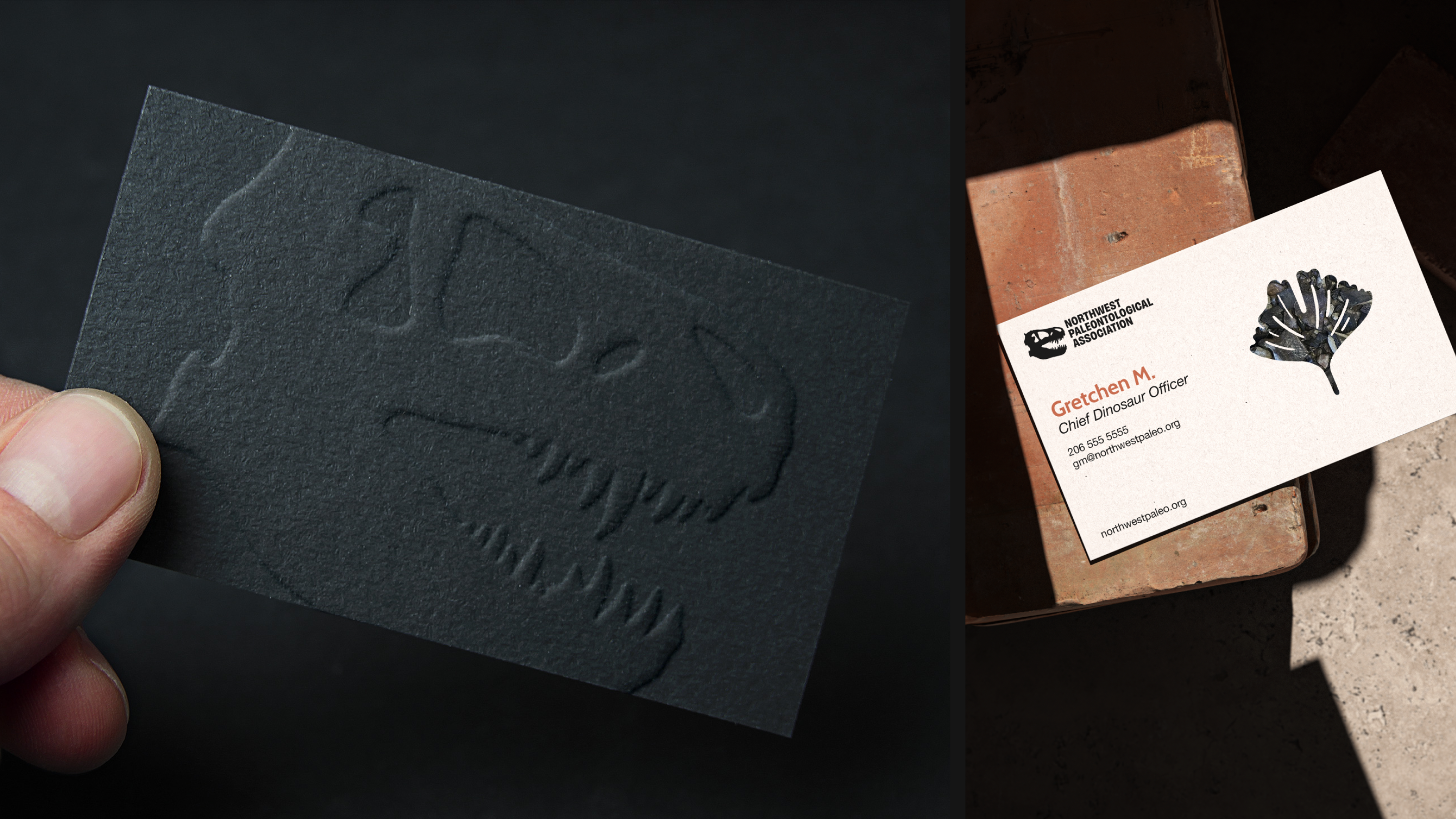
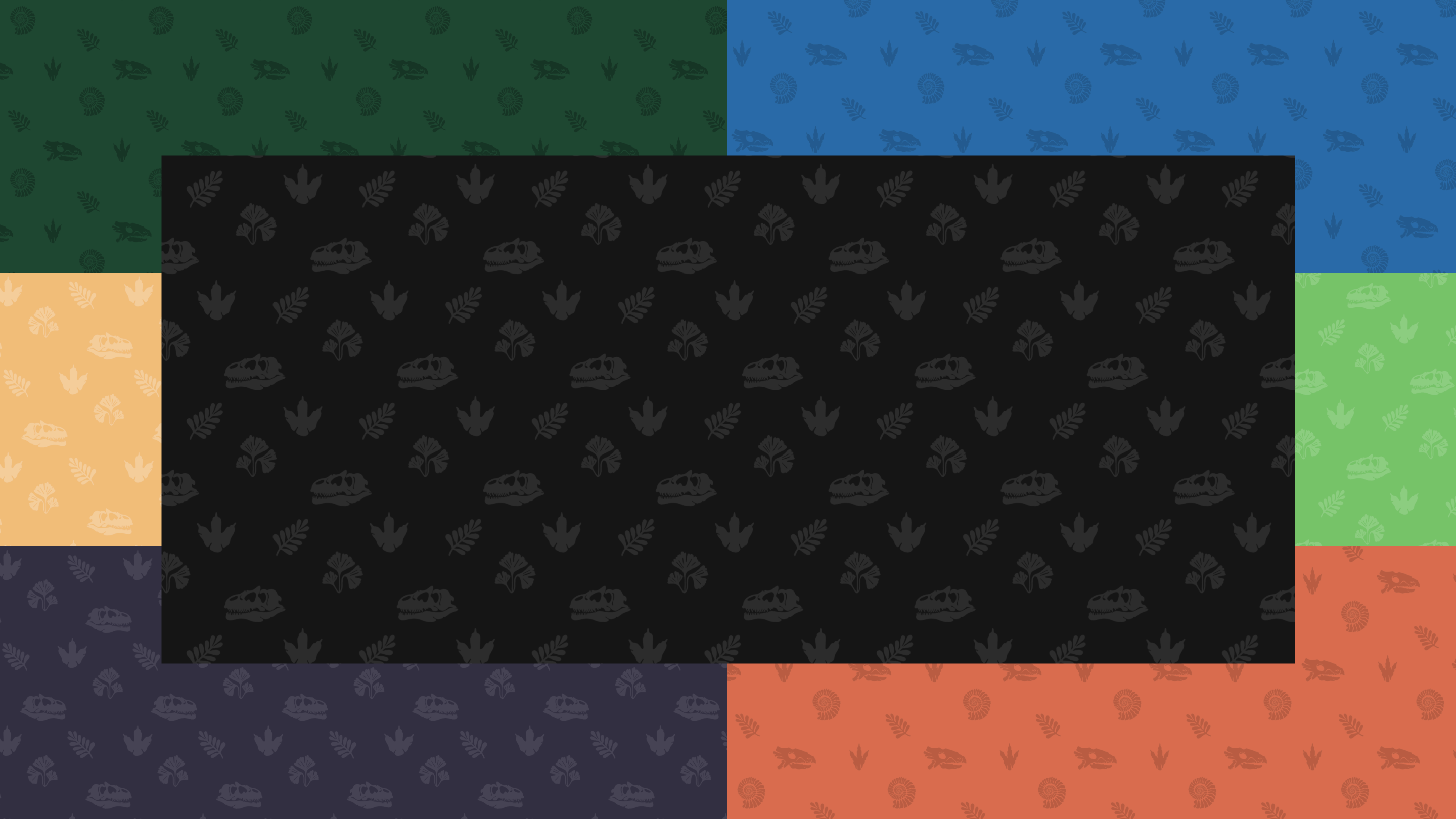
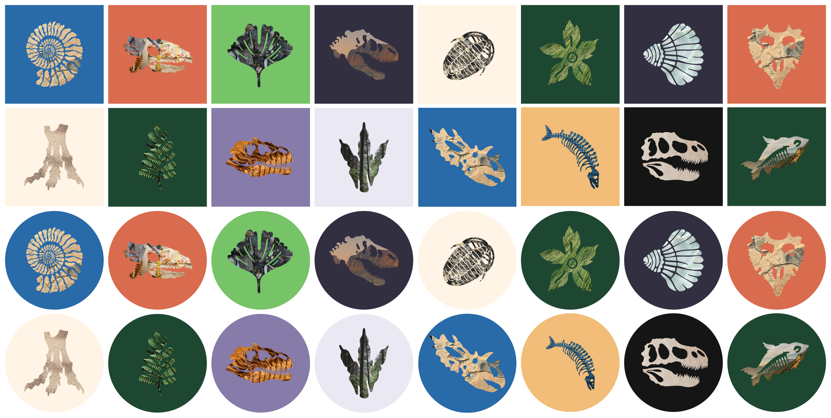
To fill out the design system with texture, depth, and versatility, we created pattern libraries using fossil silhouettes—including the organization’s own prized specimen, Judith (Spiclypeus shipporum)—along with simple, bold masking techniques.
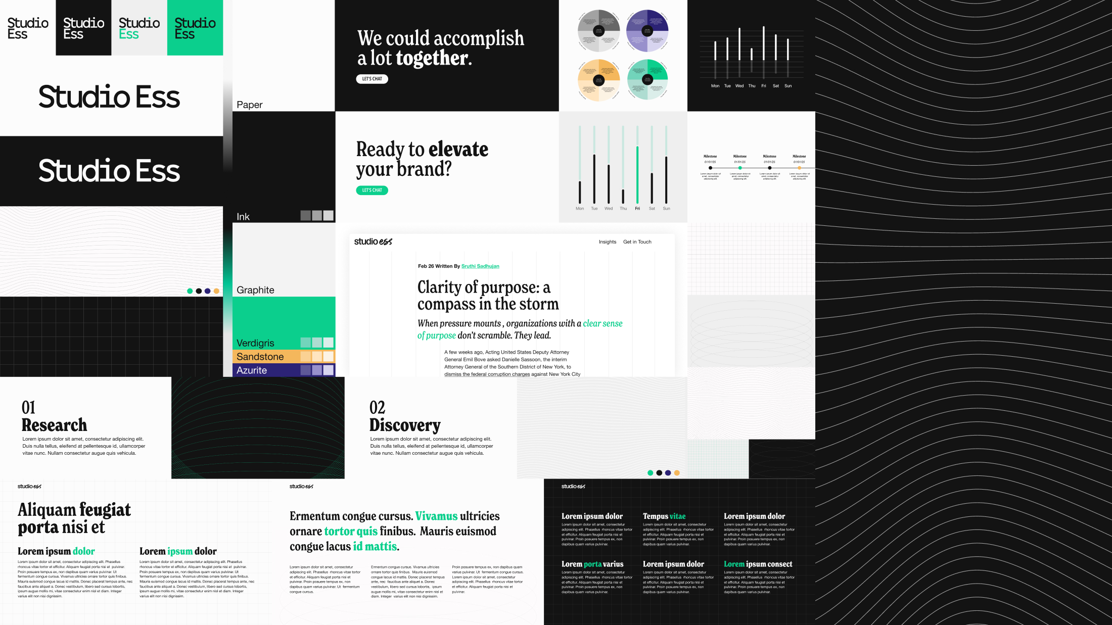
From Fossil Bed to LED Screen 🦕
A modern, responsive website was designed and built to accommodate the growing organization’s current and future needs. The modular, inviting site includes multiple archive and publishing workflows, an event calendar system, and a paid-tier membership feature. A content and existing-member migration was also undertaken as part of the initial launch process.
Jurassic to the Holocene 🦕
Physical applications and demos were built out to inspire the brand’s caretakers to have fun with the new branding.