The Kyoto Retreat
Branding, Logo, Web
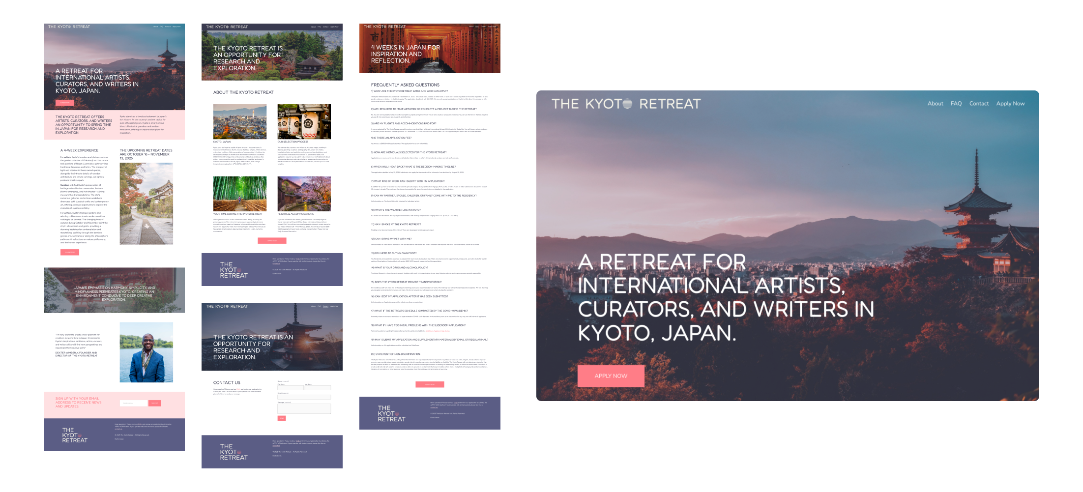
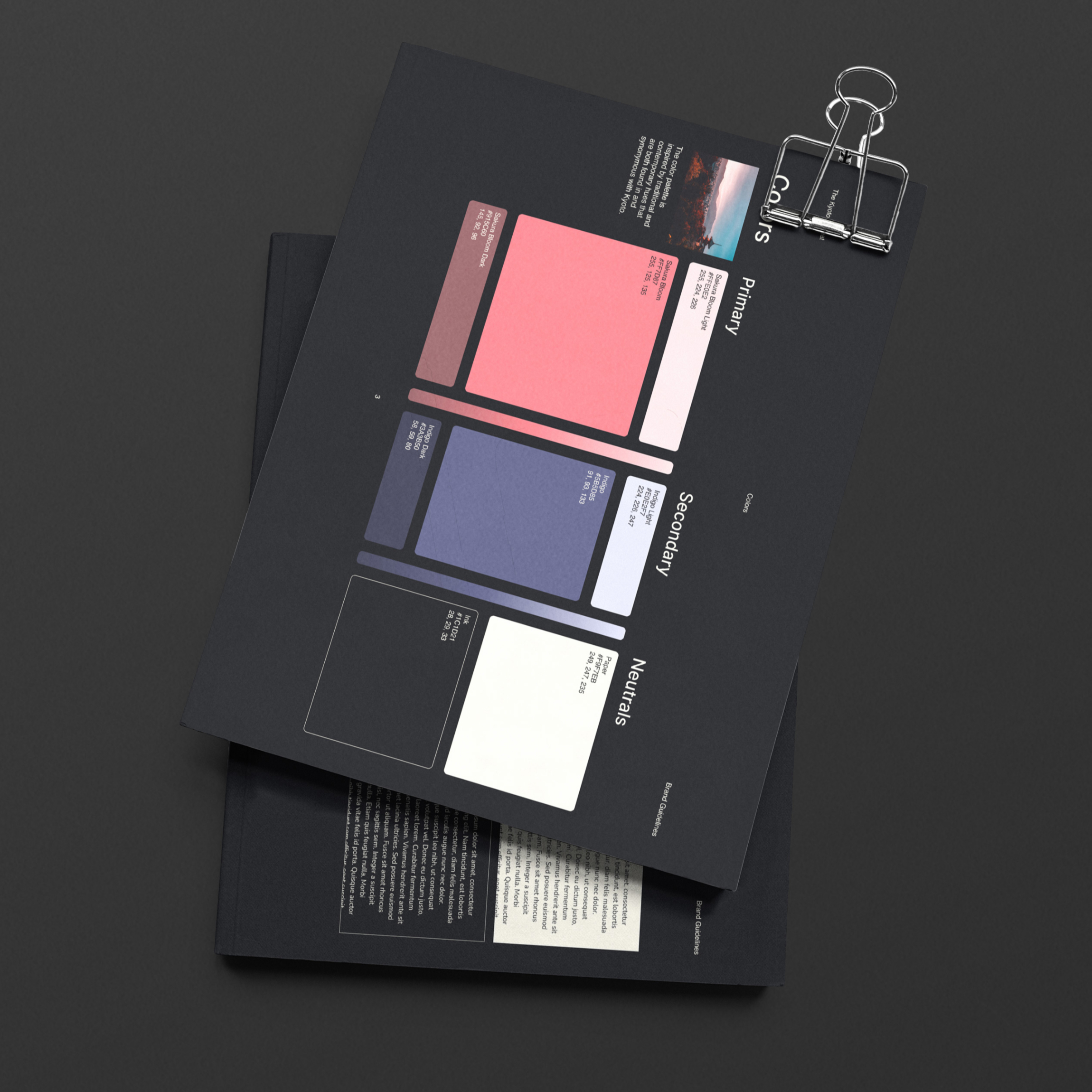
The Kyoto Retreat is a retreat for international artists, curators, and writers in Kyoto, Japan. A logo, brand guide, and website was designed and developed to launch the program.


Branding, Logo, Web
The Kyoto Retreat is a retreat for international artists, curators, and writers in Kyoto, Japan. A logo, brand guide, and website was designed and developed to launch the program.


Conception, Branding/ID, Production/Development
Part conceptual art project, part new media organization, the Department of Information was inspired by the Environmental Protection Agency, the International Typographic Style, the Public Broadcasting System, and the multitude of bureaucratic, disfunctional, government-parallel institutions we’ve worked for in the past.

The idea for a place to review art and design publications—mainly weird books and zines—was the starting point. With a shared interest and fascination with modernism, minimalism, and non-corporate entities; a concept for an authoritative, ambiguously-governmental brand was conceived.

From this the Department of Information (essentially an art blog) was born. It would need an engaging and comprehensive brand story and world-building schema to calcify it as a believable, respectible, and often comedically-bureaucratic, Kafkaesque entity.

Ultimately, the Department brand is a medium for experimenting with new media, art, and design. The style, or modality, is defined through the well-worn lenses of modernism, minimalism, government-space, and bureaucracy.
Direct influences included the United Nations, the Environmental Protection Agency, governments in general, the International Typographic Style, the Public Broadcasting System, the 1960’s/70’s/80’s, and visual culture at large.
A comprehensive brand guide was developed and printed as an A4 newsprint saddle-stitched pamphlet. However, the entire brand is a living, ever-evolving and expanding world-building exercise.


A brand-appropriate website (think a cross between the New York Times and an obscure blackbox government department website) was built to house articles on art books, zines, and interesting content at the intersection of public services, science, governance and visual culture. Accompanying digital applications and strategies would include social media, email newsletters, video, and audio content.


The brand’s physical presence was intended to be just as important as it’s virtual presence. An information awareness campaign poster series was printed on newsprint and given out promotionally during the brand’s first year.


Other physical applications include and have included multiple vinyl album releases, mailable postcards, screen printed shirts and posters, a robust stationery suite, stamps, and a variety of other strange limited run editions.


Branding, Logo, Web
FishEye Collaborative is an emerging conservation technology non-profit specializing in marine conservation bioacoustics. They do research and development on non-invasive listening technologies that can help evaluate and protect ocean habitats. Their collaborators include the Cornell University Center for Conservation Bioacoustics, the Smithsonian National Museum of Natural History, the FORTH Institute, and the Curaçao Sea Aquarium and Substation. An inaugural website and brand identity was developed to support their first scientific publication and to introduce them to the public.

While the main purpose of the collaboration was to design a beautiful new website, we used the opportunity to build a robust brand foundation on solid bedrock to support future organizational needs. Building off an existing logo, we worked backward to create a new, simplistic mark.

This helped strengthen brand conceptually and filled in gaps across mediums. Next, an appropriate and informed typographic set, color palette, pattern library, and additional ID elements were created.

Drawing inspiration from the shallow tropical waters of the Caribbean and the undersea environment where the organization primarily operates, an appropriate, utilitarian, and aesthetically pleasing color palette was developed.

A brand guide was developed to expand on the core, guiding elements to ensure all mediums and applications are thoughtfully constructed and designed.


Pockota Medium (for headlines) and Public Sans (for everything else) paired well together typographically. Together these fonts presented an appropriate balance of science-text-book seriousness, modernity, playfulness, and readability.
High resolution abstracted coral reef patterns were collected and treated with brand gradients to supplement visuals as background textures.

Additionally, an existing library of beautiful photographs was folded into the visual language.
For the species library, a celebrated and renowned illustrator of oceanic field guides was brought onboard for a licensing partnership (stand-in illustrations are used on this case study but the actual licensed ones are present on the live project/brand).


A data visualization system was developed alongside an undersea scene-building toolkit for scientific diagrams, charts, and figures.
A modern website, including a fully searchable and browsable fish sound library microsite, was designed and developed. Additionally, a social suite was created to help showcase the work of the organization and make the scientific findings approachable and fun.

To inspire the crew to ideate into the future, a suite of physical applications was envisioned.


