Art
Showing all 8 resultsSorted by latest
-

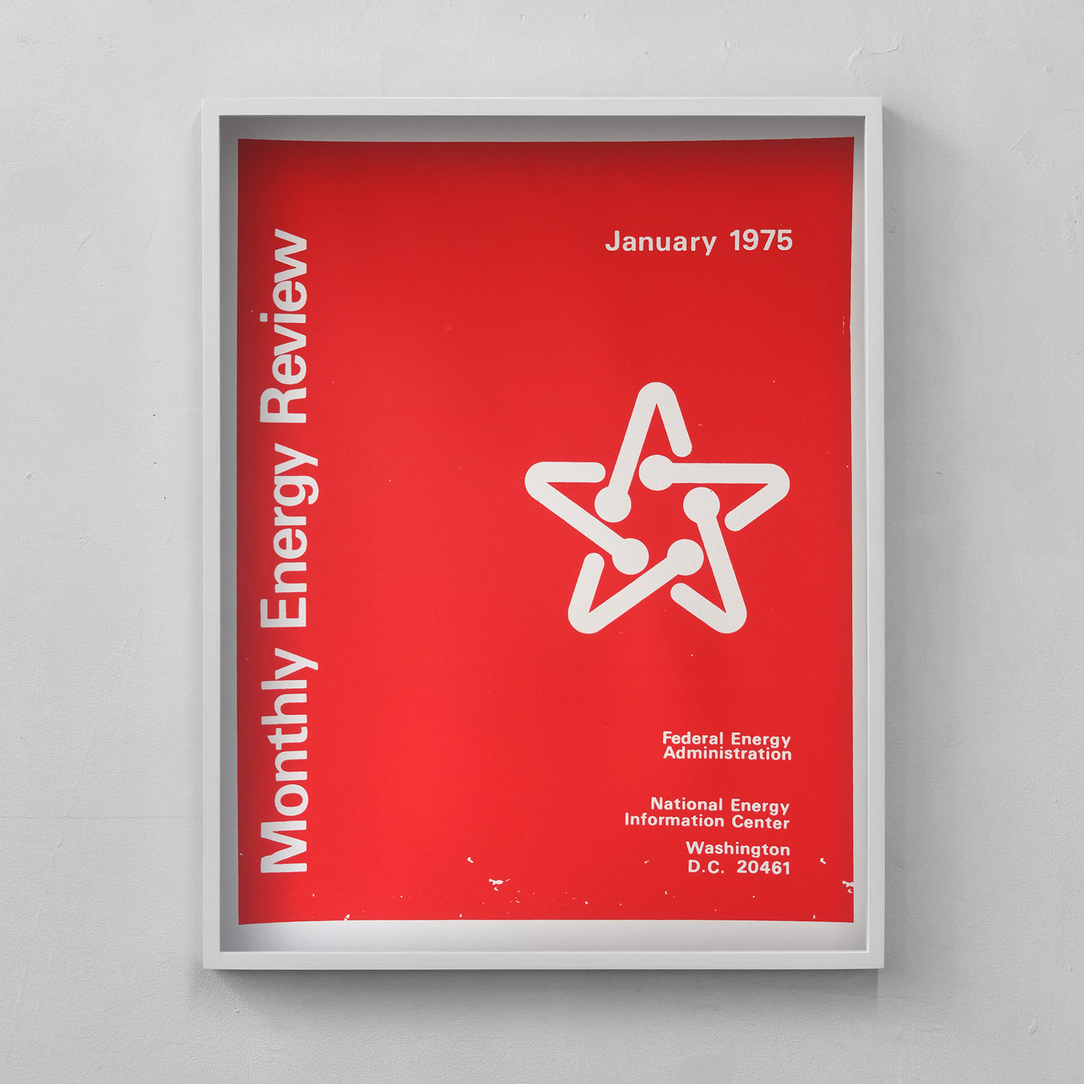
Federal Energy Administration Report Cover Poster: Monthly Energy Review, 1975
$40.00 Add to cart -
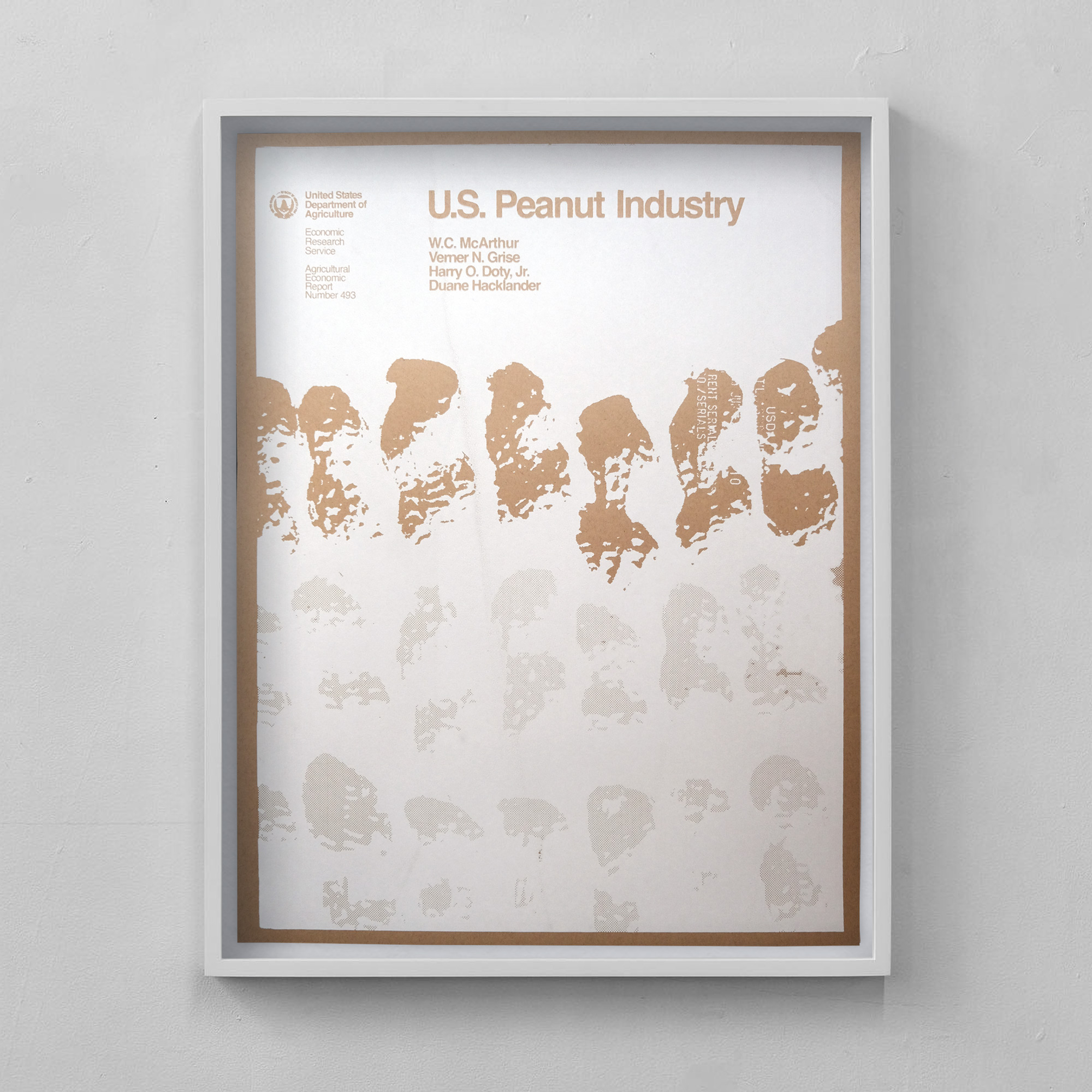
USDA Report Cover Poster: US Peanut Industry, 1982 (White)
$40.00 Add to cart -
EPA Poster: Climate Change, 1989
$30.00 Add to cart -
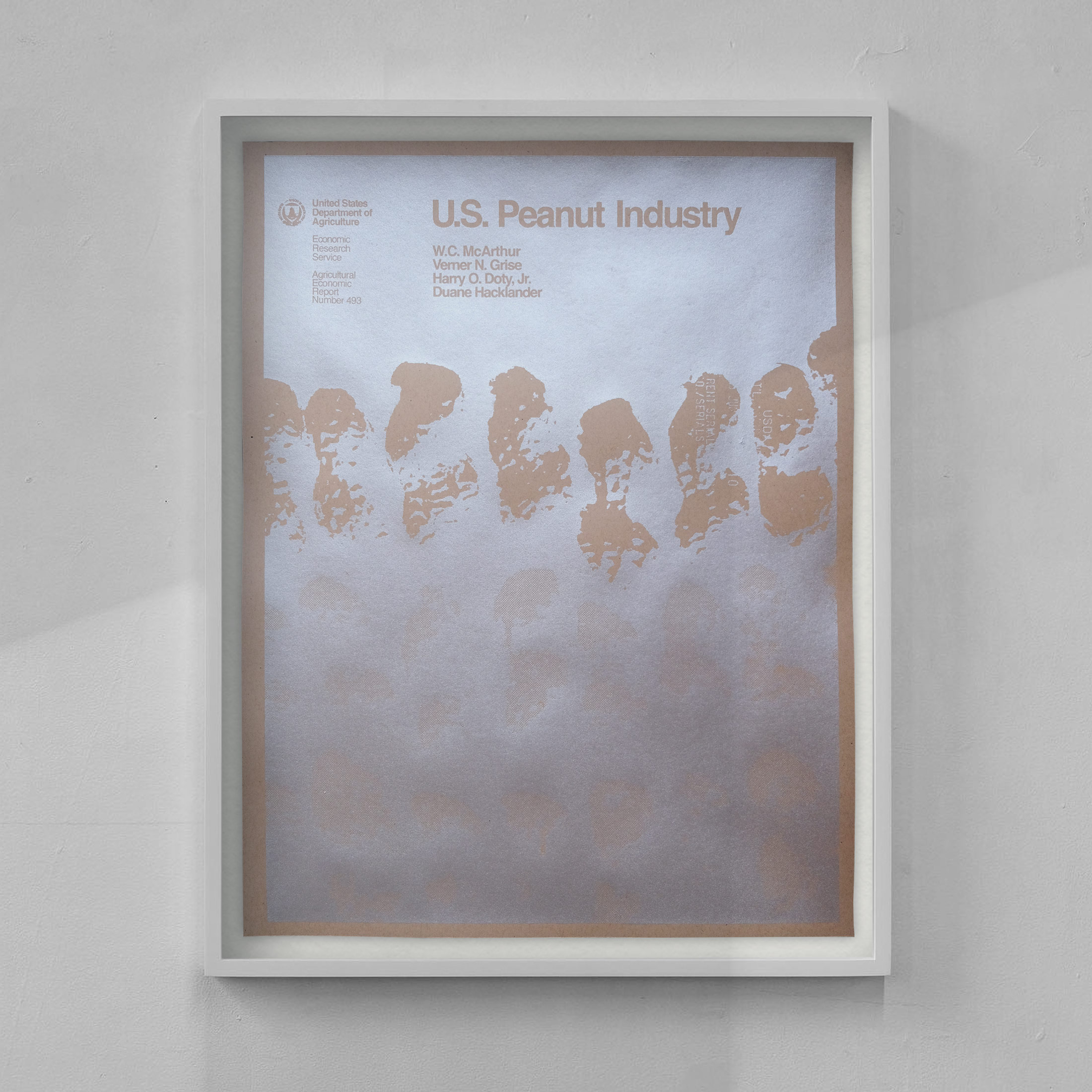
USDA Report Cover Poster: US Peanut Industry, 1982 (Silver)
$50.00 Read more -
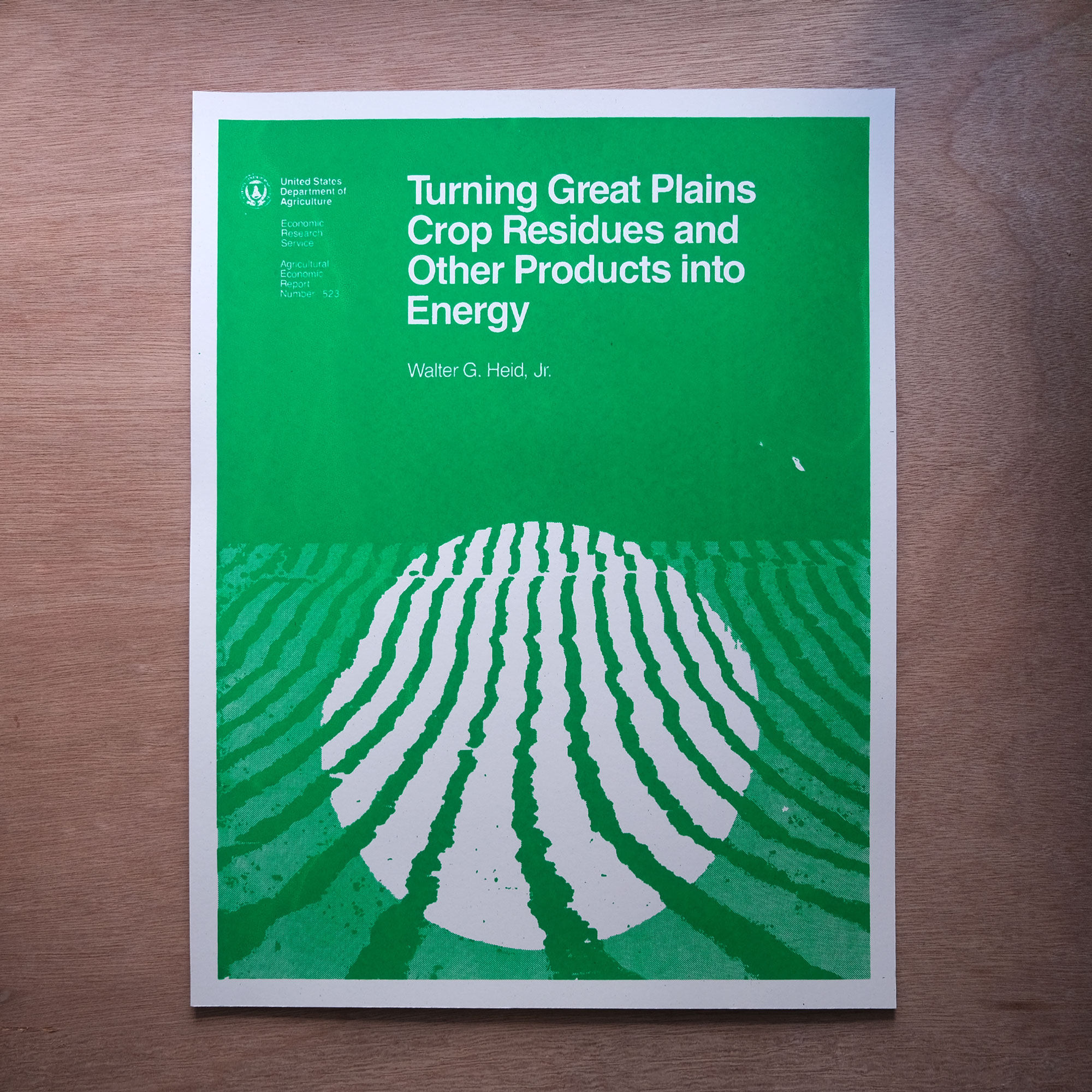
USDA Report Cover Poster: Great Plains
$40.00 Read more -
USDA Report Cover Poster: 1984 Experiment Stations
$30.00 Add to cart -
Encyclopedia of Time and Space: Fire Coral Poster
$50.00 Add to cart -
Pacific Northwest Pollinator Wildflower Seeds & Silkscreen Print
$20.00 Read more